Printed in elegant wine and antique gold inks, these letterpress invitations show off our Majorca design. We love the regal feel of these invitations, pairing a horizontal orientation with pretty script and a sophisticated color combination.

This customization of our Majorca letterpress invitations feels particularly regal printed in this sophisticated color combination of antique gold and wine. The design was adapted to a horizontal orientation and paired with pretty script for an elegant feel.

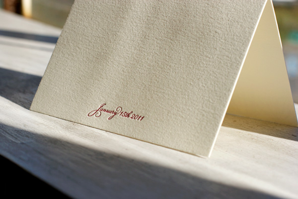
Soft and pretty in warm colors, these letterpress thank you cards feature our Botanicals design. Printed in wine ink on ivory paper, the look is elegant and sophisticated for a chic winter wedding.


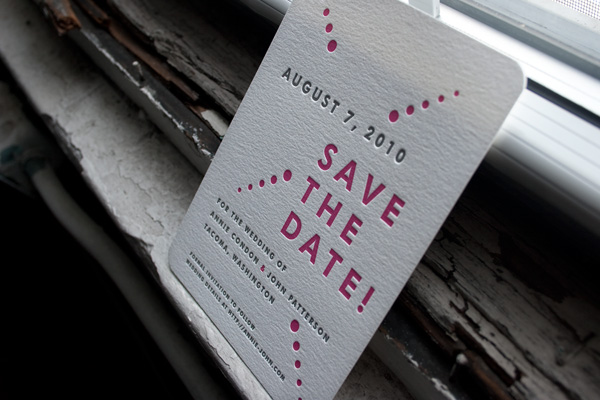
Over the past several months we’ve continued printing a lot of fabulous letterpress save the dates for upcoming spring and summer 2010 weddings. Recently we printed two customizations of a save the date design that we absolutely loved and couldn’t resist sharing both with you!


This version of our Champagne letterpress save the date is printed in fuchsia and pewter inks and features corner rounding for the perfect finishing touch.


This very different version of our Champagne design is printed in wine and clover inks. It’s a perfect example of how one design can be personalized in two unique ways and be equally perfect for two very different events.


