Recently we had the exciting opportunity to work with a couple on a really fun invitation project. We letterpress printed reply cards in our English Waltz design to accompany their invitations, silk-screened vintage handkerchiefs. Printed on our luxury 2-ply paper in taupe ink, these reply cards are a perfect complement to the hankie invitations. The bride, Kristy, shared the inspiration behind her lovely, one of a kind invitations:
We have tried our best to make the elements of our wedding personal and unique, and came across the hankie idea as a perfect way to accomplish that. We were fortunate enough to find Erin Raspberry Napier from Lucky Luxe Correspondence to help create the beautiful finished product. With some help from our moms, we searched antique shops, flea markets, garage sales, estate sales, and of course the internet to collect a wonderful variety of vintage hankies. After washing and ironing them, we sent them to Erin to be printed. When we received them back, I had a great time individually selecting who to send each hankie to. With the range of colors and patterns, I found one to perfectly represent each of our guests!
In addition to obviously using the handkerchiefs to invite our friends and family to join us on our wedding day, we have considered having our groomsmen use their invites as pocket squares, and hope that guests will carry them as we celebrate with tears of happiness!


{Silk-screened handkerchief invitations by Erin Raspberry Napier of Lucky Luxe Correspondence.}
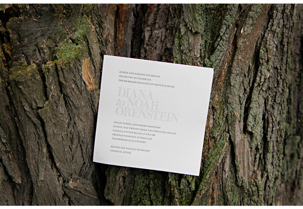
We were so happy to have the incredibly talented Marie Labbancz share photos of Diana and Noah’s wedding – and their Irving letterpress wedding invitations! We printed their invitations in pewter and pale gray inks with fuchsia edge painting and love how Diana and Noah incorporated them into their modern meets classic wedding. With bright fuchsia and orange bridesmaid dresses and playful touches like 80s-inspired sunglasses paired with the sleek elegance of a vintage Rolls Royce, we’re just in love with these photos and know you will be, too. We love seeing our wedding invitations in action like this!


 Visit Marie’s blog for all of the gorgeous details and a big congratulations to Diana and Noah from everyone at Bella Figura!
{Photos by Marie Labbancz.}
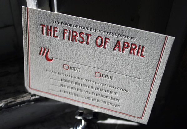
We love this customization of our Tara letterpress wedding invitation design – it’s printed in geranium and downy inks for a look that is both modern and a touch retro with cool vintage-inspired typography. We think these invitations were the perfect first impression for this couple’s wedding, held at The Foundry in Long Island City, a hip venue with a unique modern vibe.


The opportunity for us to work with brides all the time is nothing short of joyful, but the opportunity to be a bride who works at Bella Figura? Absolutely incredible. As I’ve been planning my own wedding, it has been a sincere and immeasurable pleasure to interact with the wonderful brides we’ve printed letterpress invitations for and I’ve found myself completely immersed in beautiful letterpress wedding invitations every day. Hearing their stories, seeing their wedding photos, sharing in a bit of their sheer bliss, has been a remarkable way to prepare for my own wedding, which is taking place this weekend! Knowing how helpful and wonderful it has been for me to take a glimpse into the planning and happiness of other brides, I thought it seemed only appropriate to take this week to share a bit of my own wedding and my own inspriation.

Milk glass vases were something I knew I wanted to incorporate from the beginning.
{Photo by Punam Bean}
To kick it all off, I wanted to share this inspiration board I created several months ago now. It was by far not the first one I created, nor was it the last, but it’s definitely the collective inspiration that got me headed in the direction of how our wedding will unfold. I knew I wanted an event that was both classically elegant and incredibly fun – a little bit vintage, a little bit modern and a whole lot spectacular. Early on the color palette developed into a sophisticated array of neutrals with smudges of my favorite blue hues appearing in little whispers here and there. Attention to detail has been a priority from the beginning, including our letterpress wedding invitations I’ll share later in the week, and all of the other little elements I’ve been crafting over the past many months. Sticking to things that were beautiful, vintage, and handmade has been the running thread that has helped to bring everything together. I can’t wait to see how my vision plays out and to share photos soon.
For now, here is the inspiration board that has led the way…


