Christos and Anna chose our vintage inspired Victrola design as the letterpress baptism invitations for their son Kyriakos. Copper shine foil and taupe letterpress ink were a classic pairing on our ivory Bella Cotton paper, while copper shine edging added a hint of sophistication.


letterpress ink: taupe | foil stamping: copper shine | fonts: victrola + manoir | paper: bella cotton ivory 1-ply + 2-ply | foil edging: copper shine | customization# 26797
Our letterpress wedding invitations have received some amazing publicity lately, so today it’s time again to say thank you to the amazing editors who have shined the spotlight on Bella Figura this spring! Our first feature is from Martha Stewart Weddings, where we created foil stamped and letterpress wedding invitations for one of their gorgeous real weddings. Megan, the bride, submitted the artwork for us to print — we love the glamorous outcome!

Inside Weddings featured our Pinterest-inspired design, A Bientot, in their spring 2013 issue.

Weddings by The Ritz-Carlton Magazine featured an elegant customization of our Amor design by Sarah Hanna in their January – June 2013 issue.
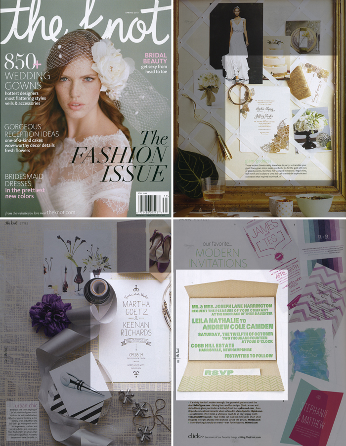
Several of our letterpress wedding invitations were featured in the spring issue of The Knot: our popular gold foil stamped Divya Formal invitation, the modern Dash invitation, and our minimalist Alton invitation were all shown throughout this issue.

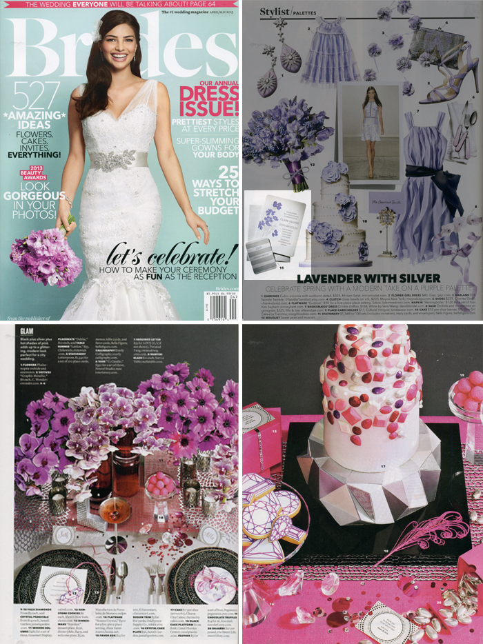
Brides magazine featured Bella Figura in several of their recent issues: first, a lovely lavender customization of our Lenox Botanical design was featured in the April / May issue, along with menus, place cards, and favor cards from our Circolo suite.

(more…)
These Victrola letterpress save the dates (by Ben Whitla) are overflowing with antique and vintage flair. The combination of a warm and cool color hue makes for gorgeous letterpress. We become all giddy when couples choose a save the date matching back to their venue – and these are a sure fire hit. Brenda Fox, who is one of our amazing in-house designers created the custom ferry which is the perfect finishing touch. We’d like to give our thanks to our friends at Gus & Ruby Letterpress in Portsmouth, New Hampshire for sending us these creative save the dates.*Additional fees may apply.
inks: champagne + pewter | fonts: victoria + manoir + sans capitals | paper: 1-ply ivory | size: A6

A western wedding dressed in the desert’s natural tones allows for a perfect Victrola customization.
Victrola customization = inks: mesa + taupe | fonts: manoir + herald | paper: white | invite size: f-8 | liner: European formal pattern in celadon and taupe ink | original design by Ben Whitla | customized by in-house designer Brenda Fox |
embellishment suggestions: edge painting: aquamarine

(Photo Credits: Love is a Big Deal)
This next design contest honoree created a lot of buzz here at Bella Figura! Letterpress and foil stamping make for a unique take on our Victrola invitation in this ticket-inspired customization, sent to us by Alexa and Julie at The Dandelion Patch in Reston, Virginia. Katie and Ryan – the bride and groom – shared the inspiration behind the invitations for their fall wedding with us:
Initially, our venue choice was going to be this amazing outdoor amphitheater in Southern Oregon called the Britt Festivals. It is a venue that hosts various musicians during the summer months. Unfortunately, they were unable to accommodate a wedding, so we went elsewhere. Lucky for us, our new venue has all of the elements we originally wanted, plus some! While we may not have a stage, we have the ability to create one that is tailor-made to us! Beyond that, we also have some amazing musicians in our family who will be performing during the ceremony. Since the feel of the wedding is so organic and artistic, we thought it would be neat to have the invitations be more like a ticket to a show.
We searched tickets and found some that had elements that we really liked, so we drew from those. I wanted to put the most important information in the forefront, such as the date and our names. By having our names in a different color, we were able to bring the focus there and make it less monotonous. Red just seemed to pop out more against the white and black colors. It was either red or copper to go with the fall colors, and red won out!

These invitations feature a really great mix of typography, and the foil stamped hand calligraphy accents add the perfect hint of elegance! We especially loved the way the modern herringbone envelope liners complemented the invitations – the perfect finishing touch. Congratulations to Alexa, Julie and everyone at the Dandelion Patch for being selected as a design contest honoree, and best wishes to the happy couple – we hope your wedding day is wonderful!
ink: black | foil: red shine | fonts: impression + bennington + sans capitals | calligraphy: sloan hand calligraphy by kelle mccarter | paper: 1-ply white | invite size: no. 10 | liner: modern herringbone in black ink | rounded corners
This design won an honorable mention in our Bella Figura design competition for 2012. This annual competition recognizes outstanding and inspired designs submitted to us by our beloved dealers.
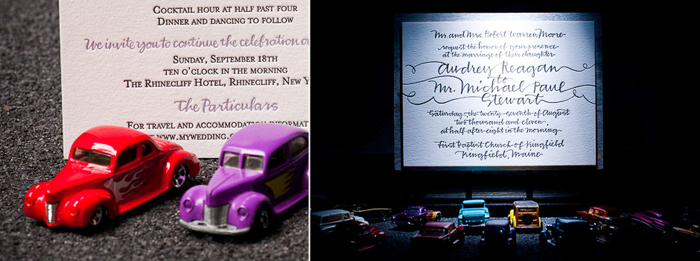
Earlier this year, we worked with Alice and Beth from Alice G. Patterson Photography on an amazing project we’re really excited to share. Featured recently on Green Wedding Shoes, this collaboration features some of our most popular letterpress invitation designs alongside some incredible miniatures. Alice and Beth set up these picturesque scenes and we were completely blown away with the end result — take a look!


 (more…)
Here at Bella Figura, we think voting is one of the most direct ways to impact this country and the world. So to encourage everybody to get out and vote this year, we’re offering a special promotion just for voters during the month of November, 2011: orders with 75 invitation sets or more will receive 25 free sets!
To take advantage of this promotion, all you need to do is supply a photo of yourself voting! Simply send in the photo with your order to receive the special by emailing order@bellafigura.com – if you plan to work with one of our retailers, just include their store name in your email. We’ll be featuring the photos on our blog and Facebook page in the upcoming weeks, so please let us know when submitting the photo if you don’t want your photograph shared!
Election day is November 8, 2011, so get out and vote! If you want to help spread the word on election day, let everyone know that you voted by uploading your photo to our Facebook page. Just click the ‘Share Photo’ option, and in the caption, tell us the state you’re voting in!
Excited about the vote? Keep the voting momentum going and click here to vote on the next design of the month! The design of the month will go on sale for 20% off during the month of December & 4 designs are in the running — be sure to check it out!

(The small print: Orders must be placed no later than 11:59pm EST on Wednesday, November 30. A photo is required to take advantage of this offer. “Invitation sets” are considered the invitation, reply card or postcard, and coordinating envelopes — no substitutes. Additional insert cards, such as direction cards or accommodation cards, do not qualify.)
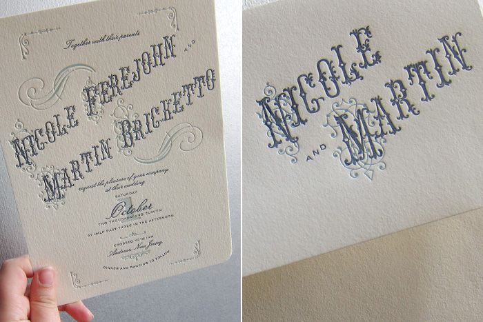
The perfect precursor to what’s sure to be a gorgeous vintage-chic outdoor wedding, this customization of our Victrola Letterpress design has got everybody here at the shop… spinning. Pressed in Deep Blue and Pool on our 1-ply ivory paper, the old school typography, cool hues, and ornate flourishes really lend this set some sick traditional Americana vibe. Two color printing throughout the set (even on the envelopes) really helps to keep things cohesive and well balanced.
ink: deep blue + pool | fonts: victoria + manoir | paper: ivory 1-ply | invite size: F-8 | client coordinator: chris gannon | in-house designer: kyle laatsch


by Chris Gannon, Client Coordinator.


