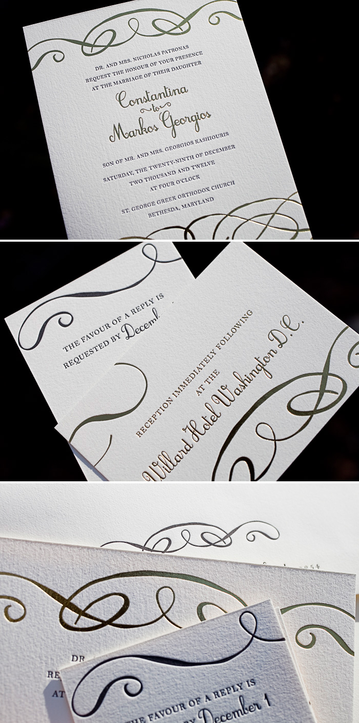
Everytime black letterpress ink is paired with gold shine foil, the end result is one we know we’re going to love. Submitted to us by our friends at Bells & Whistles in Belmont, Massachusetts, the simple flourishes at the top and bottom of the invitation give this design just enough character, while maintaining the elegant feel. We often see Amy Graham Stigler’s Tennyson design used for a black tie affair and this suite is no exception.
letterpress ink: black | foil: gold shine | fonts: botany + jovial | paper: 1-ply ivory | invite size: f8 | customization #: 15185


Soft, elegant and impossibly romantic we love a color palette of light peach, dusty pink, light lavender, cream and celadon to capture the timeless sophistication of our Tennyson letterpress wedding invitations. (Photo credits: wedding invitations + bouquet + wedding cake + dress with book.)
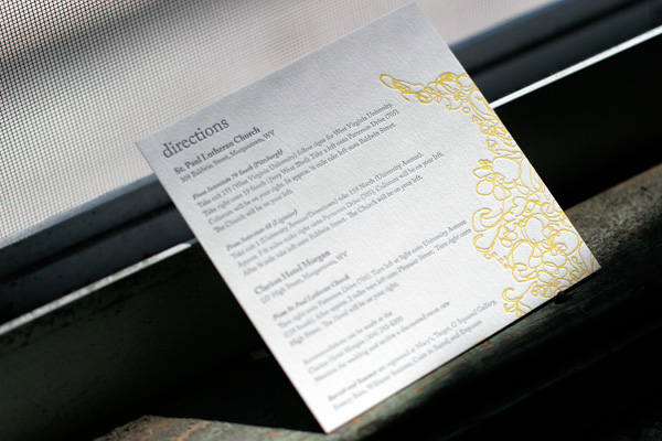
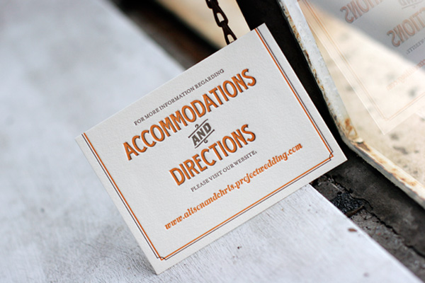
We thought we’d share a fun round up of some of the awesome letterpress directions and accommodations cards we’ve printed in recent months. Some of them include maps and other details and some of them simply refer guests to a website with lots of extra information to make their travel easier. Accommodations cards are especially helpful if you’ve negotiated group rates at local hotels so guests know where to book their room. Check out these ideas for tons of great letterpress inspiration!
 {Letterpress directions card in Flourish.}

{Tara accommodations + directions website card.}
 {Tennyson letterpress directions card.}
 {Directions card in Tuileries.}
(more…)

