Brittany and Tyler worked with our friends at Smitten Boutique in Chicago, Illinois to concept their modern typography and floral wedding invitations. They paired the bold, contemporary type style from our Loft design with the playful, hand-drawn florals from our Loley design and printed in a palette of pinks and purples fit for a May wedding. Our Olensen patterned envelope liner tied the colors together perfectly.
Geena and Zackary worked with our team and Union Street Papery to create these colorful cortes inspired letterpress invitations. They used blind deboss accents on the top and the bottom of the design to create a subtle, yet whimsical impact. The insert cards also carried the theme from the invitation, but with unique accents of their own to set them apart. The digitally printed envelope liner tied all the colors of the suite together. We have no doubt this wedding was one to remember!
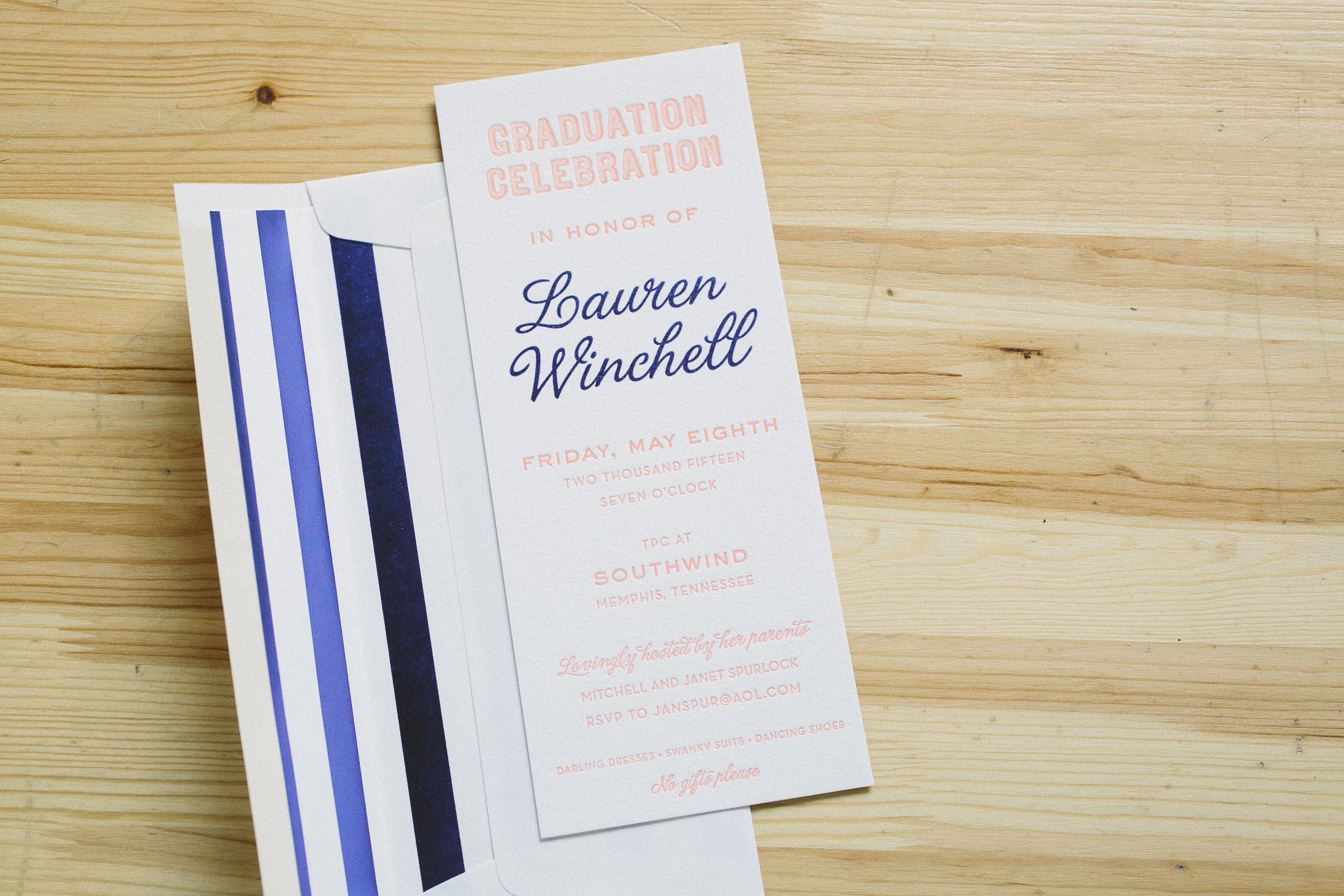
Lauren’s parents hosted a party in honor of her recent accomplishment and invited guests to join them with these colorful foil and letterpress graduation invitations. Sherbet ink and indigo shine foil made for a youthful and fresh palette while our #10 sized card was a fun way to keep things from feeling too formal. Our sea stripes envelope liner in indigo shine brought an extra pop of shiny color.
letterpress ink: sherbet | foil stamping: indigo shine | paper: bella cotton white 1-ply | envelope: bella cotton white | foil stamped liner: sea stripes pattern in indigo shine | Menage Fine Stationery & Gifts | customization #26964
This set’s actually based around Ben Whitla‘s Irving design, but the client decided to jazz things up with some sweet chevron action on some of the pieces. The Dandelion Patch strikes again with this lovely set, which comes complete with matching coasters to soak up all the suds.
inks: pale gray + pewter + sherbet | paper: 2-ply white | invite size: sq7 | edge painting: sherbet | liner: custom chevron pattern in pale gray + pewter + sherbet inks |customization #: 15492 |
Classic gardens and pastel rose bushes inspire this romantic customization of our Delambre Classic letterpress wedding invitation design (by Jessica Tierney). We love the contemporary feel of a rainbow of pastels, but the traditional Copperplate calligraphy style keeps this design formal and elegant.
Designed by Maybelle Imasa-Stukuls these Antigua letterpress invitations have style. The flowing seaweed motif adds a carefree feeling and the soft color palette looks so delicate. Thanks to our friends at Urbanic Paper Boutique for sending us these to print!
inks: sherbet + taupe | fonts: meadow + vladimir | paper: 1-ply white | size: F8 | customization #:13499 |
A big thanks goes out to the wonderful folks at Dandelion Patch – Georgetown for sending us this marvelous Calder (by Erin Jang) letterpress wedding invitation. The color combination of antique gold & sherbet inks coupled with wine edge painting are the absolute perfect choices for a fall wedding. Not to mention they look sensational on our ivory paper!
While there’s no rule saying you have to stick with the same design for both your save the dates and invites, we definitely love seeing a design carried through for all of the wedding stationery of a couple. Take this set for instance. This couple chose to take our classic Ashwell design, and to jazz it up with a custom wreath design that they used for both the save the dates as well as the invitations. Thanks to Union Street Papery for these orders!
letterpress inks: sherbet + chartreuse | foil ink: copper shine | paper: 1-ply ivory | save the date size: a6 | invite size: f8 | liner: jacquard elegance in sherbet and chartreuse inks | foil edging: copper shine | customization #: 12176 + 13060 |
We can hardly believe that Bella Figura’s first Design Contest came and went so quickly. Congrats again to all of the winners! Now that the contest has ended, we thought you’d like to see the gorgeous contest winner plaques we sent to the stores that had the top ten designs! Our internal designer Lindsy Aragona created a stunning customization of our Maile design. These beauties are letterpressed in an exciting color combination of sherbet and spring green inks on our 2-ply white paper. Corner rounding adds an extra touch, highlighting the natural curves of the leaves in the design. The wonderful Sarah Hanna is responsible for the stunning calligraphy. The photography in this post features our winners (first place Gus & Ruby Letterpress, second place Social Graces, and third place Union Street Papery).