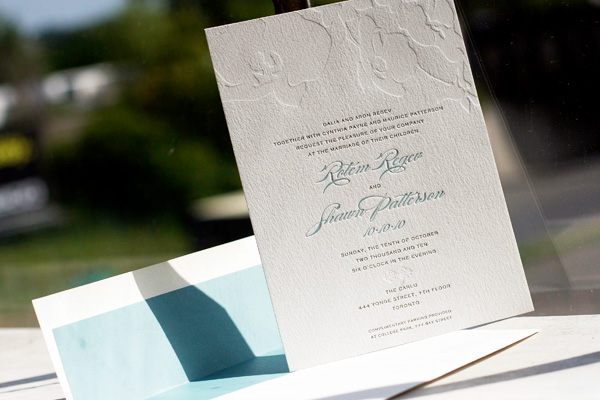
New for 2010, this three-color letterpress invitation features our Paradise design. The letterpress invitations and accommodations cards were printed in taupe and pool inks and feature a floral pattern in blind deboss, while the reply cards were printed in taupe and blind deboss. Chic pool envelope liners are the perfect finishing touch.


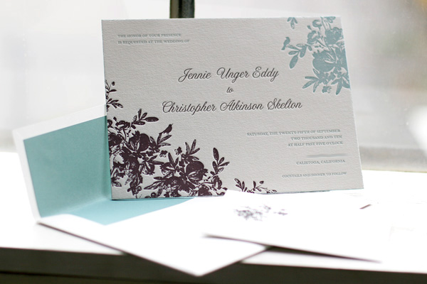
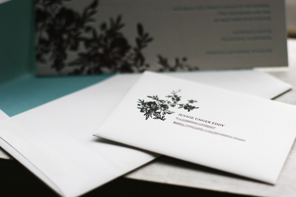
Our Vendage letterpress wedding invitation design has become one of 2010’s greatest hits. This customization is printed in pool and umber inks and features a horizontal orientation instead of the square featured in the original design. The envelopes are lined in pool to match the pool edge painting and the set is printed on our luxury 2-ply paper. Classic black ink for the envelope printing makes this set sophisticated, a bit whimsical and cool blend of modern and traditional design.


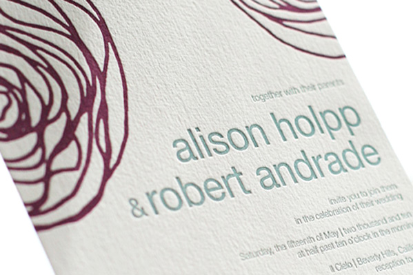
These letterpress wedding invitations showcase our Spinnerette design, one of our favorites from our 2010 collection. A fresh color combination of aubergine and pool inks give this design a contemporary look that’s playful and modern, perfect for a casual summer wedding.


The soft pale colors of this customization of our Buttonpom letterpress wedding invitation has us thinking about all things winter, which is probably appropriate considering we just got our first snow fall here in Syracuse overnight. We printed this set in pool and pale gray inks and love how the soft subtle colors allow the beauty of letterpress to take center stage.


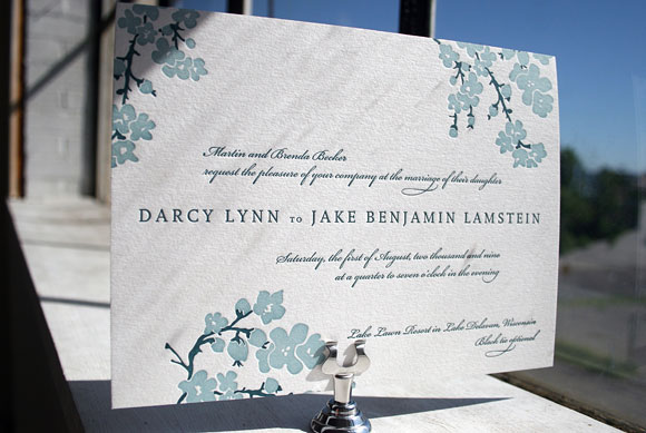
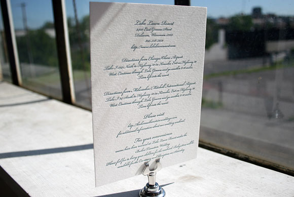
Printed in pool and peacock inks, this version of our Mimosa design features a fun pairing of 2-color and 1-color letterpress pieces detailing travel information and weekend events for guests of this lakefront wedding in Wisconsin.


The letterpress wedding invitation itself is printed in both pool and peacock, a unique pairing of ink colors that is perfect for a waterfront celebration.

This letterpress card is a simple insert detailing travel information and accommodation details for guests traveling to Wisconsin for the wedding. It is printed in peacock ink.

Also printed in 1-color letterpress in peacock ink, this insert card invites guest to a separate welcome dinner held the evening before the wedding. We love the combination of pretty 1-color inserts with this 2-color letterpress wedding invitations – it’s a great way to save money on your letterpress inserts while still showing off a great 2-color design on your main invitation.
Rounding out our posts of fun letterpress save the dates for the week, these are two cool customizations we printed for weddings this past summer. The first is our Surya design printed in rich amethyst and pool inks. We love this pairing of pretty jewel tones and suspect this will be a continuing trend in the months to come.

This letterpress save the date is a really fun customization of our Sailboat design in garden and navy inks. It’s really the perfect save the date for this couple’s wedding, which took place in the beautiful Thousand Islands region of Upstate NY, not too far from our studio in Syracuse.

In 2009, Dewdrop has become one of our most popular letterpress wedding invitation designs. It has been paired with the most modern of weddings and used for the most elegant and traditional of events. Seeing how couples customize our designs is always exciting, but seeing Dewdrop reinvented over and over has proven especially fun. This version uses the same spring green of the sample design paired with deep pool ink and an envelope lined in pool. By pairing more traditional script and serif fonts together – as opposed to the clean lines of the sans serif fonts of the original design – the look is much more formal and yet still incredibly festive and fun. And we love the addition of a third color for the envelope liner – it’s a great way to introduce a third color unexpectedly. We also love the reply card, printed in 1-color letterpress and giving guests the option to reply for multiple events, which is a great way to save money without sacrificing style. What can we say? We’re in love with Dewdrop and this customization is no exception!


