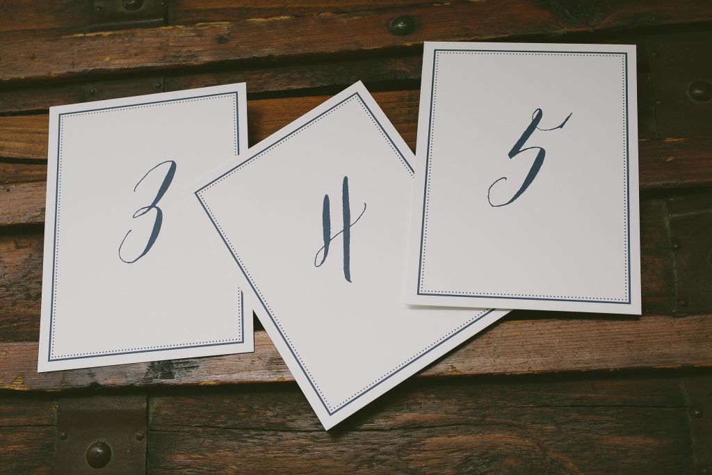
Personalized place cards, escort cards and table numbers are yet another way to use your stationery to express your wedding style. Let us digitally print your guests’ names, table numbers or both on your reception pieces to showcase your stationery design, colors and fonts throughout your event.
We printed these flat escort cards and table numbers in navy digital ink, using our Gus design as inspiration.


Since digital printing allows you to print in multiple colors it is a great way to designate meal choices in a subtle way – as seen here on these folded place cards inspired by our Briolette design.

With the help of our friends at Prickly Pear Press we printed these fun and festive rehearsal dinner invitations for Haley and Tripp, using our Modern Revelry design as inspiration. Their bold color palette of cobalt and gold shine foil was used throughout the suite – even on the cobalt edges of the invitation and menu. We digitally printed their guests’ names on the placecards, too!


letterpress ink: cobalt | foil stamping: gold shine | fonts: marilyn + streamline | paper: bella cotton ivory 1-ply + 2-ply | edge painting: cobalt | envelope: bella cotton ivory | foil stamped liner: sullivan stripe pattern in gold shine | variably printed placecards: cobalt + antique gold digital inks | Prickly Pear Press | customization #33856
Save
Lauren and her family worked with our friends at Brenda Himmel Stationery to customize our Josephine design for Lauren’s floral Bat Mitzvah invitations. They chose to keep the ladylike florals, elegant diecut shape and gold matte foil and added an events card, program cover and folded place card.


foil stamping: gold matte | digital printing: cmyk | paper: bella smooth cotton 1-ply white | diecut: lincoln style | Brenda Himmel Stationery | customization #32547
Save
We had the pleasure of working with Erin and Nicholas on their purple Wildflower wedding invitations for their recent celebration in California. They chose a monochromatic palette, using amethyst ink as their main color and highlighting their names in our soft and romantic wisteria ink.


letterpress inks: amethyst + wisteria | fonts: barocca + moravia | paper: bella smooth cotton 2-ply + 1-ply | customization #31375
Elizabeth and Matthew customized our Josephine design for their springtime Chicago wedding, but instead of the romantic florals on the original design they opted to use the laurel-like motif from the suite for a more organic feel. Their floral wedding invitations were accompanied by coordinating pieces that included a program panel and ceremony placecards.


letterpress ink: antique gold | digital printing: cmyk | paper: bella smooth cotton 1-ply ivory | PS Invitations | customization #26351
More gorgeous Mediterranean ink made an appearance with these stunning letterpress invitations in our Peacock Full design. Paired with bright spring green, this color combination is both vibrant and sophisticated. To complete the suite, pretty letterpress place cards for the reception were printed to match.


