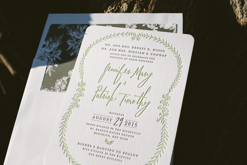
Paying homage to their venue, The Green Building in Brooklyn, Jennifer and Patrick customized our Nightingale design by printing in an earthy palette of chartreuse and taupe inks. Their green wedding invitations featured rounded corners and chartreuse painted edges and an elegant garden liner in coordinating taupe ink.


letterpress inks: chartreuse + taupe | fonts: briar + moravia | paper: bella cotton white 2-ply + 1-ply | rounded corners | edge painting: chartreuse | envelope: bella cotton white | liner: elegant garden pattern in taupe | Lion in the Sun | customization #28646
One of the most popular deities in the Hindu Pantheon, Ganesha makes a welcomed appearance here on Ellie Snow‘s True Vintage letterpress invitation design. Adding little motifs like this to an existing design is a great way to incorporate different cultural, historical, and religious aspects of the couples personal lives into the letterpress invitations. This great set comes to us courtesy of the lovely folks at Lion in the Sun.
inks: black + french vanilla | fonts: strana + danube + streamline | paper: 2-ply white | card size: SQ7 | customization #: 16575 |

Corporate shindigs are one of the top non-wedding uses for our letterpress invites, and here’s a really cool one we did recently based on Elizabeth and David Mandel‘s Deco design. Lion in the Sun sent this really sweet printing gig our way, along with some custom artwork that we printed on the envelope flaps to coordinate with the set. Overall it’s a beautiful invite that goes along perfectly with the 1920’s theme of the event.
inks: charcoal + black | paper: 1-ply ivory | invite size: f8 | envelope lining: vintage river pattern in black | customization #: 15544 |

Our friends over at Lion in the Sun sent us this wonderful customization of our Joie de Vivre (by Kamal) wedding invitations. The gold matte foil, coupled with our prussian blue letterpress ink, really helps this design to shine with excellence! The beautiful invitation envelope liner only adds to the beauty.
letterpress ink: prussian blue | foil ink: gold matte | font: streamline | paper: 2-ply white | invite size: f8 | liner: antique geometrics in prussian blue | edge painting: cardinal | customization #: 14369 |

It’s that time again…drumroll please….The Bella Figura Design Contest! We’ve collected the best, most exciting, jaw-dropping designs that our retailers have sent to us this year, and over the next couple weeks we are going to feature our contest honorees and then finish with our top 3 winners! Are you excited? We sure are!

There was really no surprise that this custom letterpress and foil invitation from Lion in the Sun in Brooklyn, New York made it in to the top 10 designs; it’s one of those we were thrilled to see come to life. Hayley from Lion in the Sun shared the lovely couple’s story:
“Veronique and Ben came into the store enthusiastic and full of ideas. First and foremost they are a world traveling duo, who wanted to add elements of their experiences in their invitation. As a personal touch they decided to phonetically depict “I LOVE YOU” in the languages from each country they traveled together. The bride wanted the invitation to really stand out, and what better way then with gold foil? The couple brought in a vintage poster that they found, and loved, to give the designers at Bella Figura some kind of direction. Sarah Walroth really took all of these elements and conveyed the couples unique style beautifully. lt was a group endeavor that created a truly unique invitation that the couple are so in love with.”

The Bella Figura team fell in LOVE with this design as well for many reasons – not the least of which is the flawless type and the use of foil stamping (a new printing method we started offering this year). The mixture of papaya ink and gold shine foil is on trend and totally hits the mark. Our Willow and Aloutte fonts look fresh and clean. The couple also chose to include motifs from our free motif library and we are glad they added that extra touch!
ink: papaya | foil: gold shine | fonts: alouette + willow | paper: 2-ply white | invite size: f8
This design won an honorable mention in our Bella Figura design competition for 2012. This annual competition recognizes outstanding and inspired design submitted by our beloved dealers.
This creative Bar Mitzvah invitation was sent to us by our friends over at Lion in the Sun in Brooklyn, New York. This exquisite set is a wonderful customization for our Surya design (by Tara Hogan). The choice of our spring green ink and an eye catching custom blue (these colors compliment each other perfectly!) really bring everything together. Staying true to the overall modern vibe this suite emanates, the client opted for a reply postcard rather than the traditional reply card. All in all this is one invitation set that really captures the feel of the party to come!
inks: spring green & custom #633| fonts: burgues script + impression | paper: 1-ply white | invite size: SQ-7 | liner: the antique geometrics pattern in custom #633

Our Lush (by Jamie Lea Bertsch ) letterpress wedding invitations go from soft to stylish with this color customization submitted by Lion in the Sun in Brooklyn, NY. Letterpressed in Light Lavender and Charcoal inks on our 2-ply white paper, the design is highlighted with corner rounding and Champagne edge paint. The Reverse Simple Geometrics envelope liner in Champagne ink perfectly compliments the edge painting.
inks: light lavender + charcoal | font: billhead | paper: white 2-ply | invite size: f8 | corner rounding | edge paint: champagne | liner: the reverse simple geometrics pattern in champagne ink


