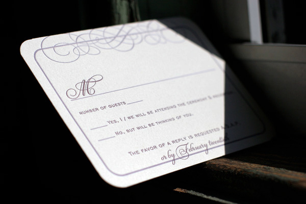
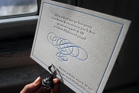
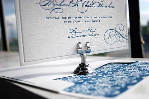
Our Keswick design is typically shown in our SQ7 size but this couple had other ideas! Gone is SQ7 and in is our F8 size. All pieces are shown with amethyst & antique gold letterpress inks. Tying the whole set together is the beautiful envelope liner used for both the invitation and reply envelopes.
letterpress ink: amethyst + antique gold | fonts: parisian + moravia | paper: 1-ply ivory | card size: F8 | customization #: 15234 |

Our Keswick (by Beth Ann Seal) letterpress wedding invitations are given a modern color twist in this quirky customization. Letterpress printed in garden and clover inks, they are perfectly contrasted with shocking pops of mesa edge paint on all pieces (yes that’s right every card). This couple also benefited from our 10% off promotion (10% off if you purchase 6 printed pieces). See more details and the small print here!
inks: clover + garden | fonts: tropez + jubilant | paper: 2-ply ivory | invite size: sq-7 | liner: the vintage river pattern in mesa ink | edge painting: mesa | client coordinator: christie jones | in-house designer: lindsy aragona


Over the past couple of years, we’ve found ourselves completely blown away by the thoughtfulness and generous spirits of the couples we’re honored to call Bella Figura brides and grooms. We think it’s so cool when a couple opts to forgo the traditional guest favors and instead makes a donation to a worthy nonprofit. To encourage this large-hearted trend, in early 2011 we started offering free letterpress favor cards to those couples making a donation to nonprofit organization doing good for the world. Here are just a handful of the many favor cards we’ve printed for couples worldwide this year…

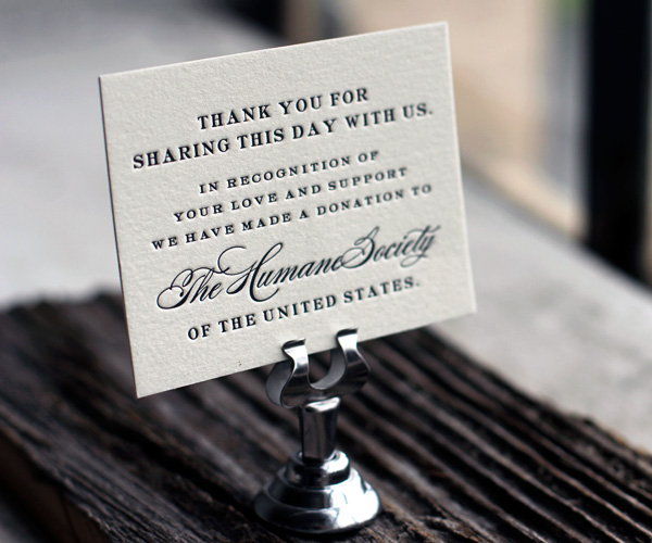
Our Deveril design; donation benefiting The Humane Society of the United States.

Our Tara design; donation benefiting Clean Ocean Action.

Our Nautilus design; donation benefiting the Reproductive and Child Health Alliance in Phnom Penh, Cambodia.

Our Florian Script design; donation benefiting CHU St-Justine. From the couple, “The CHU St-Justine is a well renowned children’s hospital in Montreal and our donation will be given toward funding R&D activities. We both believe that children should be allowed to enjoy their young lives and play outside with their friends rather to be stuck in a hospital room. We hope that our donation will help the team of doctors find a cure to many of today’s illnesses that primarily attack young children.”
(more…)
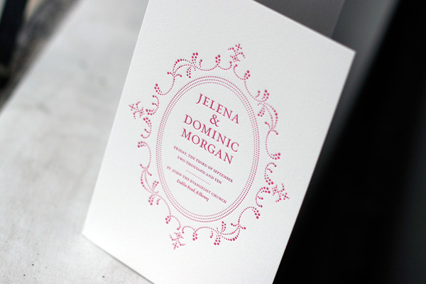
Letterpress printed in fuchsia and chartreuse inks, these bilingual invitations feature our popular Keswick design. The invitation features text in two languages, which alternate in color accordingly. We love the fun use of bright, cheerful colors on this invitation, a perfect way of incorporating multiple languages in a really lovely way.

Recently we’ve been a printing a lot of fabulous letterpress ceremony programs and program covers and wanted to share a handful of our favorites. From flat panel tea-length letterpress programs featuring full ceremony details to pretty program covers, we love every opportunity we get to print a great letterpress program. Program covers allow you to print your own insert pages and then tie everything together with a pretty ribbon or colorful twine and lend an extra special touch to a wedding ceremony.
 {Birch flat panel letterpress wedding program.}
 {Letterpress program cover in Cartoccio.}
 {Tuileries letterpress program cover.}
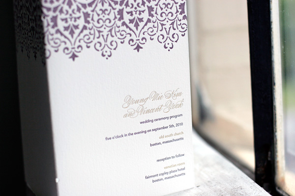
 {Tea-length flat panel ceremony program in our Keswick design.}
 {Weber letterpress ceremony program cover.}
 {Letterpress ceremony program cover in Wisteria.}
We love this customization of our popular Keswick letterpress wedding invitation design. Letterpress printed on our ivory paper, the couple chose an elegant combination of amethyst and lavender inks. Corner rounding is the perfect finishing touch for this sophisticated set.


We printed these letterpress wedding invitations, a customization of our Keswick design, for an upcoming wedding in France. They are printed in espresso and cloud 9 inks and feature a vertical orientation and a pretty espresso pocketfold, making this invitation suite a unique interpretation of one of our most popular designs. We love the pretty letterpress inserts and the letterpress thank you notes we also had the distinct pleasure of printing for this couple, all perfectly coordinated to their event in matching espresso and cloud 9 inks.


When you’re surrounded by incredible letterpress creations every day, choosing your own letterpress wedding invitations becomes difficult. Really really difficult. There were moments during that time when I joked about wanting to send each of our guests a different invitation, just so I could see all of my different ideas in print. After much debate, with the help of our amazing client coordinator, Tiffany, and our equally amazing graphic designer, Beth Ann, I was was able to settle on our Keswick design in mediterranean and pale gray inks. The entire process was incredibly exciting, but nothing topped the day I finally got to hold them in my hands. They’re absolutely stunning and you can bet we’ll have a set framed to hang in our house after the wedding.


Because we’re having an unusual two-day wedding with a private ceremony on Friday and a larger reception on Saturday, our main invitation was printed for Saturday’s reception. To let Friday guests know they were invited to the ceremony, we included a small ceremony card insert with the details as to the ceremony time and location. Reply cards sent to those guests provided space to reply for both the Friday and Saturday events. All of the pieces were printed in 2-color letterpress, with the exception of the ceremony card, which was a 1-color letterpress card.


Of course, no invitation is complete without beautiful hand calligraphy. Our envelopes were addressed by our amazing calligrapher, Debi Zeinert of The Blooming Quill. She even hand-mixed the ink to perfectly match the mediterranean blue of our invitations and printed envelopes. Not only was I stunned at how amazing the envelopes looked, but our guests are still raving about how exciting it was to get them in the mail. Now that right there, that’s a good way to kick off a wedding celebration if you ask me!
With that said, I’m off to get married – I can’t wait to share photos and more details when I’m back!
The opportunity for us to work with brides all the time is nothing short of joyful, but the opportunity to be a bride who works at Bella Figura? Absolutely incredible. As I’ve been planning my own wedding, it has been a sincere and immeasurable pleasure to interact with the wonderful brides we’ve printed letterpress invitations for and I’ve found myself completely immersed in beautiful letterpress wedding invitations every day. Hearing their stories, seeing their wedding photos, sharing in a bit of their sheer bliss, has been a remarkable way to prepare for my own wedding, which is taking place this weekend! Knowing how helpful and wonderful it has been for me to take a glimpse into the planning and happiness of other brides, I thought it seemed only appropriate to take this week to share a bit of my own wedding and my own inspriation.

Milk glass vases were something I knew I wanted to incorporate from the beginning.
{Photo by Punam Bean}
To kick it all off, I wanted to share this inspiration board I created several months ago now. It was by far not the first one I created, nor was it the last, but it’s definitely the collective inspiration that got me headed in the direction of how our wedding will unfold. I knew I wanted an event that was both classically elegant and incredibly fun – a little bit vintage, a little bit modern and a whole lot spectacular. Early on the color palette developed into a sophisticated array of neutrals with smudges of my favorite blue hues appearing in little whispers here and there. Attention to detail has been a priority from the beginning, including our letterpress wedding invitations I’ll share later in the week, and all of the other little elements I’ve been crafting over the past many months. Sticking to things that were beautiful, vintage, and handmade has been the running thread that has helped to bring everything together. I can’t wait to see how my vision plays out and to share photos soon.
For now, here is the inspiration board that has led the way…


