Here’s a really cool customization of Kamal‘s Joie de Vivre design that features a vivid combo of Lime-Aid and Aubergine inks. The color palette seems really appropriate for the tropical locale of this wedding, which took place in Ko Sumui, Thailand. Can we go back in time and go to this wedding, please?
inks: lime-aid + aubergine | fonts: henry + streamline | paper: 2-ply white | invite size: SQ6 | edge painting: aubergine | customization #: 16244

However you pronounce it, Joie de Vivre has been a phenomenally popular design since Kamal first designed it for our 2012 collection. This little gem features black ink, inkless blind deboss, and the unmistakable shimmer of silver shine foil stamping. Much love to Village Invites for sending this for us to print!
inks: black + inkless blind deboss | foil: silver shine | fonts: | paper: 1-ply white | invite size: F8 | customization #: 16126

Once again our Joie de Vivre design transforms in a blend of letterpress and foil stamping. This popular design created by Kamal works for all wedding styles – from modern to formal with just the right touches of hand calligraphy by Debi Zeinert.
letterpress inks: sherbet + pewter | foil: silver shine | calligraphy: revolution hand by Debi Zeinert | paper: 1-ply ivory | size: F8 for pocketfold | pocketfold: silver | customization #: 16064 |

A lucid blend of two fantastic designs, this foil + letterpress invitation set features elements from our Joie de Vivre and Typology designs. The bride and groom worked with The Village Invites for this beauty of a set, which included personalized gift tags for wedding favors. To complete the look, we drilled holes in the favor tags so they could easily be tied with ribbon.
letterpress inks: shell + sea-mist | foil: copper shine | paper: 2-ply white | invite size: sq7 | edge painting: sea-mist | customization #: 15049 |

Our friends over at Lion in the Sun sent us this wonderful customization of our Joie de Vivre (by Kamal) wedding invitations. The gold matte foil, coupled with our prussian blue letterpress ink, really helps this design to shine with excellence! The beautiful invitation envelope liner only adds to the beauty.
letterpress ink: prussian blue | foil ink: gold matte | font: streamline | paper: 2-ply white | invite size: f8 | liner: antique geometrics in prussian blue | edge painting: cardinal | customization #: 14369 |

Kamal‘s Joie De Vivre design was an instant trendsetter as soon as it was released in 2011, and it’s still one of our most popular designs. This one, though, is just such a gorgeous example that we had to share. The invite includes two foil colors and one letterpress ink – for a look that complements the design beautifully and looks incredibly rich. We don’t show pricing on our site for invites with more than two colors, so if you’re looking for something like this for your own invites please contact us for a custom quote.
letterpress ink: espresso | foil ink: gold matte + fuchsia shine | paper: 2-ply ivory | invite size: sq7 | foil edging: fuchsia shine | customization #: 14565 |

This customization of our Joie de Vivre design by Kamal is the perfect introduction to your festive, dance-all-night wedding celebration! Fun colors and a bold font give this a playful party feel. For an extra pop, replace the navy liner with metallic blue pearl and go with a fuchsia shine foil edge.
joie de vivre customization = inks: aquamarine + navy | fonts: eros + herald | paper: white | invite size: sq-7 | liner: classic color in navy ink | original design by Kamal | customized by in-house designer Sarah Walroth

(Photo Credits: Green Wedding Shoes).
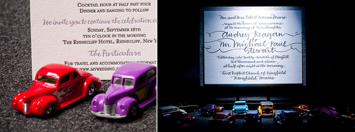
Earlier this year, we worked with Alice and Beth from Alice G. Patterson Photography on an amazing project we’re really excited to share. Featured recently on Green Wedding Shoes, this collaboration features some of our most popular letterpress invitation designs alongside some incredible miniatures. Alice and Beth set up these picturesque scenes and we were completely blown away with the end result — take a look!


 (more…)
We are delighted to share these Joie de Vivre (by Kamal) letterpress wedding invitations submitted to us by our friends at Judy Paulen Designs in New York, NY. This stylish set definitely has a cutting-edge vibe. We feel that the perfect pairing of mediterranean and pale gray inks is out of this world. We think you will agree that this design lives up to its name-as the French phrase, “Joie de Vivre” translates to “a carefree enjoyment of life.” This set is customized with fuchsia edge paint and a stellar envelope liner to match!
inks: mediterranean + pale gray | fonts: streamline | paper: 1-ply white | invite size: sq-7 | liner: the antique geometrics pattern in fuchsia ink | edge painting: fuchsia |


