Need to make sure your guests aren’t going to forget your wedding date? Send a save the date! Better still – send one with a calendar on it! Jessica Hische‘s Hendrix design is for sure one of the shop favorites around here, so naturally we love this unique interpretation of the original design.
ink: prussian blue | paper: 1-ply ivory | save the date size: a6 | client coordinator: chris gannon | in-house designer: brenda fox

Our stomachs rumble on a daily basis when we read the delicious menus that our lovely clients (you!) choose for their wedding receptions. With choices like organic greens and crabcakes, spicy tuna and beef tenderloin, we see tasty options for everyone. For all the foodies out there, feast your eyes on these gorgeous letterpress wedding menus!
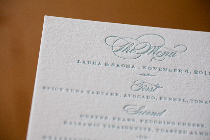
[Make the menu stand out with a bold title. Weber by Jessica Hische.]

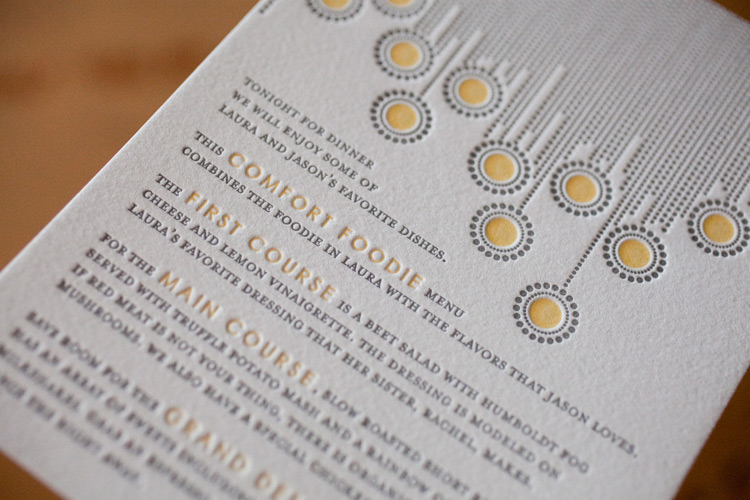
[Our popular Bejeweled design is letterpress printed in 2 colors for a crisp, modern menu. Design by Kamal.]

[Did you know our menus can be printed in any language? This menu features the Harp design by Tara Hogan.]

[Tie in the details of your invitations and your decor with our free motifs! We love this elegant Walden menu, designed by Beth Ann Seal.]

[ A classic Deveril menu, another popular design suite from Beth Ann Seal.]

[Keep things sweet with our colorful Somersby, a whimsical design by Beth Ann Seal.]

Our standard menu size is the A6, which measures in at 4.625 x 6.25 inches. We can also print tea-length menus (3.875 x 9.25 inches) for an additional charge.

Wondering about wording? View our menu etiquette and wording or feel free to contact us!
The Village Invites II has done it again! This Hendrix 2 (by Jessica Hische) letterpress wedding invitation takes the art of subtle beauty to a whole new level.

The color combination of Cream and Sand inks on our 1-ply ivory cotton paper really lets the unique nature of the paper shine through. The hand calligraphy accents only add to the understated elegance of the suite.


inks: cream + sand | fonts: sans capital | calligraphy: patricia mumau harrison hand | paper: ivory 1-ply cotton | invite size: a7
This design won an honorable mention in our Bella Figura design competition for the first half of 2011. This twice-a-year competition recognizes outstanding and inspired design submitted by our beloved dealers.
This Hendrix 2 (by Jessica Hische)letterpress wedding invitation was submitted by our friends at The Village Invites II in New York, NY and we think it is absolutely stunning! The color combination of Cream and Sand inks are so subtle on our 1-ply ivory cotton paper and we think that’s what makes it unique! Showcased perfectly with hand calligraphy accents we think this is ideal for an elegant outdoor celebration!
ink: cream + sand | fonts: sans capital | calligraphy: patricia mumau harrison hand | paper: ivory 1-ply cotton | invite size: a7 |

by Christie Jones, Client Coordinator.
This morning we wanted to share an inspiration board inspired by our current Design of the Month, Hendrix by Jessica Hische. We envisioned a pretty, outdoor celebration where guests are invited to dine al fresco in a fragrant garden or open field. Colorful flowers, sweet summery details and pops of color in peach, pink, green and teal make this look both elegant and playful.
 Don’t forget that between now and August 15th, all orders of our Hendrix design over $1000 will receive free letterpress thank you notes! Check out the details here.
{Row 1: Martha Stewart Weddings, Martha Stewart Weddings, photo by Benjamin Edwards Photography via The Sweetest Occasion. Row 2: April Smith Photography via Once Wed, Martha Stewart Weddings. Row 3: Letterpress wedding invitations by Bella Figura, Martha Stewart Weddings, Kate MacPherson via Twigs & Honey. Row 4: photo by Megan W Photography via The Sweetest Occasion.}
In celebration of Hendrix, our July Design of the Month, we wanted to share one of our favorite recent customizations of this gorgeous design. We printed these letterpress wedding invitations in a pretty combination of espresso and aquamarine inks for a late summer wedding in California. We just adore this customization for it’s cheerful sophistication and modern sensibility meets sweet vintage feel.


Today we’re exited to introduce you to July’s Design of the Month – Hendrix by Jessica Hische. It’s pretty, playful and a touch whimsical, and one of our favorites from our 2010 collection. We think it’s perfect for a garden party wedding or an outdoor celebration under the stars. As our Design of the Month, all orders of our Hendrix design over $1000 placed between now and August 15 will receive free letterpress thank you notes – don’t miss out! (Flat thank you notes, letterpress printed to match your invitations with unprinted envelopes.)

Meet the Designer – Jessica Hische
In honor of our Design of the Month, we thought a little Q & A session with the talent behind the design was in order. Brooklyn-based Jessica Hische is an incredibly inspiring designer, typographer and illustrator. In addition to her amazing art prints and Buttermilk, her first typeface of which we just can’t get enough, we are obsessed with her blog and her Daily Drop Cap project. Without further ado, meet Jessica Hische.

What was the inspiration behind Hendrix?
My friend, illustrator John Hendrix, had a baby girl and commissioned me to design his baby announcement, which I letterpressed for he and his wife in exchange for one of his original drawings. The Hendrix wedding invitation design takes elements from the original announcement and tweaks it and expands it to a full wedding suite. Everyone loved the original design so much I was so happy to be able to share it with others!
When did you know you wanted to be a designer? How did you get your start?
I actually didn’t know what graphic design was until I was in college. I always knew I wanted to do something art related, I just didn’t really know exactly what that was until I took my first design class in my sophomore year at Tyler School of Art. I loved that design isn’t really self-expressionistic — it is about solving problems and doing what is appropriate for a client / project.

{Jessica notes, “I love breakfast.”}
If you were an ice cream flavor, what would you be?
This is a tough one! I think the closest one might be Ginger, but if “Almond Croissant” was an ice cream flavor I’d be that.
What’s your favorite PMS shade?
PMS Warm Red U or something a bit more orangey.
What’s the most memorable vacation you’ve ever taken?
I was invited to speak at the Semi-Permanent Conference in Sydney this year and went a week prior to vacation with my boyfriend. It was the most fun vacation I’ve ever been on. All we did was eat amazing food, drink amazing coffee and get our pictures taken with koalas.

(more…)


