Cathy and Michael chose our Harlow design for their Irish castle wedding, highlighting the delicate pattern and romantic fonts with gold matte foil on our ivory cotton paper. A design inspired patterned envelope liner personalized with their monogram (a free customization!) complimented these vintage gold wedding invitations.


foil stamping: gold matte | fonts: moravia + harlow + ballantine | paper: bella cotton ivory 1-ply + 2-ply | envelope: design inspired pattern with monogram in navy | Appleberry Press | customization #25014
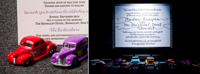
Earlier this year, we worked with Alice and Beth from Alice G. Patterson Photography on an amazing project we’re really excited to share. Featured recently on Green Wedding Shoes, this collaboration features some of our most popular letterpress invitation designs alongside some incredible miniatures. Alice and Beth set up these picturesque scenes and we were completely blown away with the end result — take a look!


 (more…)
We love having the opportunity to share real weddings from our Bella brides! This next wedding is filled with so much vintage prettiness — Shawna (a member of the amazing Style Me Pretty team) included lots of personal touches, soft pretty colors, lace, and the perfect dose of Southern charm for her & Matt’s springtime celebration. She even started a new family tradition! Shawna decided on our Harlow design for her invitations, and they fit her wedding style to a T. Read on for all of the pretty little details, and don’t miss Shawna’s advice if you’re currently planning your own wedding – she’s got some great tips!


Can you share with us a bit about your wedding and your inspiration for the event?
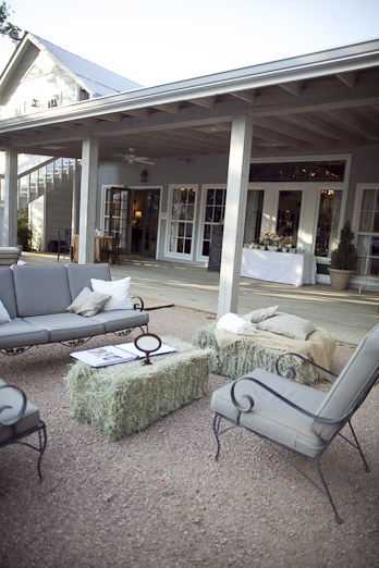
Matt and I had our wedding in Hill Country in Fredericksburg, Texas. The ceremony and reception was at the Hoffman Haus, a cottage property that’s close to the main street. We wanted a charming, home style wedding that we would love always. Our vintage and warm colored décor was inspired by the property; we had doilies, burlap, lace, vintage silver and haybales. Guests were greeted with peach lemonade and mini peach ice cream cones. The ceremony was a dream, violins played a combination of traditional and beatles songs. It was a simple, pretty garden wedding. Matt looked so handsome in his dark brown 3-piece suit and I loved my dress. The crystals on the belt were from my grandma and my short blusher veil made me feel glamorous.


Our vows were more on the traditional side and we had a tree planting with a gardenia shrub. I added photo books, handmade wedding facts about both of our families and matchbooks as additional décor. The hors d’oeuvres at our cocktail hour and our dinner menu featured a blend of Italian and Texas cuisine. Texas beers and wine were also served. The food stations were fun; we had a yummy bruschetta bar and a Bellini bar that was so pretty. Our first dance was a waltz. We danced with friends to all kinds of music including hip hop, country. Matt played the Texas Tech fighting song before the garter toss. I started a mother/daughters dance tradition in our family: me, my mom and two sisters jammed to Poison by Bobbi Brown. I think everyone had seconds of the wedding cake, it was delicious
(more…)
I don’t think you’ll ever come across a more vintage inspired letterpress wedding invitation! Our Harlow design (by Jessica Tierney) looks especially timeless here with its own touch of flair. We have a weakness for wedding invitations with clean lines that still hold true to that romantic feel. We can never get enough of a vibrant pop of color-and the aubergine edge painting beautifully contrasts with the pewter ink. Paired with the perfect envelope lining -means tossing in another cool customization! These invitations are perfect for a wedding venue so rich in history.
ink: pewter | font: moravia + harlow | paper: 1-ply white | invite size: a-7 | liner: reverse european formal pattern in aubergine ink | edge painting: aubergine | client coordinator: jessica hanaman| in-house designer: kyle laatsch


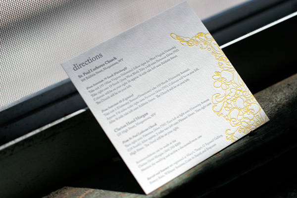
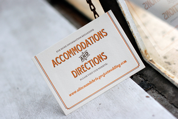
We thought we’d share a fun round up of some of the awesome letterpress directions and accommodations cards we’ve printed in recent months. Some of them include maps and other details and some of them simply refer guests to a website with lots of extra information to make their travel easier. Accommodations cards are especially helpful if you’ve negotiated group rates at local hotels so guests know where to book their room. Check out these ideas for tons of great letterpress inspiration!
 {Letterpress directions card in Flourish.}

{Tara accommodations + directions website card.}
 {Tennyson letterpress directions card.}
 {Directions card in Tuileries.}
(more…)
Bright bursts of surf and mango give the classic look of our Harlow design a fresh, modern feel. These letterpress invitations were printed in espresso and surf inks with mango edge painting and reply cards printed in mango to match. Calligraphy accents by Bella Figura calligrapher Debi Zeinert of The Blooming Quill add a gorgeous personalized touch that makes this set truly unique and one of a kind.


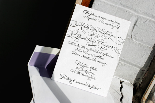
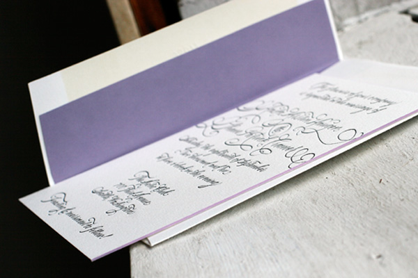
These letterpress wedding invitations are a stunning customized design boasting the gorgeous hand calligraphy of Bella Figura calligrapher Debi Zeinert of The Blooming Quill. The letterpress invitations were printed in black ink with lavender edge painting paired with a reply post card printed in lavender and black. Lavender envelope liners are the perfect coordinating touch. To keep things fun, our Harlow design is used for the letterpress ceremony programs, printed in black and lavender inks, and is accompanied by a pretty tea-length letterpress menu printed in black.
