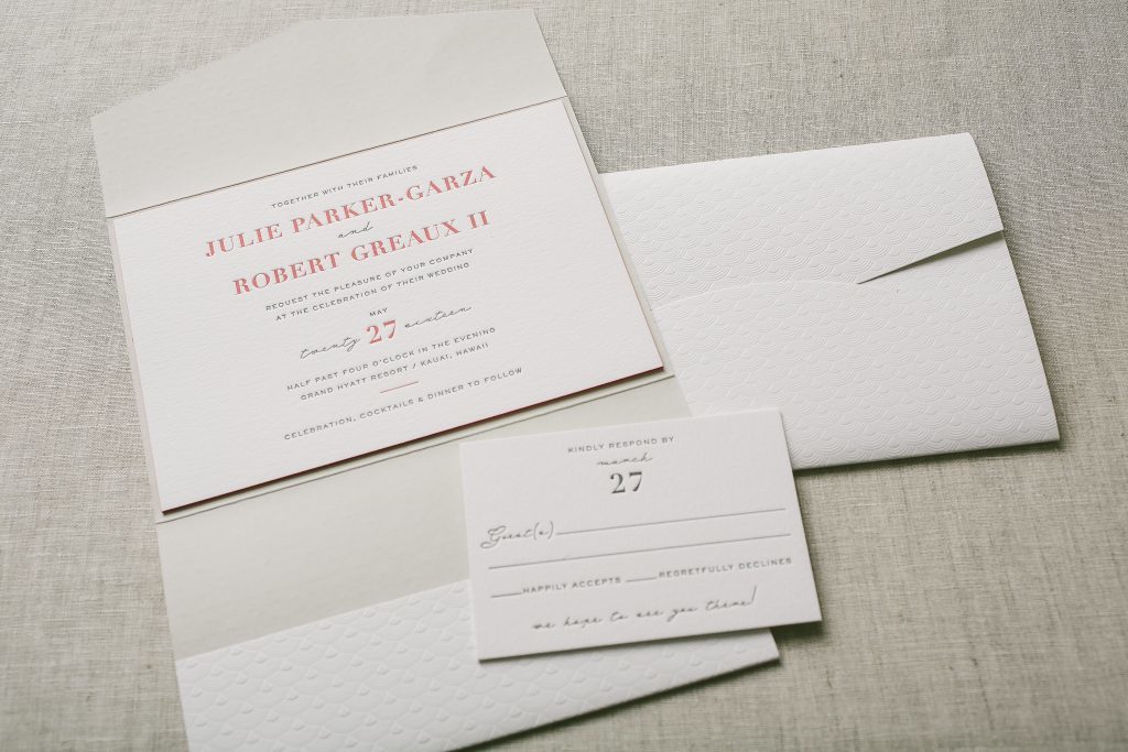
Julie and Robert kept things simple and opted for typography wedding invitations for their Hawaiian wedding. Our friends at Sweet Paper helped them select our Maeve design, and we printed it horizontally in geranium and charcoal inks. Our island-inspired tavish pattern was printed without ink on the exterior of their pocketold and a flood of pale gray ink was digitally printed on the interior.


letterpress inks: charcoal + geranium | fonts: didot + sans capitals + riviera | paper: bella cotton 2-ply | edge painting: geranium | pocketfold: exterior blind debossed in tavish pattern; interior digitally printed in classic color pattern | Sweet Paper | customization #31288
Save
Come one, come all! Let your invitation be the Ringmaster of your bright and colorful celebrations with our Modern Bazaar customization.
modern bazaar customization = inks: geranium + antique gold | calligraphy: mitty hand calligraphy | font: moravia | paper: white | invite size: F8 | liner: pearse in prussian blue | original design by Kamal Patel | customized by in-house designer Racheal Bumbolo |
embellishment suggestions: pocketfold in metallic bronze

(photo credits: cameron ingalls photography)
This one-color fall customization of our Connemara letterpress wedding invitation is perfect for an elegantly rustic ceremony. Our bright geranium ink gives this design a bold twist.
connemara customization = ink: hazel | fonts: antoinette + herald | paper: ivory | invite size: a-7 | edge painting: geranium | liner: vintage stripes pattern in olive, + hazel + geranium | original design by Beth Ann Seal | customized by in-house designer Andrea Streeter
embellishment suggestions: foil edging in copper shine

(Photo Credits: Sweet Little Photographs)
Color’s such a funny and subjective thing, but when something works it just works. This version of Erin Jang‘s Handrawn design looks incredible in the ink colors that the couple choose for them – and that aquamarine edge painting just sets things off so perfectly. Did you notice the cute little food icons on the reply card? We get requests for these a LOT. These kinds of icons are available on any of our designs, but these particular ones from our motif library just coordinate really well with the overall vibe of this letterpress wedding invitation set.
inks: pewter + geranium | paper: 2-ply white | invitation size: f8 | liner: modern herringbone in geranium | edge paint: aquamarine | client coordinator: chris gannon

The beautiful color combination of Geranium and Umber inks breathe new life into our Onalisse (by designer Heidi) letterpress wedding invitations. The reply and direction cards are cleverly combined together onto one card (a great way to cut down on the amount of paper and save $). The classic color envelope liner in geranium ink ties the set together. These colors really embody the feeling of the Fall season.
inks: geranium + umber | fonts: baskerville + pillar | paper: 2-ply ivory | invite size: f-8 | liner: classic color pattern in geranium ink | client coordinator: christie jones | in-house designer: kyle laatsch

You can always find great looks in the city and this urban inspired Alice customization is no exception. Accenting with deep blue inks and a heavy coverage of black really makes this invitation pop. Adding a sleek single letter monogram and some geranium edge painting really sets this one apart. Our strana font finishes this invite with a nice formal touch that makes this the perfect blend of class and style.
alice customization = inks: deep blue + black | fonts: strana + aiden stripe | paper: white | invite size: f-8 | liner: rustic crosshatch pattern in geranium | edge painting: geranium | original design by Tara Hogan | customized by in-house designer Kyle Laatsch |

(Photo Credits : Cheri Lehnow)
by Kyle Laatsch, In-House Designer

New from our 2011 collection, Hoxton is modern and industrial when paired with a neutral color palette of charcoal, pewter, pale gray and taupe combined with pops of geranium for a chic and sophisticated urban wedding. (Photo credits – letterpress invitations + love + dress + couch.)
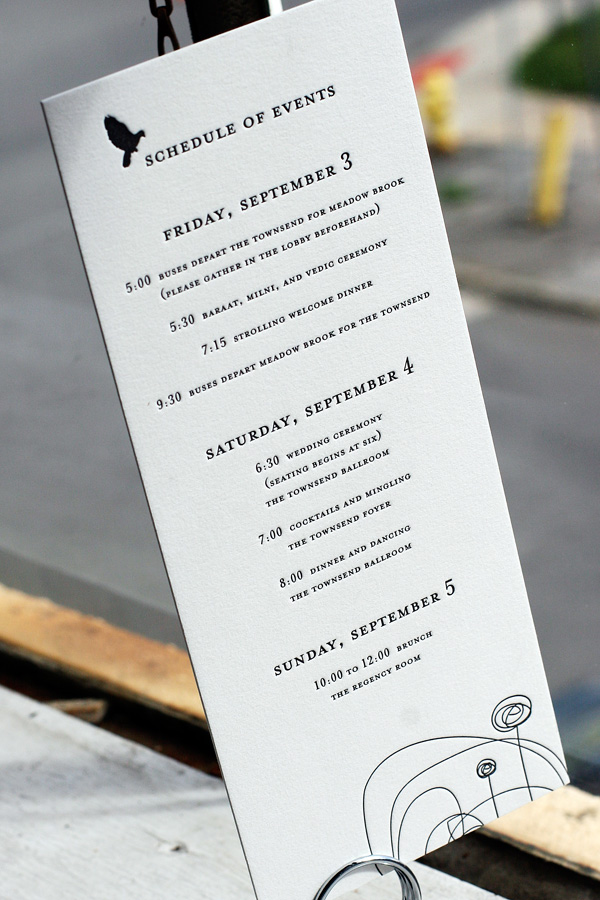
These letterpress wedding ceremony programs and reception pieces were printed in black ink on our white paper featuring our Urbanity design. It’s a chic, modern look that we just love. The ceremony programs, menus and escort cards were letterpress printed on our 1-ply paper, with square table number cards printed on our 2-ply paper. The letterpress menus feature geranium ink to highlight the couple’s names – a great way to add a fun pop of color! A tea-length letterpress events card on 2-ply paper informs guests of various weekend festivities.


(more…)
We’ve been printing a lot of gorgeous letterpress wedding invitations for fall weddings lately, and this one is no exception! This is our Fontaine design – the invitation is printed in fall-inspired geranium and umber inks, with a coordinating one color reply card in geranium.


We love this customization of our Tara letterpress wedding invitation design – it’s printed in geranium and downy inks for a look that is both modern and a touch retro with cool vintage-inspired typography. We think these invitations were the perfect first impression for this couple’s wedding, held at The Foundry in Long Island City, a hip venue with a unique modern vibe.

