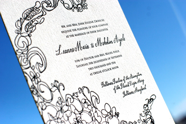
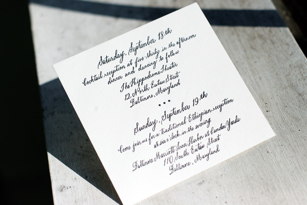
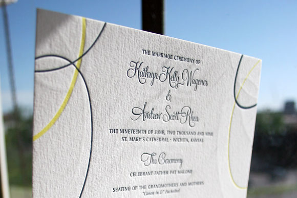
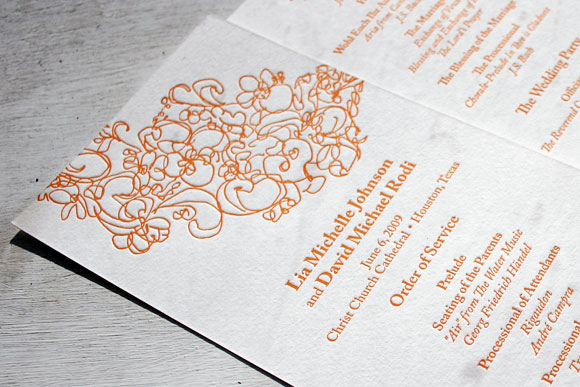
Some times things work best just the way they are. That seems to be the case with the Flourish design (by Jamie Lea Bertsch). Brenda Himmel Stationery had the foresight to simply infuse a little bit of espresso and wisteria inks and the result speaks for itself.
inks: espresso + wisteria | font: jubilant | calligraphy: belle calligraphy by Maybelle Imasa-Stukuls | paper: 2-ply white | edge painting: wisteria | liner: classic color in wisteria | invite size: F-8 | customization #: 15758 |

As part of our “Do Good in March” promotion (where you have the chance to win a grand prize of 100 free invitations and everyone who enters gets 25 free invitation sets with the purchase of 50 or more!), we’re hoping to inspire others to get out and do good this month. Service work can mean the world to the people you help, but you’d be amazed at how good it will make you feel, too! We rounded up some of our favorite quotes to inspire you and have paired them up with some of our favorite designs — check them out!
Modern Garden

Anais

Jack and Jill

Flit
 (more…)
Featuring Belle hand calligraphy these Flourish letterpress invitations (by Jamie Lea Bertsch) are what’s happening! This set features Maybelle Imasa-Stukuls’ Belle hand calligraphy which is one of the many different calligraphy styles we offer. The stellar pairing of our prussian blue and chartreuse inks looks amazing on our 1-ply ivory paper. The couple chose our save the date size (A6) for their reply card to better accommodate all of the details of their wedding weekend! With flat place cards and adorable website cards printed in prussian blue inks-their guests can get the lowdown on the wedding fun! We’re in love with their flawless tea length programs letterpress printed to match with their set. The couple even chose precious letterpress thank you cards to match to their invitations. This heartfelt gesture shows the true appreciation of their friends and family being such an important part of their special day.
inks: chartreuse + prussian blue | font: jubilant | calligraphy style: belle by maybelle imasa-stukuls| paper: 1-ply ivory | invite size: a7 | liner: the european formal pattern in chartreuse ink | client coordinator: jessica hanaman| in-house designer: racheal decker


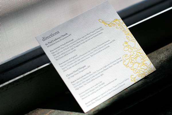
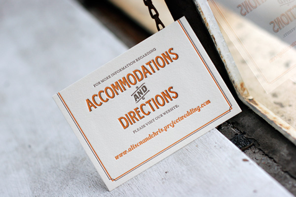
We thought we’d share a fun round up of some of the awesome letterpress directions and accommodations cards we’ve printed in recent months. Some of them include maps and other details and some of them simply refer guests to a website with lots of extra information to make their travel easier. Accommodations cards are especially helpful if you’ve negotiated group rates at local hotels so guests know where to book their room. Check out these ideas for tons of great letterpress inspiration!
 {Letterpress directions card in Flourish.}

{Tara accommodations + directions website card.}
 {Tennyson letterpress directions card.}
 {Directions card in Tuileries.}
(more…)
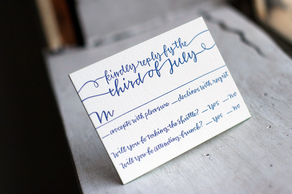
In recent months we’ve been fielding a lot of questions about cool reply card ideas and wording options, so we thought it’d be fun to round up some of our recent favorites to share with you. From traditional reply cards with envelopes to cool reply postcards to petite-sized reply cards requesting a response via email or a website, the options are limitless. Go modern or traditional, but don’t be afraid to make your reply card your own!

[Surya letterpress reply card.]

[Letterpress reply card with edge painting in String Calligraphy.]

[Destination wedding reply card in Plume.]

[Birch letterpress reply card.]
(more…)
Featuring gorgeous hand calligraphy accents from Bella Figura calligrapher Maybelle Imasa-Stukuls, we love this chic customization of our Flourish letterpress wedding invitation design. It was letterpress printed on our 2-ply paper in classic black ink and features edge painting in yarrow. We adore this pairing of modern meets traditional design and just can’t get enough of Maybelle’s stunning calligraphy.


While we love printing letterpress wedding invitations, it’s always a treat to get to print a fabulous letterpress birthday party invitation. This version of our Flourish design is a great example of a great letterpress party invitation. It’s printed in mesa ink at our save the date size on our white cotton paper and we think it’s the perfect invitation for a festive 40th birthday celebration.

This pretty letterpress wedding invitation is our Flourish design printed in persimmon and atlantic inks. It’s also printed on our A7 size card in a horizontal orientation instead of the square shape of the sample design. We love the pretty combination of modern design, bold colors and pretty script font.

Recently we’ve had the pleasure of printing a whole bunch of really great letterpress ceremony programs. In different shapes and sizes and featuring a whole array of different designs, each one is personalized with the colors, fonts and designs perfect for each individual couple and their event.


These double-sided programs are in our Suyra design, printed in deep blue and butter yellow inks. They were a full F8 size, the same as our larger-sized invitations, to allow the couple to really maximize the amount of information they could include. In this case, the back of the program featured details on the members of their wedding party.


Decidedly modern in our Flourish design printed in persimmon, these 1-color double-sided ceremony programs are a true reflection of the event this couple was planning. They are fun and whimsical while still perfectly appropriate for their traditional church ceremony.


Perfect for a more formal event, these letterpress programs in our Plume design feature deep blue and antique gold inks and the undeniable flair of hand calligraphy accents. Like the Flourish letterpress programs above, these were double-sided letterpress on our tea length size. We love the elegance a lovely letterpress ceremony program can add to a wedding and look forward to printing many many more.


