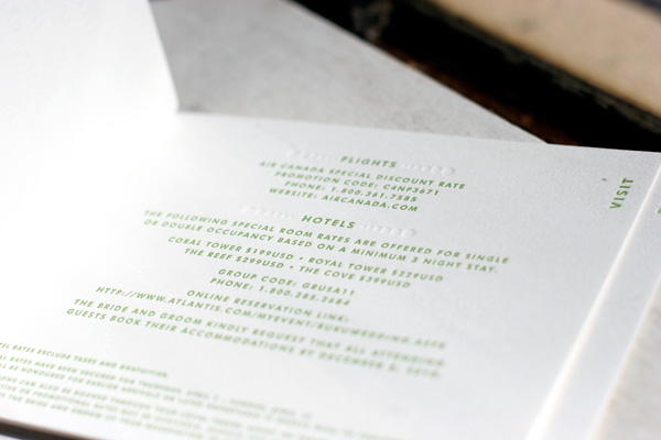
We absolutely love this unique customization of our Champagne design! Letterpress printed in clover and blind deboss for a tropical destination wedding, we worked with this couple to create a small booklet by fastening the different elements of their invitation suite together with grommets. The page sizes are stepped to create tabs and labeled to identify which page contains what information. The booklet contains an invitation, an events card, a directions and accommodations card, and a reply card that is perforated to be torn out and returned.


We printed this customization of our Birch letterpress wedding invitation design for an upcoming fall wedding. The couple included Hebrew text on their letterpress wedding invitations, printed in mesa and pewter inks, with coordinating event cards and letterpress thank you notes. They chose silver metallic envelope liners and also included matching letterpress escort cards to carry the theme throughout their celebration.


Julie and Noam’s letterpress wedding invitations are a custom creation we were thrilled to letterpress, designed by the couple in collaboration with their good friend Katerina Barry of Your Day Designs. The invitation design is based on a postcard Noam sent Julie a few years ago when he was living in Berlin and she in New York and the complete set is incredibly thoughtful and personalized with details that are reflective of Julie and Noam’s history as a couple. The set includes several pieces including the gorgeous main invitation, a custom map depicting locations special to Julie and Noam, invitation cards to other weekend events, a wonderfully fun mad lib reply card that was a nod to Julie’s love for word games and a custom blind debossed envelope that we hand crafted to meet Noam’s vision. All of the pieces are printed in 1-color in deep blue ink and together are an absolute showstopper, featuring a range of finely printed details and large solids that together achieve a really unique and beautiful letterpress look.


Bride to-be Julie was wonderful and happily shared thoughts on their inspiration with us…
The inspirational postcard, which still hangs on our fridge, features the silhouettes (in black) of a bunch of Berlin monuments that were then reflected so that the row of monuments looked kind of like a sound wave. When we started talking about invitation design, we knew we wanted to do something that was striking and that was both really different and really beautiful. We went to Katerina with the idea of a reflected composite skyline made up of some of the most recognizable buildings from cities around the world that we had spent time in together: New York, Berlin, Paris, Moscow, Istanbul. Our friend Katerina took it from there — she created the skyline image, hunted for the perfect font, and brought it all together. She created the individual events cards using enlarged versions of the New York buildings in the skyline, in recognition of the fact that our wedding will take place in the city.

The hand-drawn map was created by calligrapher Nancy Howell. It features some of Julie and Noam’s favorite East Village and Lower East Side spots, including the place where they first met, Tompkins Square Park, the theater that hosted their first real date, Millennium Film Workshop, and the site of New York’s best smoked salmon, Russ & Daughters. The Angel Orensanz Foundation, where they will be married next month, is also included on the map.


Julie and Noam’s design was especially unique because it continued onto their inner envelopes, a design element that evolved from an idea Noam dreamed up and was ultimately engineered by Bella Figura co-founder, Harold. The invitation design was blind debossed on large sheets of paper and then die cut, with each envelope being carefully hand-assembled. Naturally, we had to ask Julie to share the inspiration behind their beautiful envelope design…
One thing Noam got really excited about was the idea of making the letterpress technology a part of the design itself. He really wanted to have not only a mirroring of the skyline image, but also a reproduction of the letterpress plate, so that there would be one part of the invitation that mimicked the plate used to print the skyline and invitation text. Katerina played around with doing all of that on the invitation itself, but it always seemed to be visually confusing or, if printed blind, to leave too much white space. So we took it off of the invitation card and moved it to the inner envelope, where the entire invitation is blind debossed in an exact mirror of the invitation itself both in left-right orientation and in terms of what is pressed down and what is raised…but printed without ink. It’s as if the press came through the card and pressed into the envelope. You all at Bella Figura ingeniously figured out a way to execute Noam’s vision of the inner envelopes, and they turned out better than we had even imagined.
Having had the opportunity to work with Julie and Noam on this brilliant invitation suite, we had to know a bit more about their upcoming wedding and the things they are most looking forward to…
We chose Bella Figura because of the company’s commitment to social justice and the environment, values we hope will permeate every aspect of our wedding, from the local and sustainable food to the egalitarian ceremony. And we are also looking forward to a really crazy hora.
Now that’s our kind of wedding! Julie and Noam, thank you both for letting us share your incredible invitations. Congratulations and best wishes from all of us at Bella Figura!


