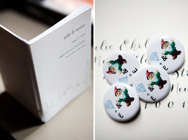
Last spring we featured the cool custom skyline letterpress wedding invitations we printed for Julie and Noam, designed by their friend Katerina Barry of Your Day Designs. Today we were thrilled to see their gorgeous New York City wedding featured on one of our favorite wedding blogs, Snippet & Ink. They held their celebration at the stunning Angel Orensanz Foundation and worked with Hatch Creative Studio for the gorgeous flowers. We know you’ll love their wedding so visit Snippet & Ink for all of the details!


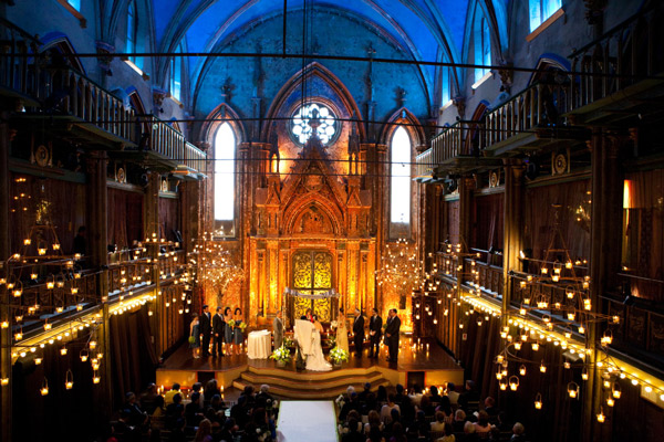 {Photos by Dave Robbins via Snippet & Ink.}
We printed these letterpress wedding invitations, a customization of our Keswick design, for an upcoming wedding in France. They are printed in espresso and cloud 9 inks and feature a vertical orientation and a pretty espresso pocketfold, making this invitation suite a unique interpretation of one of our most popular designs. We love the pretty letterpress inserts and the letterpress thank you notes we also had the distinct pleasure of printing for this couple, all perfectly coordinated to their event in matching espresso and cloud 9 inks.


Our Ashwell letterpress wedding invitation design is another design from our 2010 collection so we especially loved printing this beautiful invitation suite. Showcasing a lovely custom monogram, this customization is a classic pairing of black ink on our ivory cotton paper with corner rounding for the perfect finishing touch. The coordinating letterpress coasters are a perfect addition to any reception and carry the design details seamlessly through the event from start to finish.


We printed these custom letterpress wedding invitations for a couple who submitted their own design and worked with us to print the perfect letterpress invitations for their wedding. The design is a cool juxtaposition between simple black type on the front and an ornate blind deboss letterpress pattern on the back. We love the unexpected pairing of type and pattern, a unique blend between tradition and modern sensibility that looks fabulous in letterpress.


We created these custom letterpress invitations for an event hosted by Nestlé last spring. They are a custom design derived from our Walden design, printed in antique gold and espresso inks with rounded corners and elegant metallic gold edge painting. Nestlé had these invitations printed for a celebration in honor of their first Leadership in Energy and Environmental Design Gold Certification, which is a certification bestowed upon buildings which meet or surpass rigorous standards for energy efficient and environmentally sustainable design in the architecture community. Bravo, Nestlé! We love working with businesses striving to do good things for the world.


While we certainly love elaborate 2 or 3 color letterpress wedding invitations, we get really excited to print fabulous designs in one fantastic ink color. Not only is it a budget-friendly letterpress option, but it really adds a special touch to the design. Especially if you’re only planning to incorporate one primary color in your event, or if you’re still debating colors to pair with your favorite shade as you plan, 1-color letterpress wedding invitations are stunning. Both of these customizations feature 2-color designs that have been turned into really lovely 1-color invitations.


This vibrant version of our Dewdrop design is printed in mango. We love how it is both elegant and fun, a bit of a modern edge paired with beautiful hand calligraphy. It’s a little bit unexpected and a whole lot beautiful.


Mimosa is one of our favorite new designs and this custom version, printed in garden ink, is no exception. Printed for an outdoor wedding at a riverfront camp in Texas, this letterpress wedding invitation is the perfect complement to the natural setting of the event.
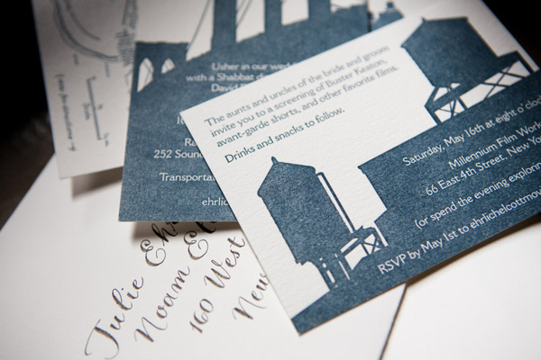
Julie and Noam’s letterpress wedding invitations are a custom creation we were thrilled to letterpress, designed by the couple in collaboration with their good friend Katerina Barry of Your Day Designs. The invitation design is based on a postcard Noam sent Julie a few years ago when he was living in Berlin and she in New York and the complete set is incredibly thoughtful and personalized with details that are reflective of Julie and Noam’s history as a couple. The set includes several pieces including the gorgeous main invitation, a custom map depicting locations special to Julie and Noam, invitation cards to other weekend events, a wonderfully fun mad lib reply card that was a nod to Julie’s love for word games and a custom blind debossed envelope that we hand crafted to meet Noam’s vision. All of the pieces are printed in 1-color in deep blue ink and together are an absolute showstopper, featuring a range of finely printed details and large solids that together achieve a really unique and beautiful letterpress look.


Bride to-be Julie was wonderful and happily shared thoughts on their inspiration with us…
The inspirational postcard, which still hangs on our fridge, features the silhouettes (in black) of a bunch of Berlin monuments that were then reflected so that the row of monuments looked kind of like a sound wave. When we started talking about invitation design, we knew we wanted to do something that was striking and that was both really different and really beautiful. We went to Katerina with the idea of a reflected composite skyline made up of some of the most recognizable buildings from cities around the world that we had spent time in together: New York, Berlin, Paris, Moscow, Istanbul. Our friend Katerina took it from there — she created the skyline image, hunted for the perfect font, and brought it all together. She created the individual events cards using enlarged versions of the New York buildings in the skyline, in recognition of the fact that our wedding will take place in the city.

The hand-drawn map was created by calligrapher Nancy Howell. It features some of Julie and Noam’s favorite East Village and Lower East Side spots, including the place where they first met, Tompkins Square Park, the theater that hosted their first real date, Millennium Film Workshop, and the site of New York’s best smoked salmon, Russ & Daughters. The Angel Orensanz Foundation, where they will be married next month, is also included on the map.


Julie and Noam’s design was especially unique because it continued onto their inner envelopes, a design element that evolved from an idea Noam dreamed up and was ultimately engineered by Bella Figura co-founder, Harold. The invitation design was blind debossed on large sheets of paper and then die cut, with each envelope being carefully hand-assembled. Naturally, we had to ask Julie to share the inspiration behind their beautiful envelope design…
One thing Noam got really excited about was the idea of making the letterpress technology a part of the design itself. He really wanted to have not only a mirroring of the skyline image, but also a reproduction of the letterpress plate, so that there would be one part of the invitation that mimicked the plate used to print the skyline and invitation text. Katerina played around with doing all of that on the invitation itself, but it always seemed to be visually confusing or, if printed blind, to leave too much white space. So we took it off of the invitation card and moved it to the inner envelope, where the entire invitation is blind debossed in an exact mirror of the invitation itself both in left-right orientation and in terms of what is pressed down and what is raised…but printed without ink. It’s as if the press came through the card and pressed into the envelope. You all at Bella Figura ingeniously figured out a way to execute Noam’s vision of the inner envelopes, and they turned out better than we had even imagined.
Having had the opportunity to work with Julie and Noam on this brilliant invitation suite, we had to know a bit more about their upcoming wedding and the things they are most looking forward to…
We chose Bella Figura because of the company’s commitment to social justice and the environment, values we hope will permeate every aspect of our wedding, from the local and sustainable food to the egalitarian ceremony. And we are also looking forward to a really crazy hora.
Now that’s our kind of wedding! Julie and Noam, thank you both for letting us share your incredible invitations. Congratulations and best wishes from all of us at Bella Figura!
This letterpress wedding invitation is printed in a custom dark blue ink and features lots and lots of gorgeous, hand-drawn calligraphy by our master calligrapher Debi Zeinert.


Even the M line on the reply card highlights the calligraphy….lovely! Shows how even a single calligraphy letter can totally make a card shine.

Letterpress accents on the classy letterpress coasters too….

Here is another great version of the Deveril letterpress wedding invitation— this time in classic black ink with gold edge painting (the edge painting made all of us here swoon….just perfect!). Black ink, by the way, shows no signs of losing its elegance or popularity for this wedding season. Enjoy these photos of winter sunlight!


The Deveril letterpress wedding invitation has been one of true loves ever since we first printed the sample – it’s a customer favorite too, and we love seeing how clients customize the design. For the next few days, we’ll highlight some cool variations of the classic Deveril invitation design. We’ll start with a really fun idea – printing each piece in an invitation suite using a different color ink – the invite in navy, the reply card in garden, the reception card in fuchsia. It’s such a great twist on the usual 1-color letterpress invitation – fun, festive, but still really elegant.


 {Photos by Dave Robbins via Snippet & Ink.}
