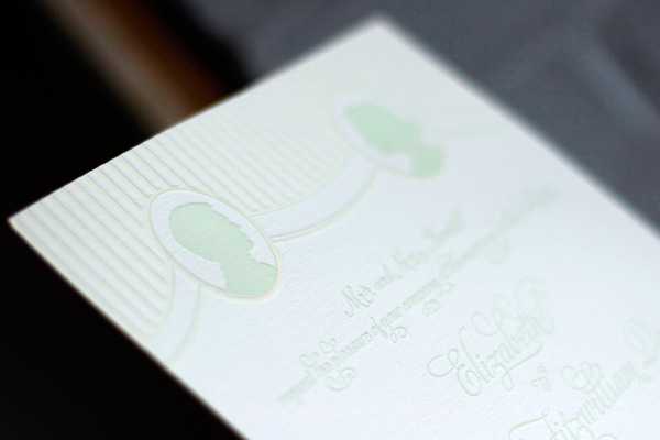
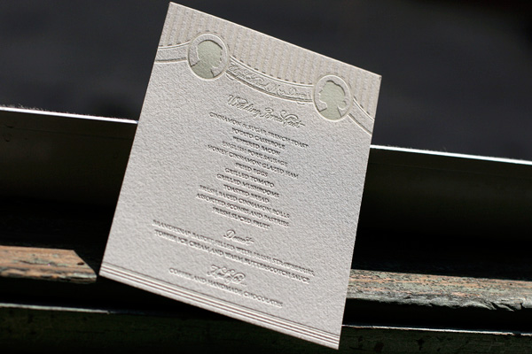
Earlier in the year we were excited to be contacted by one of our favorite bloggers and stylists, Anne Sage of The City Sage, about collaborating on a Pride & Prejudice themed photo shoot for Nonpareil Magazine. Needless to say, this was one opportunity we couldn’t pass up! We printed letterpress wedding invitations, menus and escort cards all in our Cameo design, which features a sweet vintage-inspired silhouette design. (Our favorite part about Cameo? We customize it with your silhouettes at no charge!) We printed all of the pieces in celadon and cream inks for a soft, romantic feel just perfect for a wedding at Pemberley Estate. The shoot was designed around the concept of a wedding breakfast reception and the reply cards asked guests to write in their request for a favorite waltz.


See the shoot here in Nonpareil Magazine and stay tuned tomorrow for many more photos right here!
Printed in an elegant combination of pewter and cream inks, this letterpress wedding invitation is our Sylvan design. This customization was personalized so that the design has a horizontal orientation and features Hebrew text to make it especially appropriate for this couple’s wedding. We love the sophisticated neutral color palette and the simple typography on this design – it allows the beauty of letterpress to shine through while making an incredible first impression upon guests.


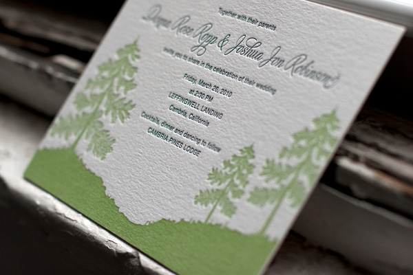
This letterpress wedding invitation is one of our new designs for 2010, Adirondack, customized for this couple using a horizontal orientation and printed in clover and peacock inks. We love the way it makes this already beautiful design really unique to this couple’s wedding.


The letterpress accommodations card insert and reply card used motifs from our Nautilus design printed in peacock and cream inks, which, when paired with the Adirondack letterpress invitations, is a tribute to the unique woodsy seaside venue where this couple will be celebrating their wedding. This kind of personal customization really allows the couple’s wedding to come to life for guests long before the day arrives and is a perfect way to kick off the festivities.


When we’re working with couples to create their letterpress wedding invitations, we love seeing just how different they make one of our original designs by playing with personal details. This customization of our Champagne invitation is a perfect example of a couple who truly made a design their own. They opted for a subtle cream ink paired with black ink for all of the type on our thick 2-ply cotton paper, with metallic gold edge painting and a luxurious metallic gold envelope liner. It is sophisticated and completely elegant, perfect for their New York City wedding.


There is something really fun about working with couples to print letterpress save the dates for their upcoming weddings – they’re often newly engaged and completely excited as they delve into wedding planning. So, when we recently had the opportunity to print these awesome save the dates, we were beyond thrilled. In our Majorca design, printed in cream and garden inks, these save the dates actually feature two cards in our reply card size that are then fastened together with a grommet, a simple yet completely unique feature that we love!

The first card features basic save the date information including the wedding date and location – the date is emphasized in large serif type for a look that is clean and modern.

The second card features detailed lodging and travel information for guests traveling from out of town. Providing such details can prove immensely useful for guests as they prepare to join you for your celebration.

This kind of truly customized letterpress save the date is our favorite to print – we love seeing couples take our designs and play with font and sizes and colors to totally reinvent something that is perfect for their unique event. For more inspiration, check out some of our favorite letterpress save the dates we’ve printed in recent months.


