Watery ink colors paired with the preppy Alouette Monogram letterpress wedding invitation is sure to make your heart float – think row boats, sun hats and sweet underwater kisses.
alouette monogram customization = inks: aquamarine + taupe | fonts: salzberg + social | paper: white | invite size: f-8 | liner: the reverse rustic crosshatch pattern in celadon ink | corner rounding |original design by Jessica Tierney | customized by in-house designer Lindsy Aragona |
embellishment suggestions: edge painting: aquamarine

(Photo Credits: Max Wanger)
by Lindsy Aragona, In-House Designer.

Soft, elegant and impossibly romantic we love a color palette of light peach, dusty pink, light lavender, cream and celadon to capture the timeless sophistication of our Tennyson letterpress wedding invitations. (Photo credits: wedding invitations + bouquet + wedding cake + dress with book.)

We’re probably a bit premature in our longing for spring (especially here in Syracuse), but we love a woodsy natural color palette of clover, taupe, hazel, celadon and cream to showcase our Festoon letterpress wedding invitations for a pretty spring wedding. (Photo credits: wedding invitations + wedding dress + bouquet + wedding cake.)

Using pretty spring weddings and our Palais letterpress wedding invitations as inspiration, we love this sweet palette of wedding colors in sea mist, deep blue, dusty pink, light peach and celadon. (Photo credits: wedding bouquet + bridesmaid dresses.)
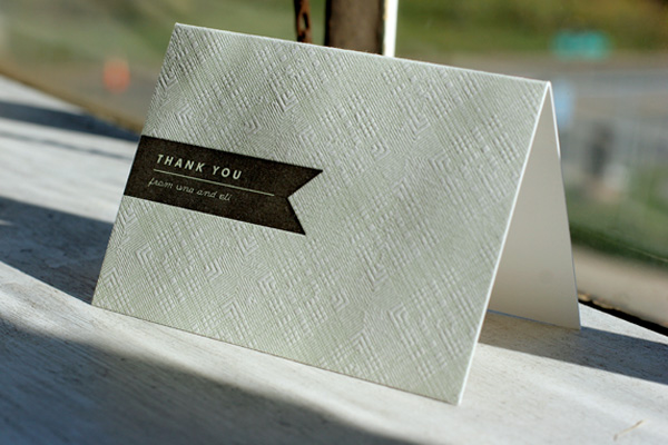
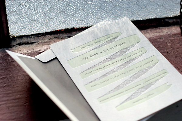
A couple of months ago we featured Una and Eli’s letterpress wedding invitations and recently we had the pleasure of printing their letterpress thank you cards to match. Once again showcasing our Ribbon design, these pretty folded notes were printed in celadon and taupe inks to perfectly coordinate with their invitations, an easy and beautiful way to effortlessly coordinate the design details of your wedding.

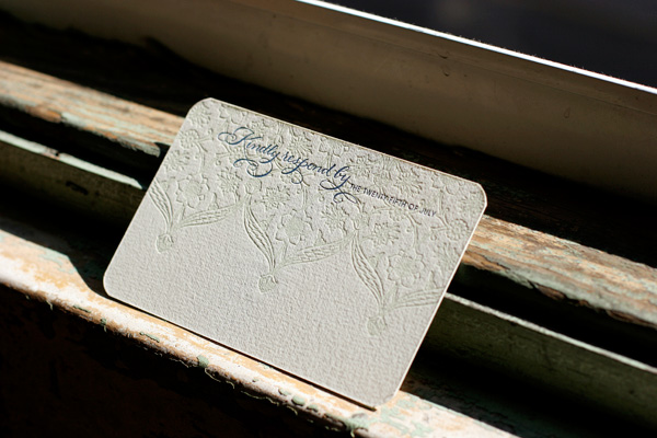
This pretty customization of our Connemara design was printed in celadon and navy inks, and features gorgeous hand calligraphy accents on the letterpress wedding invitations and reply cards by calligrapher Debi Zeinert of The Blooming Quill. The couple opted for our 2-ply paper for the invitations, and 1-ply reply postcards, both with rounded corners. We also letterpress printed their petite website cards printed in navy – a great way to provide guests with additional wedding information!


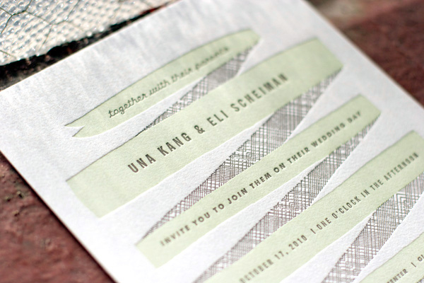
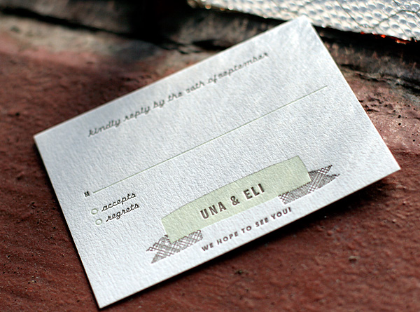
This customization of our Ribbon letterpress wedding invitation design was printed in taupe and celadon inks and features a taupe envelope liner. One of our new designs for 2010, Ribbon was created for us by Erin Jang, an incredibly talented designer and art director. We love this sophisticated, earthy color palette for this couple’s fall wedding.


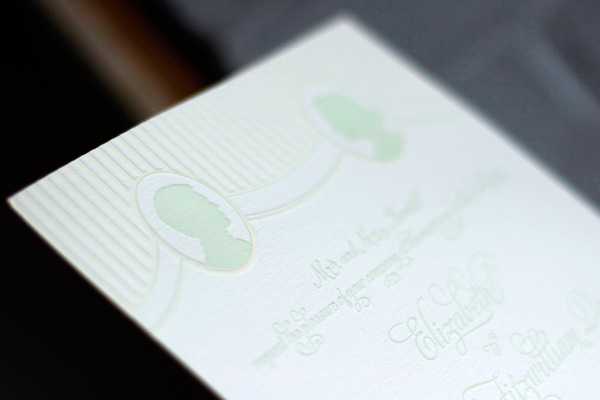
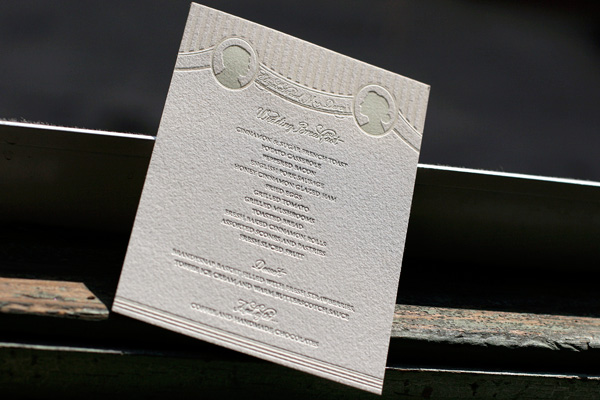
Earlier in the year we were excited to be contacted by one of our favorite bloggers and stylists, Anne Sage of The City Sage, about collaborating on a Pride & Prejudice themed photo shoot for Nonpareil Magazine. Needless to say, this was one opportunity we couldn’t pass up! We printed letterpress wedding invitations, menus and escort cards all in our Cameo design, which features a sweet vintage-inspired silhouette design. (Our favorite part about Cameo? We customize it with your silhouettes at no charge!) We printed all of the pieces in celadon and cream inks for a soft, romantic feel just perfect for a wedding at Pemberley Estate. The shoot was designed around the concept of a wedding breakfast reception and the reply cards asked guests to write in their request for a favorite waltz.


See the shoot here in Nonpareil Magazine and stay tuned tomorrow for many more photos right here!


