Village Invites 2 in New York City sent us these soft and feminine Traditional Script (by Beth Barr) save the dates for printing. The end result made for a classic save the date with nice clean lines, a refined look – and definitely not too overly flourished.
inks: shell + pewter | fonts: aiden + aiden stripe + grace | paper: 1-ply white | invite size: A6 | customization #: 15390 |

The Gilford invitation goes dashingly with this wedding held lakeside at a large white estate house. The motif alludes to the elegance of the event with the type modern and young.
Gilford customization = inks: desert + coral | fonts: streamline + keeva | paper: white | invite size: sq 7 | liner: sullivan pattern in prussian blue ink | original design by Beth Barr | customized by in-house designer Brenda Fox |
embellishment suggestions: foil stamp motif in tawny matte

(Photo Credits: Simply Jessie Photography)
Our popular Traditional Script design (by Beth Barr) has never looked so good! Both the regalia letterpress ink and the teal shine foil shine brightly on our white cotton paper. Thanks go out to The Village Invites for sending this our way.
letterpress ink: regalia | foil: teal shine | fonts: parisian + harlow + stadium | paper: white | invite size: F8 | customization #: 15964

Would you look at this one? What do we have here? Why, here we have a fine example of Beth Barr‘s Damask design, which we’ve printed in a combo of pewter letterpress ink and silver matte foil. Striking, isn’t it?
letterpress ink: pewter | foil: silver matte | font: impression | calligraphy: Victoria by Sarah Hanna | paper: 2-ply white | size: f8 | customization #: 15479 |

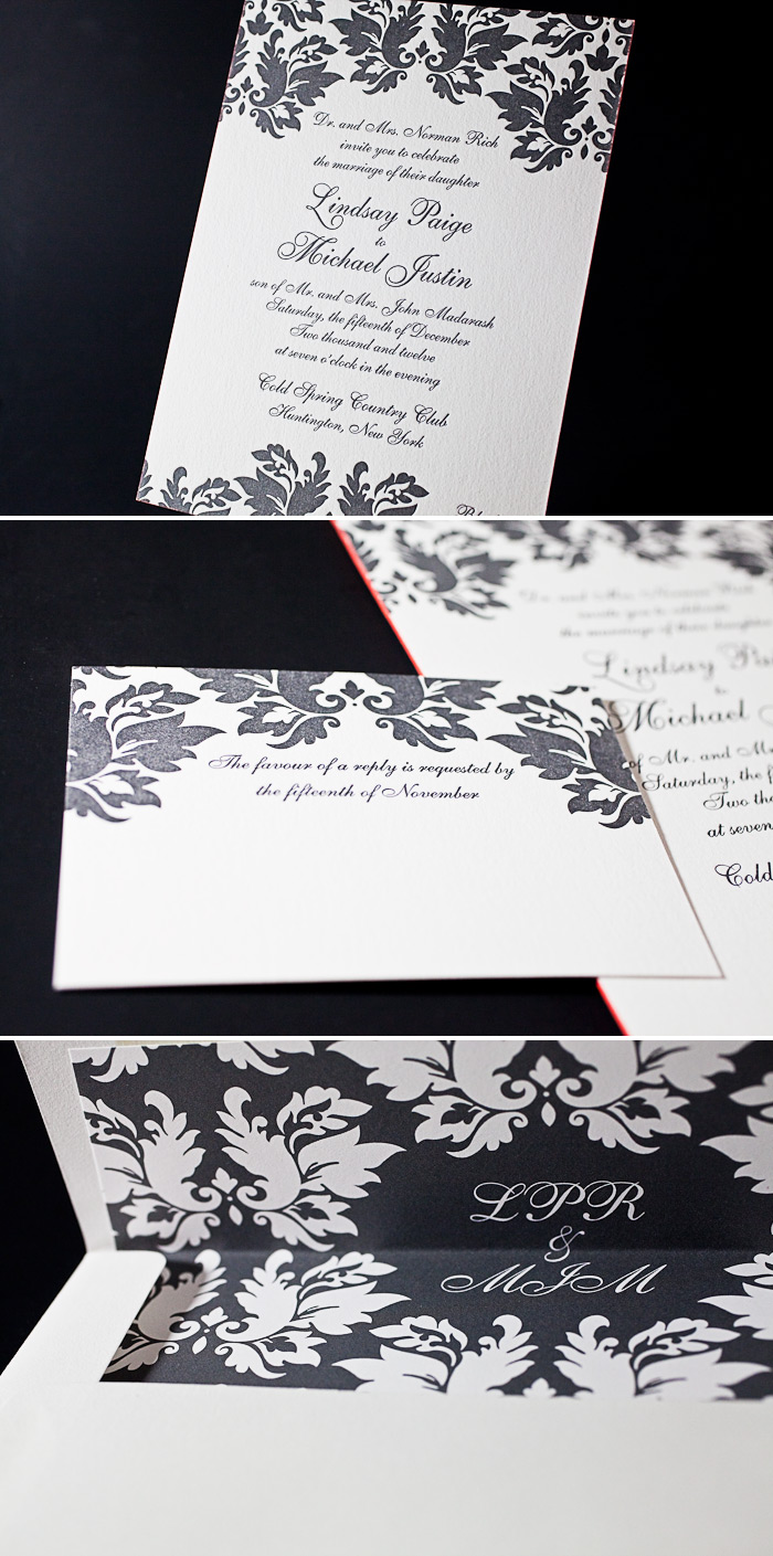
Ravishing as always, Beth Barr‘s Damask design is shown here sporting a classic combo of charcoal ink and inkless blind deboss. Papery and Cakery of Boca Raton gets the kudos for this lovely set – thanks guys!
inks: charcoal + blind deboss | font: impression | calligraphy: victoria hand calligraphy by Sarah Hanna | paper: 2-ply white | invite size: f8 | edge paint: metallic silver | liner: classic color pattern in charcoal | customization #: 14495

Here’s a stunning version of Beth Barr‘s Damask design that we recently had the pleasure of working on. Our buds over at Phantastic Papers sent this one our way – thanks guys!
ink: charcoal | paper: 2-ply white | invite size: f8 | edge painting: geranium | liner: custom design inspired liner in charcoal | customization #: 15222 |

The cool and muted winter tones in this Damask (by Beth Barr) customization perfectly compliment a glowing bride.
Damask customization = inks: sea-side + pale gray + pewter | fonts: sophia + henry | paper: white | invite size: sq-7 | liner: classic color in sea-side ink | original design by Beth Barr | customized by in-house designer Brenda Fox |
embellishment suggestions: edge paint in pewter ink

(Photo Credits: Fashion Bride)
The elegance of fall is oh so grand! Rich deep purples cool the mood down for a classy evening, paired with swirling scripts and soft floral accents – our Rococo Elegance design is sure to please!
rococo elegance customization = inks: amethyst + wisteria | fonts: danube + aiden | paper: ivory | invite size: f8 | liner: antique geometrics in amethyst + wisteria | original design by Beth Barr | customized by in-house designer Racheal Decker
embellishment suggestions: edge paint in pansy

(Photo credits: john and joseph photography)
Our new collection of letterpress wedding invitations has arrived, and we’ve introduced 83 new invitation designs (plus metallics: foil stamping, foil edging and lots of other cool new embellishments!) for the 2012 wedding season. Since everything at Bella Figura is completely customizable, we thought we’d show you a ‘before and after’ look at some of our favorite new invitation designs to show how a change of color, fonts, and design placement can completely transform an invitation design.
First up: the La Salle invitation design by Ian Koenig. The original design is soft and romantic in camel + pewter inks, and features three fonts, but takes on a completely regal look with new inks (regalia and charcoal), corner rounding, and new fonts: Vessa + Jubilant.
Suggested embellishments: We think this design would look gorgeous with a European formal patterned envelope liner in regalia ink and a coordinating custom postage stamp.
Details: letterpress inks: regalia + charcoal | fonts: vessa + jubilant | paper: bella cotton white 1-ply | size: f-8 | corner rounding

Next up: Rustic Jolene – an earthy design with a folk-art feel – is completely transformed with a drastic (but gorgeous) change in design placement. Prussian blue and cornflower blue inks create a stunning two-tone effect, and the square size, corner rounding, and sophisticated fonts complete the look.
Suggested embellishments: a white cotton pocketfold with a monogram letterpress printed in Prussian blue would add a nice finishing touch, along with an envelope liner in our woodstock pattern in cornflower + Prussian blue inks.
Details: letterpress inks: prussian blue + cornflower blue | fonts: daisy + moravia | paper: bella cotton white 1-ply | size: sq-7 | corner rounding

Rococo Elegance, created by Beth Barr, one of our new designers for 2012, takes on a more floral feel in this elegant customization. Hand calligraphy accents and ivory paper give the design a soft, romantic feel.
Suggested embellishments: keep it simple with a European formal patterned envelope liner in taupe ink.
Details: letterpress inks: light peach + taupe | font: botany | paper: bella cotton ivory 1-ply | size: f-8 | hand calligraphy accents: spencerian style | corner rounding
 (more…)


