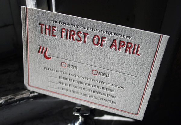
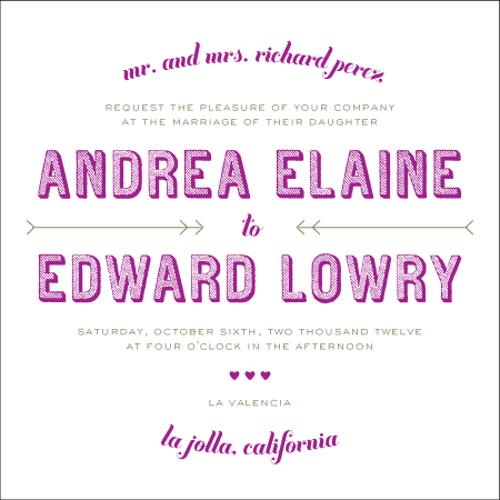
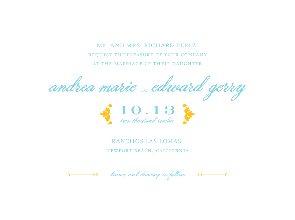
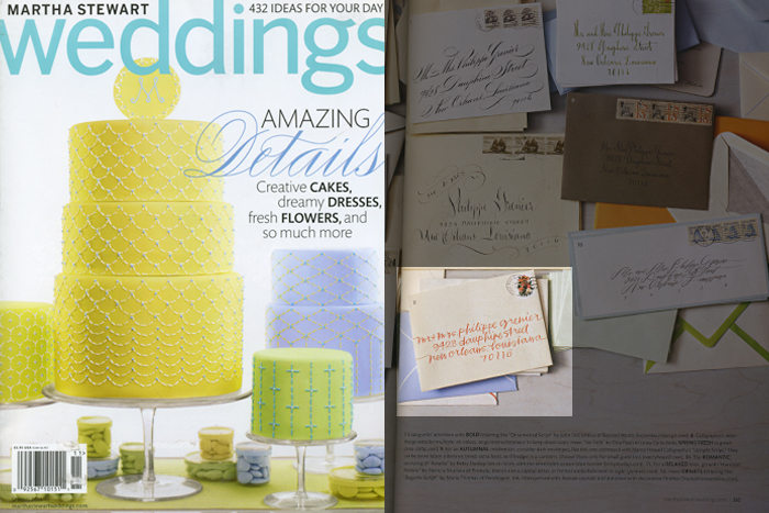
We’re pretty excited about Election Day 2011 around here (it’s today! Tuesday, November 8), so we’ve decided to hold a vote of our own! From now through November 30, four of our letterpress invitation designs will be in the running to become the next Bella Figura Design of the Month. The winning design will go on sale for 20% off during the month of December, so be sure to vote! (And tell your friends to vote, too!) The 20% off applies to save the dates, thank you cards, coasters, place cards, menus, programs, invitations, and any other piece that uses the winning design.
Voting is easy: simply visit this page to view the nominated designs, then ‘like’ your favorite (you must be logged in to Facebook to do this). Already dreaming up ways to customize your favorite design? Check out these gorgeous customizations our in-house graphic design team dreamed up to get some extra inspiration.
Alice by Tara Hogan


Carte de Visite by Ben Whitla


(more…)
We just love when magazines and blogs decide to showcase the beautiful letterpress printing we get to do every day, so today we’re sharing some of the amazing features Bella Figura has been spotted in over the past few months. One of the most recent spotlights was found in the fall 2011 issue of Inside Weddings, where Kamal‘s majestic Bejeweled design sparkled.

A few months back, Brides magazine highlighted our Nouvina design by Heidi, which features modern, whimsical flowers and fun, bold colors.

Stationery Trends also decided to feature one of our invitations this fall — the ever popular Irving invitation (designed by Ben Whitla).

We were also thrilled to see one of our calligraphers, Patricia Mumau of Primele, featured in Martha Stewart Weddings a few months back!

We’d also like to thank Oh So Beautiful Paper, Once Wed, Modernly Wed, Chic Vintage Brides, Wed Haute, If I Must Say So, and I Love You Too for highlighting our work — thank you, thank you!
We think you’ll definitely agree that these vibrant and lively letterpressed Tara (by Ben Whitla) Bar Mitzvah invitations really get you in the mood for a celebration! These trendy invitations set the tone for the important Jewish milestone. The stand-out color combination of spring green and aquamarine inks is carried through onto all of the pieces. The modern vibe is continued through with adorable letterpressed thank you cards. It’s safe to say the celebration will not be short lived with a festive party to follow!
inks: spring green + aquamarine| fonts: moravia + billhead | paper: 1-ply white | invite size: a7 | client coordinator: jessica hanaman | in-house designer: kyle laatsch


What better way to make sure your guests don’t let your wedding date *ahem* coast by, than with some letterpress save the date coasters? We printed these Carte de Visite (by Ben Whitla) letterpress save the dates and matching coasters in Taupe, Papaya, and Sand inks, and we’ve got to say – we’re really into this color combo.
To make everything in this set as cohesive as possible we also custom designed and letterpress printed an envelope liner that coordinates with the cards and coasters. Between this letterpress envelope liner and the bright Papaya edge painting on the save the date, this set really has some amazing presence when you open the flap (even before you take the pieces out!).
inks: taupe + papaya + sand | fonts: sofia + sans capitals + archive | paper: 2-ply white + coaster stock | save the date size: a6 | liner: custom pattern letterpress printed in taupe ink | client coordinator: chris gannon | in-house designer: kyle laatsch


We just adore these recently printed letterpress wedding invitations in our Lumos design (by Ben Whitla). The couple chose to adhere their invitation to a striking black pocketfold. These brilliant pocketfold enclosures hold the couples website card. We love how pronounced the bride and groom’s names look in black ink and the antique gold ink makes for an excellent pairing! Perfect for a black and white wedding theme, these invitations have a spot-on contemporary feel (and check out their save the dates in a previous post)!
inks: black + antique gold | fonts: sans capitals + popular | paper: 1-ply white | invite size: a-7 | pocketfold: black | client coordinator: jessica hanaman | in-house designer: kyle laatsch

by Jessica Hanaman, Client Coordinator.
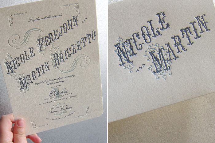
The perfect precursor to what’s sure to be a gorgeous vintage-chic outdoor wedding, this customization of our Victrola Letterpress design has got everybody here at the shop… spinning. Pressed in Deep Blue and Pool on our 1-ply ivory paper, the old school typography, cool hues, and ornate flourishes really lend this set some sick traditional Americana vibe. Two color printing throughout the set (even on the envelopes) really helps to keep things cohesive and well balanced.
ink: deep blue + pool | fonts: victoria + manoir | paper: ivory 1-ply | invite size: F-8 | client coordinator: chris gannon | in-house designer: kyle laatsch


by Chris Gannon, Client Coordinator.
As 2011 nears, we thought we’d pause a moment to recognize 2010 by celebrating our top selling letterpress wedding invitation designs from this past year. From the traditional and sophisticated to the modern to the vintage inspired, these wedding invitations were our clients’ favorites in 2010. A huge thank you to our amazing clients for making this past year the best one yet – we’ve got lots of exciting new things coming for 2011 so stay tuned!

{Deveril letterpress wedding invitations from our Signature Collection.}

{Classic Calligraphy wedding invitations by Debi Zeinert.}

{String Calligraphy wedding invitations by Patricia Mumau.}

{Harlow letterpress wedding invitations from our Signature Collection, designed by Jessica Tierney.}

{Urbanity letterpress wedding invitations by Tara Hogan.}

{Birch wedding invitations from our Signature Collection, designed by Jessica Tierney.}

{Vendage letterpress wedding invitations by Kamal.}

{Tara letterpress wedding invitations by Ben Whitla.}

{Victoria Calligraphy wedding invitations by Sarah Hanna.}

{Irving letterpress wedding invitations by Ben Whitla.}
We love this customization of our Tara letterpress wedding invitation design – it’s printed in geranium and downy inks for a look that is both modern and a touch retro with cool vintage-inspired typography. We think these invitations were the perfect first impression for this couple’s wedding, held at The Foundry in Long Island City, a hip venue with a unique modern vibe.

