bella figura real wedding: coastal letterpress invitations for a montauk affair
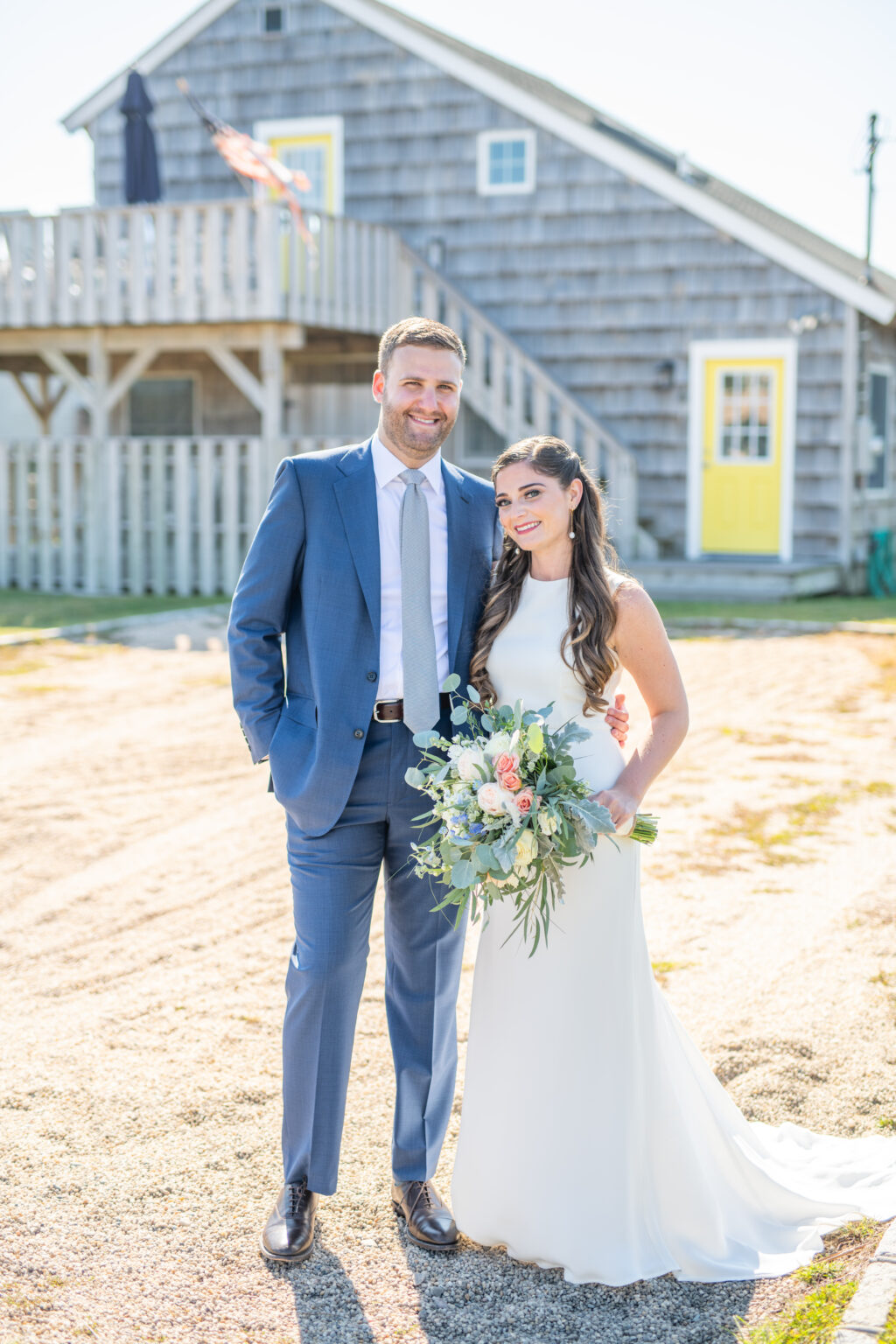
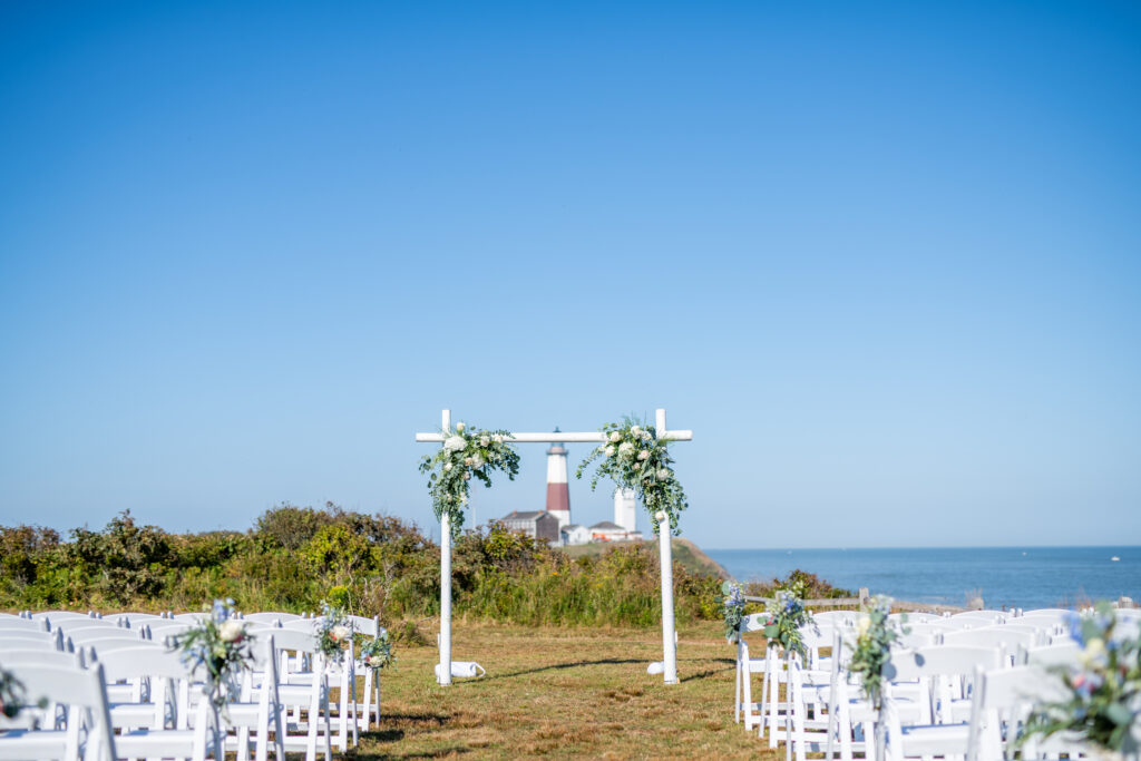
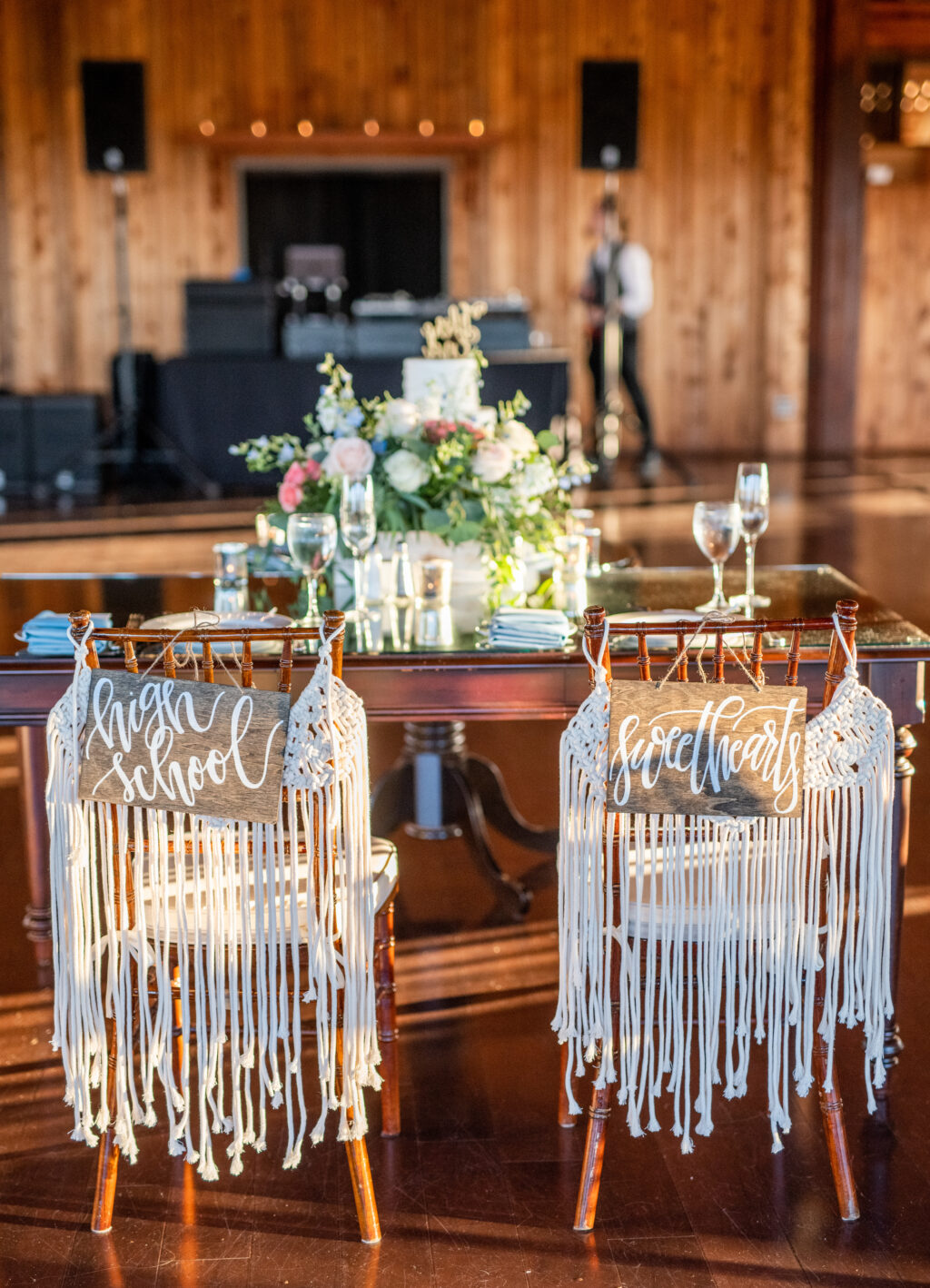
All it takes is a pair of high school sweethearts getting hitched and a set of coastal letterpress invitations to set the stage for a perfect Montauk wedding. The historic Montauk Point Lighthouse served as the backdrop for this happy couple’s wedding day this past September. The celebration continued with views for days at 360º East at Montauk Downs. The invitations easily matched this beachy aesthetic with a clean design paired with a gray color palette. They worked with our Bella Figura – Brooklyn location to bring their vision to life. We will let the bride Brittany take it from here to share more about her big day!

CAN YOU SHARE WITH US A BIT ABOUT YOUR WEDDING AND YOUR INSPIRATION FOR THE EVENT?
The September sun shone brightly against clear blue skies as a gentle breeze floated off the ocean. It was something out of a dream! The distinct natural beauty of Montauk inspired our wedding. Having grown up together in Southampton, New York, just 25 miles from Montauk, we knew we wanted a relaxed coastal vibe. We embraced the setting by incorporating a sea of blues and grays and whites throughout the details of our wedding day.

WHAT ADVICE DO YOU HAVE FOR COUPLES CURRENTLY PLANNING A WEDDING?
Sweat the small stuff! One of our favorite parts of wedding planning was finding ways to weave our love, our story, and our personalities into the details. When Henry and I first started dating in high school, we would often spend summer days collecting shells on the beach in Southampton—so we thought it would be fitting to use hand-calligraphed scallop shells as escort cards as a nod to our early days together. The guestbook was a vintage lighthouse book my mom came upon in a local thrift store. Our signature cocktail was named for our beloved cat, Woodley May. Instead of favors, we donated to the National MS Society, a charity near to our hearts.

HOW DID YOU CHOOSE YOUR INVITATION DESIGN & INK COLORS?
For our wedding invitations, we envisioned a clean design that reflected the casual elegance of Montauk. To bring our vision to life, we chose dark gray letterpress on light gray paper, paired with a white envelope. We had our names printed in an organic script and selected a modern serif font for the rest of the invitation wording. We personalized the envelope liner by adding a white and gray design reminiscent of waves crashing on the coast. The same design was incorporated into our save-the-date cards and menus for visual coherence.


WHAT WAS YOUR FAVORITE MOMENT
I will never forget our ceremony at Camp Hero. I walked down the aisle with both my parents to a string duet playing “Air on the G String”—the same processional song my parents selected for their Montauk wedding more than 30 years ago. My sister and brother and Henry’s best friend stood beside us. Our friend who has known us for more than 10 years officiated with a script we wrote together and a beautiful tribute to our relationship. Henry and I then read hand-written vows, in which we reflected on the thirteen years of laughter, tears, understanding, friendship, and love that had led us to that moment. We ended the ceremony with the breaking of the glass and our guests shouting “Mazal Tov!”


WHAT’S NEXT FOR THE NEWLYWEDS?
After our wedding, we traveled to Peru for our honeymoon, which was filled with adventure, culture, and breathtakingly beautiful sights. For now, we are continuing to enjoy all the wonderful opportunities that living in Brooklyn has to offer.

Vendors: Venue: 360º East at Montauk Downs | Photographer: Kaitlyn Ferris Photography | Stationery: Bella Figura | Gown: Shareen Bridal | DJ: 74 Events | Florals: Roses and Rice | Videographer: ZANNI Productions | Day-of Coordinator: Deborah Minarik Events | Makeup: Daisy Monsalves for Metamorphosis New York | Hair: Tamara McKie for Metamorphosis New York | Groom’s Suit: Martin Greenfield Clothiers | Ceremony Music: Luminous Sounds | Calligraphy: Laced in Letters | Cake: The Rolling Pin
Limo: M&V Limousines | Shuttle: Hampton Hopper
