Jessica and Cameron were inspired by a vintage flyer when customizing our retro-cool Tara wedding invitation design for their autumn garden wedding. They added Gold Matte foil and more vintage design elements along with their own very personalized wording. To make sure guests had all the details, a double-sided direction/map card, accommodations card and brunch card were included.

letterpress inks: pool + espresso | foil stamping: gold matte | fonts: moravia + billhead + knockout + pyramid | paper: bella cotton 2-ply ivory | foil edging: gold matte | envelope: bella cotton ivory | envelope liner: european formal pattern in pool ink | customization #19205
Today’s beautiful real wedding is such a classic. Maggie and Ian both grew up and met in Vermont, so for their wedding day they wanted to give their friends and family a true Vermont experience. We worked with Maggie and Ian for their letterpress wedding invitations, which featured our
Deveril design on ivory paper in antique gold ink. Maggie shared some of the details behind their beautiful wedding day and some advice for brides-to-be — take a look!
When it came to the invitations, we wanted to select an ink that represented warmth, something that was reminiscent of sitting by a fire and one that would make our guests feel welcome. The ink and paper we chose were the perfect combination and truly set the stage for our December wedding. It was a traditional invitation, however, we put a different spin on some of the wording to make it uniquely our own. We could not have been more pleased with the finish product!
We chose the village of Dorset because we felt it would give our family and friends an authentic Vermont experience. As Dorset speaks for itself, we didn’t try to have a theme or follow a specific trend. We wanted our guests to experience the many things we love about Vermont, and the pristine village of Dorset embodies so many of those things: the nostalgia (especially during the Christmas season), white clapboard houses, the most perfect general store, Bed and Breakfasts, a historic Inn and the list goes on.
The entire Dorset Inn was booked with our guests for the weekend, as well as the surrounding B&B’s, so it was like everyone was home for the holidays — doors were open, people were coming and going, voices of family and friends echoed throughout the halls — it was so special.
It was important to us that our wedding have personal touches throughout and be a representation of us as a couple. Ian is an artist and created our ceremony programs. Our dogs, Roxie and Zoe served as our ring bearers & flower girls. My mom had her wedding dress from 1975 made into a jacket for me! We had a progressive cocktail party instead of a sit down dinner. As December conjures up the feelings of family and friends gathered together, we wanted our guests to “mix and mingle” the entire night through.
On Saturday morning, the day of the wedding, I was sitting in a chair in my room at the Dorset Inn, which overlooked the village green. Watching our guests mill about the village, coming and going from the general store, throwing the football. It was the best feeling to know all of your favorite people were together and in one place. I was so surprised at how fast it all went. Everyone tells you it goes by quickly, but it really does. Make sure to take it all in, step back and watch your family and friends talking, laughing, dancing. And eat. You will need it!
Many thanks to Maggie & Ian for sharing their special day with us!
Ceremony: The Dorset Church
Florist: Tara Pollio
Band: Sultans of Swing
Cake: Irene’s Cakes by Design
Dress: Camille Bridal Couture
Shoes: J.Crew
Groom’s attire: Jos. A. Bank
Honeymoon: The Cloister Sea Island, Georgia
We recently had the pleasure of working with an amazing local bride on her letterpress wedding invitation suite. A gorgeous customization of our Plume design (by Amy Graham Stigler), these invitations were printed with two custom-mixed ink colors to match her wedding color palette – perfect for an elegant evening reception!
ink: custom pantone 7490 at 20% + custom pantone 7449 | fonts: nysa + jubilant | paper: 2-ply white | invite size: a-7 | liner: classic color pattern in custom pantone 7449 | edge painting: custom pantone 7490 | client coordinator: chris gannon | in-house designer: sarah walroth


by Sarah Walroth, In-House Designer.
A true story-book romance is reflected in this letterpress wedding invitation of Linden Summer design (by Lindsy Aragona). Completed with a metallic bronze pocketfold, this entire set has a vintage, yet whimsical feel. The invitation and additional pieces are adorned with soft Espresso ink branches and delicate Champagne ink leaves. You cannot help but fall in love.
ink: espresso + champagne | fonts: luster roman | calligraphy style: clermont by debi zeinert | paper: 1-ply ivory | invite size: a-7 | liner: the reverse european formal pattern in espresso ink | pocketfold: bronze | client coordinator: christie jones | in-house designer: lindsy aragona


This couple benefited from our 10% off promotion (10% off if you purchase 6 printed pieces) and our free CHARITY favor card promotion. See more details and the small print here!


by Lindsy Aragona, In-house Graphic Designer.
This simple, chic Bleecker Modern (by Jessica Tierney) letterpress wedding invitation suite is a perfect precursor to any classy yet down to basics wedding. With it’s ultra modern font paired with Aubergine, Charcoal and a hint of Fuchsia edge paint you can’t go wrong, it’s like letterpress poetry. Bundle this all up in a Ash pocketfold and our Modern Canopy envelope liner in fuchsia, you’ll have your guests as excited about them as you are!
inks: charcoal + aubergine | fonts: knockout | paper: 2-ply white | invite size: sq-7 | liner: reverse modern canopy pattern in fuchsia ink| edge painting: fuchsia | pocketfold: ash | client coordinator: christie jones | in-house designer: racheal decker


(more…)
We have our amazing friends at Social Graces in Nashville, Tennessee to thank for this elegant design customization of our String Calligraphy letterpress invitation! The invitation, featured in Pale Gray and Shell inks on our 1-ply white cotton paper, has matching reply postcards and detail cards in Pale Gray which complete the gorgeous set. We think these are perfect for a family farm celebration- and that is exactly what they are intended for!
ink: pale gray + shell | font: jubilant | hand calligraphy: harrison style | paper: 1-ply white | invite size: F8


by Christie Jones, Client Coordinator.
We’re loving these fun letterpress coasters and coordinating accommodations cards, showcasing our Tara design (a 2010 favorite!). They are printed in daffodil and espresso inks and add a touch of retro cool to any reception or celebration.


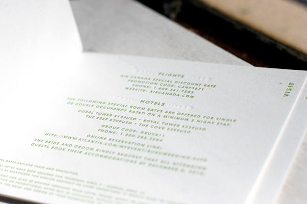
We absolutely love this unique customization of our Champagne design! Letterpress printed in clover and blind deboss for a tropical destination wedding, we worked with this couple to create a small booklet by fastening the different elements of their invitation suite together with grommets. The page sizes are stepped to create tabs and labeled to identify which page contains what information. The booklet contains an invitation, an events card, a directions and accommodations card, and a reply card that is perforated to be torn out and returned.


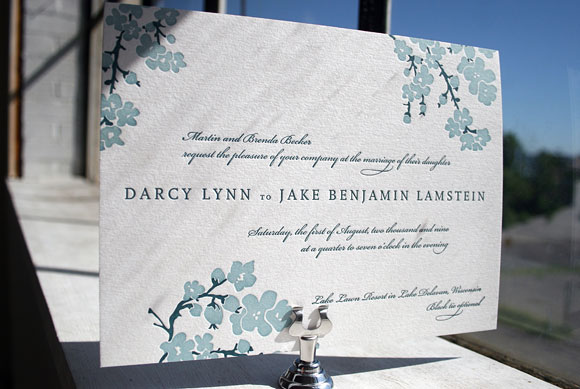
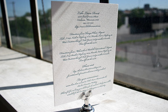
Printed in pool and peacock inks, this version of our Mimosa design features a fun pairing of 2-color and 1-color letterpress pieces detailing travel information and weekend events for guests of this lakefront wedding in Wisconsin.


The letterpress wedding invitation itself is printed in both pool and peacock, a unique pairing of ink colors that is perfect for a waterfront celebration.

This letterpress card is a simple insert detailing travel information and accommodation details for guests traveling to Wisconsin for the wedding. It is printed in peacock ink.

Also printed in 1-color letterpress in peacock ink, this insert card invites guest to a separate welcome dinner held the evening before the wedding. We love the combination of pretty 1-color inserts with this 2-color letterpress wedding invitations – it’s a great way to save money on your letterpress inserts while still showing off a great 2-color design on your main invitation.


