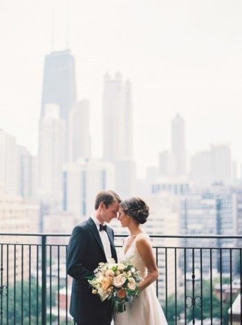
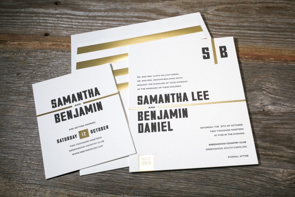
Rob and Blair chose a timeless look for their custom wedding invitations to help set the tone for their classic wedding at the Chicago History Museum. We combined submitted calligraphy accents with a classic serif font to create their design, and printed the suite in charcoal ink on our white cotton paper. The couple continued the muted color palette on their wedding day, with Blair’s bridesmaids donning gray, floor-length gowns by Jenny Yoo, and carrying lush bouquets in soft shades of pink and peach. White linens and floral centerpieces carried the theme through to the reception, which featured unique personal touches including the groom’s favorite dish and live entertainment!


Be sure to visit Style Me Pretty to see more photos from Blair and Rob’s big day! Love the invitations? Create a similar look by customizing our Glamorous Swash design!
Photography: Taylor Lord | Event Planning: LK Events | Floral Design: Stems Chicago | Wedding Dress:Bride’s Mother’s, Altered By Patti Flowers | Cake: Amy Beck Cake Design | Invitations: Designed By Bride, Printed By Bella Figura | Rings: Dana Rebecca | Bridesmaids’ Dresses: Jenny Yoo | Catering: Food For Thought | Makeup: Brian Sutherby | Calligraphy: Heather Bloom Of Design Roots | Band: Gold Coast All Stars | Groom’s Attire: Custom Hickey Freeman By Culwell & Son | Officiant: Rev. Dave Angle | String Quartet: Artistrings | Venue: Chicago History Museum | Photography – Assistance: Justin Tearney
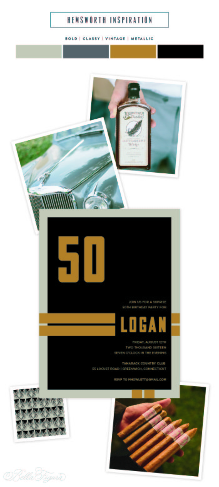
Kyle Laatsch reimagined his Hemsworth design for a fiftieth birthday soiree, using a dramatic palette of black and desert inks and copper foil. Our gatsby patterned liner in coordinating inks adds sophistication and compliments the masculine feel of the design.

Designer Kyle Laatsch is March’s Designer of the Month – be sure and check out his other designs and save 10% through March 31!
hemsworth customization | digital inks: black + desert | foil stamping: copper shine | fonts: valuco + gotham | paper: bella smooth cotton white | invite size: F8 | digital liner: gatsby pattern in black + desert | original design + customization by Kyle Laatsch
whiskey | vintage car | cigars
Cate and her family worked with our friends at Union Street Papery to create these bubbly gold foil and pink Bat Mitzvah invitations based on our Joie de Vivre design. They used fuchsia letterpress ink and gold matte foil to highlight important text and design elements and brought in pewter letterpress as a neutral element to balance the boldness of the design. Fuchsia was used again on the envelope liner and edging on the cards to carry through Cate’s vibrant color palette.


letterpress inks: fuchsia + pewter | foil stamping: gold matte | fonts: keeva + sans capitals | paper: bella cotton white 1-ply | edge painting: fuchsia | envelope: bella cotton white | liner: classic color pattern in fuchsia | Union Street Papery | customization #29499
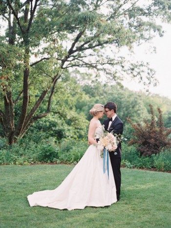
Ellie and Andrew worked with our friends at Hitched to create their elegant save the dates and invitations for their wedding at Cheekwood Botanical Garden. The D.C. based couple decided to return to Nashville (where they attended college at Vanderbilt University) for their springtime celebration, which was featured recently on Style Me Pretty! We letterpress printed their Serendipity wedding invitations in deep blue ink on our white cotton paper. Their romantic blue ink color was echoed throughout the wedding, from the Jenny Yoo bridesmaid dresses to the indigo goblets used at the reception. Here are a few of our favorites, but be sure to visit Style Me Pretty to see the entire real wedding!


Photography: Landon Jacob Productions | Wedding Dress: Modern Trousseau | Cake: Dessert Designs | Invitations: Bella Figura | Bridesmaids’ Dresses: Jenny Yoo | Catering: Kristen Winston | Hair + Makeup:Amanda Gros | Lighting: Bright Event Productions | Band: Atlanta All Stars | Venue: Cheekwood Botanical Garden | Event Planning + Floral Design: Sage Nines Event Production | Getaway Car:Matchless Transportation | Tent Rentals: Music City Tents & Events
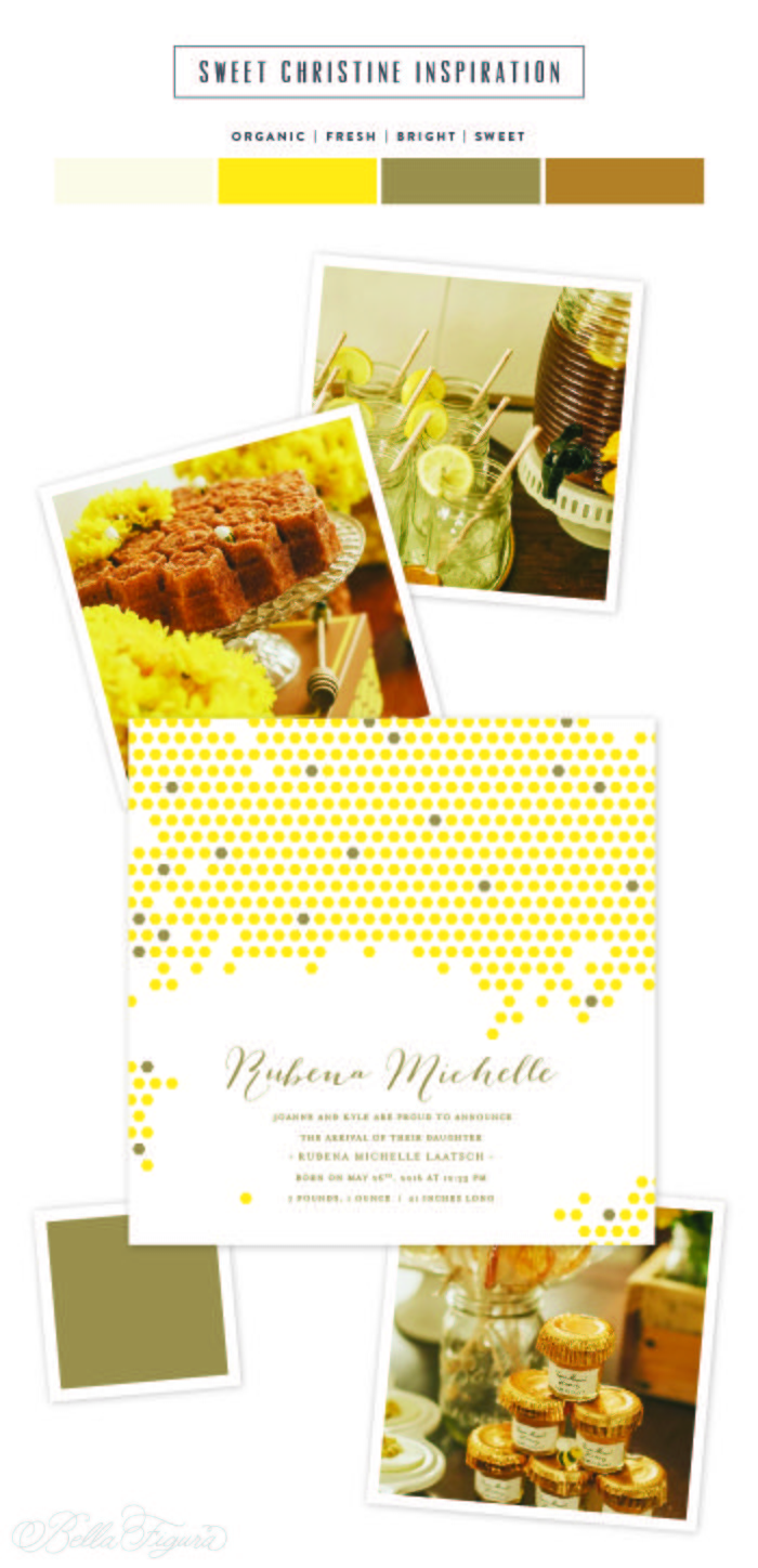
Using his Sweet Christine design as inspiration, Kyle Laatsch created this honeycomb birth announcement using a sunny palette of yolk and gold foil. A solid gold foil envelope liner highlights the gold foil accents on the card, adding a little shine to this bright and happy announcement.

Designer Kyle Laatsch is March’s Designer of the Month – be sure and check out his other designs and save 10% through March 31!
sweet christine customization | letterpress ink: yolk | foil stamping: gold matte | fonts: marilyn + moravia | paper: bella cotton white | invite size: sq-7 | foil stamped liner: classic color pattern in gold matte | original design + customization by in-house designer Kyle Laatsch
baby shower
This March we’re featuring Kyle Laatsch as our designer of the month! Kyle’s collection is new for 2016 and includes the romantic Sweet Christine, which features hand calligraphy accents by Nicole Black and an elegant blind deboss honeycomb pattern, as well as Hemsworth, a masculine, type-based design that’s sure to make a statement. We recently re-imagined these designs as Bar Mitzvah invitations, and they take on a brand new look — see the before and after below! For the entire month of March, you can save 10% on any order featuring one of Kyle’s designs, and save an additional 10% when you order 6 printed pieces or more — this includes invitations of any kind, save the dates, announcements, business cards — you name it!


The fine print: this offer is exclusive to designs by Kyle Laatsch and does not apply towards the purchase of other designs. Orders must be placed by 11:59pm Eastern on March 31, 2016 in order to receive this offer.
We’re hiring! If you’re in love with stationery and weddings, and have a knack for writing, we’d love to hear from you. We’re looking for a part-time individual to join our team here in Syracuse to help develop content for our blogs and social media — if you’re interested, email work@bellafigura.com with your resume, cover letter, and at least 3 writing samples!

To celebrate Jim’s recent milestone birthday, friends and family joined him at The Napa Valley Reserve, a private club that celebrates winemaking and the culinary arts. Our Irving design was a fitting introduction to his wine country birthday celebration, with a masculine palette of mediterranean and pool inks and tawny matte foil edging for a hint of glamour.


letterpress inks: mediterranean + pool | font: didot | paper: bella smooth cotton 1-ply + 2-ply white | foil edging: tawny matte | envelope: bella cotton white | envelope liner: dune pattern in mediterranean + pool | Union Street Papery | customization #30708
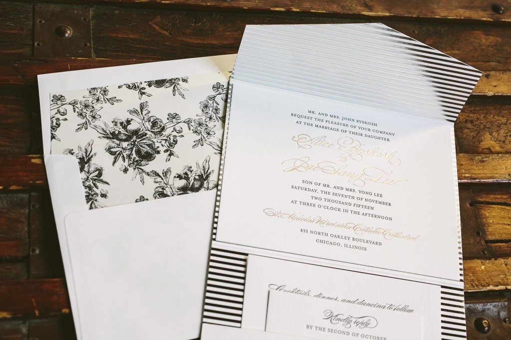
Our Deveril design has been one of our most popular traditional wedding invitations since it’s introduction. When Alice and Jae chose it for their Chicago wedding we weren’t surprised – but when we saw what additions they had in mind to make it uniquely theirs, we couldn’t wait to see it printed. Together with Magnificent Milestones they created a classic invitation set against a silver shine striped backdrop and complimented by a romantic floral patterned envelope liner digitally printed on metallic paper. Their invitations married classic and modern design into one elegantly turned our stationery suite.


letterpress ink: charcoal | foil stamping: tawny matte | fonts: danube + moravia | paper: bella cotton 1-ply white | pocketfold: bella smooth cotton white, interior printed in silver shine foil | envelope: bella cotton white | envelope liner: elegant garden pattern printed in charcoal on metallic white gold paper | Magnificent Milestones | customization #28990
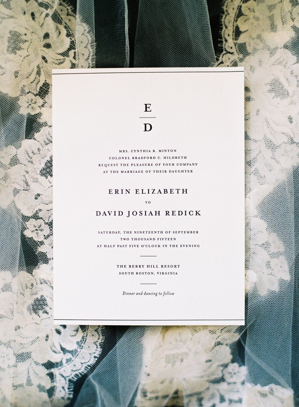
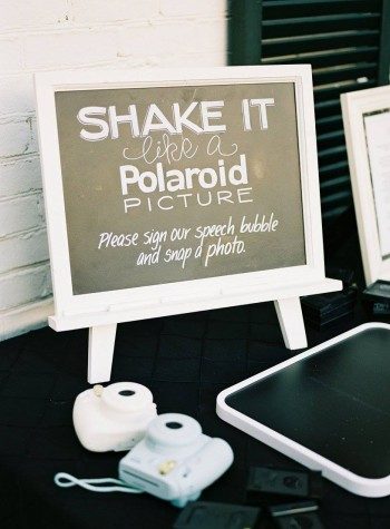
Erin and David planned a timeless, intimate celebration for their closest friends and family at Berry Hill Resort in Virginia. They wanted to showcase the beauty and Southern charm that Virginia has to offer on their wedding day, so they planned a classic black & white wedding in the middle of September and used our Simple Elegance invitation suite to set the tone for their big day. The simple monogram that they included on their invitations invitations helped inspire other decorative elements throughout their wedding, from the welcome sign and programs at the ceremony to gift bags and beer koozies at the reception. The beautiful bride Erin shared some of her favorite moments from her wedding day with us, along with some helpful advice for future brides-to-be — take a look!


From the bride, Erin: The key detail for us was family. While we were grateful everyone was celebrating our love, our wedding was a special tribute to our families. We love traditions and kept them at the center of everything we did. I recycled my mom’s once Cathedral length Italian lace veil by cutting it into a more modern style. I also wore my grandmother’s vintage watch that my Maid of Honor and older sister had gifted me the morning of my wedding day. Even the table numbers represented the years our parents, siblings, and grandparents had married – along with their wedding photos. It was also important for us to remember our loved ones watching from Heaven with a remembrance table at the reception. We used an old whiskey barrel to keep with the Southern theme.


David and I did not see each other on our wedding day until I walked down the aisle. I was escorted by my father who wore traditional dress blues, representing his 23 years in the US Army. My grandmother, who turned 93 the night before our wedding, read her favorite Bible verse during the ceremony. We wanted a traditional day but also tried to add unique parts in our wedding. My niece escorted my 11 year old Chihuahua down the aisle, and my bridesmaids (6 sisters and 3 friends!) each wore their own little black dress. I did my own hair and makeup, and I even designed my own bouquet to create something different that was unstructured, soft, and beautiful. Our cake was designed after the cascading detail of my wedding dress.


David and I decided to write our own vows individually. It was an emotional moment as he read his first and I realized we had used the same phrase – “I choose you”– in our vows. As if I needed another reminder that we were meant for one another, that moment will be the greatest memory of our wedding day.


When it comes to planning, this might be the most important piece of advice I could offer: there are no rules. Rank what is important to you and begin a budget. If flowers are the most important part of your wedding and will bring you the most happiness, spend as much as you want. You can splurge on what’s important to you if you save on the things that are not. It’s definitely smart to find that balance. I knew that photography and invitations were two of the most important parts of our wedding, so we made those a priority and we selected those first. I even found a calligrapher who was out of state to save money on that, because a hand addressed invitation was really important to me. I had 9 bridesmaids and David only had 6 groomsmen. I did my own makeup and wore my hair down. These might seem like small details, but they were decisions I debated over and over and got many opinions on. My mom gave the best response when she said, “Do what will make you happy”. Staying true to yourself is under emphasized in the planning process. Don’t rush into a venue or a dress if you don’t really love it. If a certain vendor is out of your price point, be honest with them about it and see if they’re flexible or can customize your package. Go after what is important to you and you will be grateful you did. Be cautious what you tell your friends and guests before the actual wedding because not everyone will agree on time, attire, venue, etc. and they will voice those opinions. It was so tempting with Pinterest, other people’s opinions, and vendors to sway away from what David and I wanted for our day, but after it was all said & done, we’re both glad we did what we were passionate about. Planning a wedding also means putting the bride and groom at the heart of it, so don’t forget that or ever feel guilty for it.


Many thanks to Erin and David for sharing a look inside their wedding day with us!
Photography: Graham Terhune | Venue & Catering: The Berry Hill Resort | Flowers: Rod Meek, Lynchburg, Virginia | Cake: Edible Art | Groom’s Tux: Abbeydale | Bride’s Dress: Alvina Valenta, couture collection | Music: Bunn DJ Company
Looking for garden wedding invitation inspiration? This customization of our Garden Sun design uses inkless blind deboss to highlight the delicate floral motifs while rose gold foil and taupe ink add a breezy and soft elegance.

Designer Mariel Mirra is February’s Designer of the Month – be sure and check out her other designs and save 10% through February 29th!
garden sun customization | letterpress inks: blind deboss + taupe | foil stamping: rose gold shine | fonts: nave + herald + yana | paper: bella cotton white | invite size: F8 | foil stamped liner: sullivan stripe pattern in rose gold shine | envelope: bella cotton white | original design + customization by Mariel Mirra
bride | bouquet | shoes
Patricia Mumau’s playful, carefree String Calligraphy feels right at home on Alexandra and John’s invitations to their Florida wedding at John’s Island Club. They chose a palette of cornflower and tawny matte foil accompanied by an island-inspired liner pattern that was a fresh and fun addition to their beach wedding invitations.


letterpress ink: cornflower | foil stamping: tawny matte | hand calligraphy: harrison style | paper: bella cotton 2-ply white | edge painting: cornflower | envelope: bella cotton white | envelope liner: moroccan charm pattern in sand + cornflower + powder blue | Patra | customization #25316
