Using a custom motif inspired by their mountain top venue, Katie and Jeffrey customized our Austin Traditional design to set the stage for their Park City wedding. Prussian Blue ink was used throughout the suite, bringing a cool sophistication to the clean, modern typography. Many thanks to our friends at Shindig Paperie for helping us bring Katie and Jeffrey’s ski resort wedding invitations to life!


letterpress ink: prussian blue | font: didot | paper: bella cotton white 2-ply + 1-ply | envelope: bella cotton white | liner: classic color pattern in prussian blue | Shindig Paperie | customization #30575
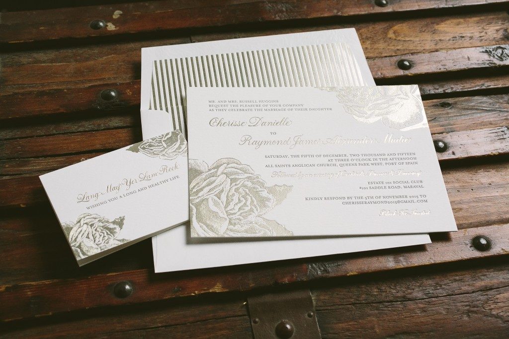
Our Leigha Spring design was the inspiration for Cherisse and Raymond’s rose wedding invitations. Our friends at di’zain loft limited worked with the couple to make some changes to the design – like adding Sarah Hanna’s hand calligraphy, changing the motif to a rose from our library and using tawny matte foil to highlight their cards and envelope liner. They used a well known Scottish phrase on their thank you cards, wishing their guests a long and healthy life.


letterpress ink: espresso | foil stamping: tawny matte | font: moravia | hand calligraphy: napa style | paper: bella cotton white 2-ply + 1-ply | envelope: bella cotton white | foil stamped liner: sullivan stripe pattern in tawny matte | di’zain loft limited | customization #28520
Isabella and her family worked with our friends at Dear Emily to create these neon Bat Mitzvah invitations based on our Avery design. Day-glo and hot pink inks combined to create a 3D effect on highlighted text, while charcoal ink added balance to the details. Hot pink edge painting on all cards and a sweet polka envelope liner added to the vibrant feel of the ensemble.


letterpress inks: hot pink + day-glo + charcoal | fonts: valuco + gotham + grace | paper: bella cotton white 2-ply + 1-ply | edge painting: hot pink | envelope: bella cotton white | liner: sweet polka pattern | | Dear Emily | customization #30565
We’re holding two special events at the Bella Figura Flagship Store later this month! Join us on Saturday, May 14th from 2-6pm to meet calligrapher Ted Clausen, sip champagne, and enjoy sweet treats from Madison Lee’s Cakes! We’ll be debuting our new Flora Collection, and Ted will be offering on-the-spot calligraphy, so you’ll have the chance to have your name or favorite phrase calligraphed on a keepsake card! Check out some of Ted’s beautiful work below for a preview of the cards. We’re also hosting a trunk show with Designer of the Month Brenda Fox and Client Coordinator Sarah Sadler on Wednesday, May 18th. In addition to sips and sweets, we’re offering a trunk show special at both events: buy 75 invitation sets or more and get 25 free!

We love Ted’s story on how he got started in calligraphy:
One of my earliest memories is of walking into my first grade classroom and seeing the letters of the alphabet hung above the blackboard, and thinking to myself ‘Oh, BOY, do we get to do THAT now!’ I was ecstatic! Throughout grade school my handwriting grade was the most important mark for me. I loved writing and everything about it. I studied other people’s handwriting and borrowed letters from them: I would take your ‘m’, his ‘w’, her ‘y’ and do them over and over until I liked them, and then change them to make them mine. I have been addicted to letters ever since.

When I was in high school a friend showed me a gift she had received from her brother: a series of Zen Buddhist stories written out in hand italic calligraphy. I remember asking her ‘What kind of printing press did your brother use to make this?’. She replied, ‘No, he wrote them out by hand’. Within two days I was on the phone to her brother’s teacher, the legendary Lloyd Reynolds in Portland, Oregon, to find out how I could learn to do ‘that fancy writing’.

I spent a number of years studying with a long list of impressive and generous teachers, including Lloyd Reynolds, Herman Zapf, J. Savaren, D. Dehn, and Donald Jackson, scribe to Her Majesty the Queen. I studied typeface design in this country and at the Kunstgewerbeschule in Basel, Switzerland. I worked for a number of years designing type before ultimately deciding to leave the ‘constructed letter’ in favor of the handwritten one. And that’s where I still am, still learning, still liking your ‘M’ better than mine, and still loving the act of watching that pen dance across the paper.

The store is located at 1031 Lexington Avenue (at 74th Street) in the Upper East Side of Manhattan. We hope to see you at the events — RSVP on Facebook today!
Allison and Ben sent these adorable letterpress birth announcements welcoming their son Benjamin. They worked with our friends at Charlotte’s, Inc. to choose a custom color that complimented Benjamin’s photo that we then used to print their announcement text and their sweet country gingham liner.


letterpress ink: pms 277 digital printing: cmyk | font: garamond | paper: bella smooth cotton white 1-ply | envelope: bella cotton white | digital liner: country gingham pattern in pms 277 | Charlotte’s, Inc. | customization #30125
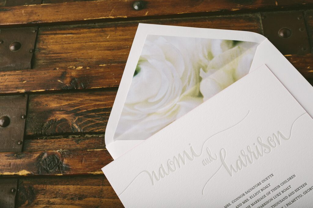
We are thrilled to finally be sharing a sneak peek at our new Flora Collection! These floral patterns were created earlier this spring in collaboration with Kate Ignatowski and Photosynthesis Floral Design, and will be available in stores and online very soon. We paired these pretty new patterns with some of our existing invitation designs to give you an idea of some of the new possibilities — take a look!


Our die-cut Elliotte calligraphy wedding invitations by Elizabeth Hardin feature olive letterpress ink on our white cotton paper and pair beautifully with our soft yellow and white Flora pattern #8.

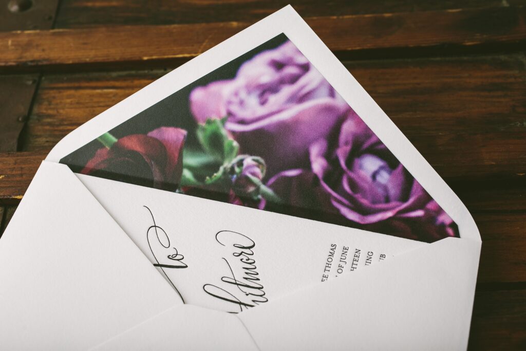
The modern Belperron design by Kelle McCarter is printed in classic black ink and includes oversized hand calligraphy accents— we love how it looks with the dramatic, deep purple Flora liner #46.

The soft gray color palette on one of our best-selling designs, Colette, pairs perfectly with Flora pattern #2.

These new Flora patterns pair nicely with our ivory paper, too! Leyton, a modern classic by Amy Graham Stigler from our 2016 collection, is printed in tawny matte foil on our ivory paper — we matched it up with Flora pattern #10 for an English garden feel.

We paired Splash, a modern letterpress wedding invitation from our 2016 collection, with Flora pattern #7.

Hadley, another new suite from Amy Graham Stigler, looks stunning next to the deep purple roses in Flora pattern #9.

The playful calligraphy accents from Elizabeth Hardin on our Madison Chic suite complement the light, feminine flowers in Flora pattern #3.

And last but not least – how pretty is our light peach ink next to Flora pattern #13?! We love the Southern charm of our Calligraphy Monogram design next to this soft peach rose!
May Designer of the Month Brenda Fox reimagined her Chalkboard design for these vintage inspired Bar Mitzvah invitations. A masculine color palette, bold, sophisticated type and dramatic design elements transform this design into an elegant invitation perfect for any swanky, vintage inspired party.

Designer Brenda Fox is May’s Designer of the Month – be sure and check out her other designs and save 10% through May 31st!
chalkboard customization | foil stamping: copper shine | digital inks: black + hunter + hunter at 60% | font: gotham | paper: bella smooth cotton white 1-ply | hand calligraphy: mitty style | foil stamped + digital liner: sullivan stripes pattern in copper shine + classic color pattern in black | original design + customization by in-house designer Brenda Fox
vintage car | typewriter | copper tiles
Our friends at Elizabeth Grace helped Nikhil and Chelsea customize these Indian wedding invitations for their Chicago wedding. Their traditional palette of wine ink and gold matte foil paid homage to the Indian customs practiced at the wedding while Debi Zeinert‘s hand calligraphy was used to accent standout text on their customization of our Darjeeling design.


letterpress ink: wine | foil stamping: gold matte | font: garamond | hand calligraphy: revolution style | paper: bella cotton ivory 1-ply | Elizabeth Grace | customization #29930
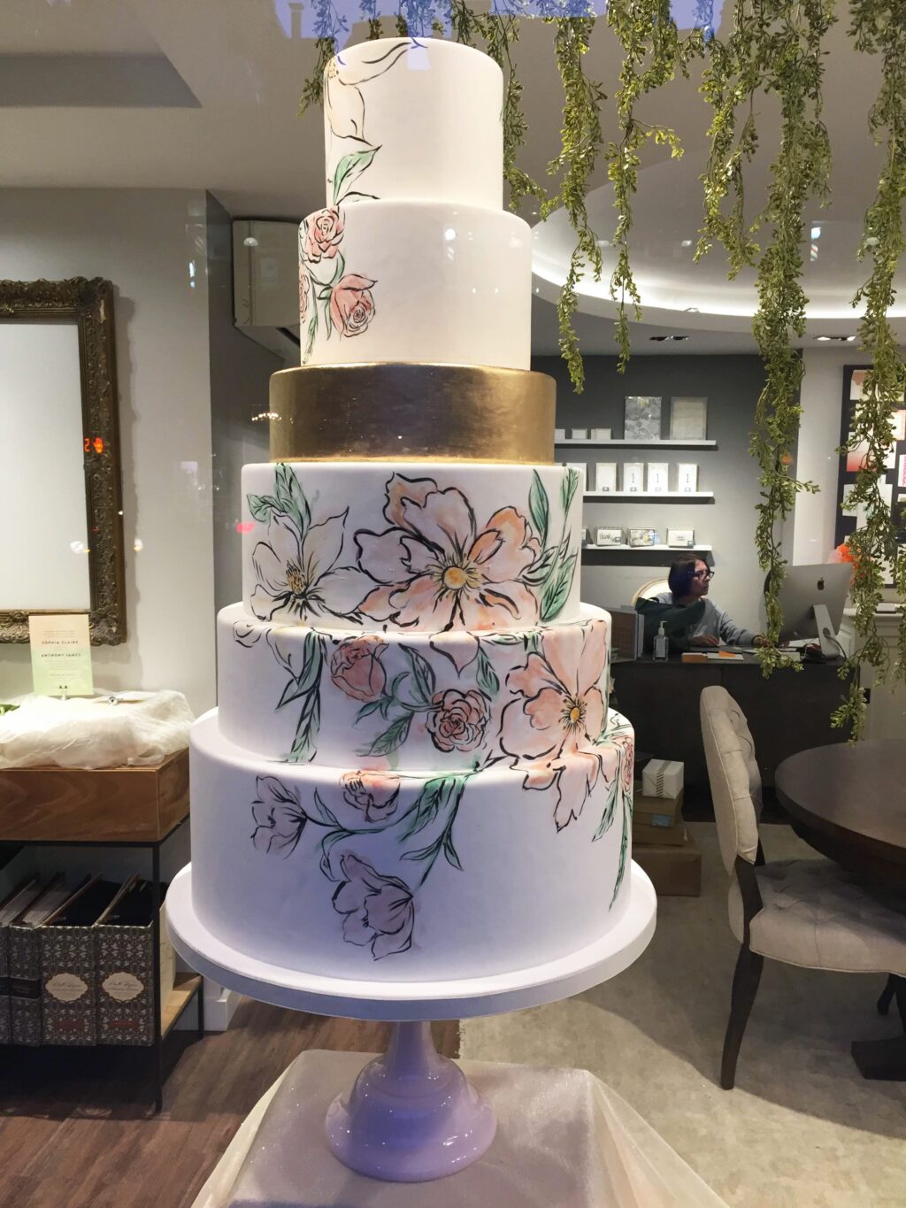
If you’ve been by the Bella Figure flagship store recently, you’ve seen our sweet collaboration with Madison Lee’s Cakes: invitation inspired cakes! We worked with Madison to create a collection of cakes inspired by some of our invitations, opting for a few modern styles for one half of the window, and a selection of floral designs for the other. Madison recreated our English Garden design by Chelsea Petaja in cake form with hand painted watercolor florals that look just like the invitation! Our Adele design by Ellie Snow inspired a second cake, with handmade sugar flowers adorning the top and piped gold florals cascading down the sides.


The more modern side of the window features our geometric Briolette design by Ellie Snow, our on-trend, marbled Onyx design by Jamie Lea Bertsch, and our ever-popular confetti inspired Joie de Vivre by Kamal. The Joie de Vivre cake includes hundreds of hand cut, hand painted gold sugar confetti pieces!


And last, but certainly not least, our entryway display! Madison created a petite cake modeled after the sea-side Vincent customization we created for the spring 2016 issue of New York Weddings magazine, with a watercolor effect and splashes of metallic gold.

Interested in seeing the cakes in person? Visit our flagship store in New York City from now through May 20th! The shop is open every day from 11am – 7pm and is located at 1031 Lexington Avenue (at 74th Street).
Cathleen and Robert worked with our friends at Urbanic Paper Boutique to customize our Shore design for their Southern California wedding. They opted for more traditional fonts and used tawny matte foil to highlight their names and wedding venue on the invitation. A metallic white gold envelope liner added a hint of glamor to these ocean inspired watercolor wedding invitations.


foil stamping: tawny matte | digital inks: aquamarine + black | fonts: danube + impression | paper: bella smooth cotton 1-ply white | edge painting: surf | envelope: bella cotton white | metallic liner: white gold | Urbanic Paper Boutique | customization #29808
Our May designer of the month is Brenda Fox! Right now, all of her designs are on sale for 10% off – order any piece, like custom invitations, save the dates, or social stationery, and you’ll save 10% on your entire order. As always, this promotion can be combined with our 6+ printed pieces discount, so you can save an additional 10% when you order six printed pieces or more (check out this post for some ideas). Brenda is an amazing illustrator, and her incredible pen and ink style comes through on many of her designs. Cool, modern fonts are a common theme on Brenda’s designs as well – be sure to check out her entire collection today!


The fine print: this offer is exclusive to designs by Brenda Fox and does not apply towards the purchase of other designs. Discount is applied automatically – no code required. Orders must be placed by 11:59pm Eastern on May 31, 2016 in order to receive this offer.
We amplified the elegance of the original Vincent design with a rich color palette of jade, black and copper shine foil. The hand painted background and Kelle McCarter’s unique calligraphy accents make an eye catching statement especially when paired with these opulent jewel tones – all setting the stage for a stately wedding filled with old fashioned gilded glamour.

Vincent customization | foil stamping: copper shine | digital inks: black + jade | font: garamond | paper: white | invite size: F-8 | liner: classic color pattern in black | hand calligraphy accents: mulberry style | original design by Chelsea Petaja | customization by in-house designer Jessica Tierney
table | bouquet | bridal party


