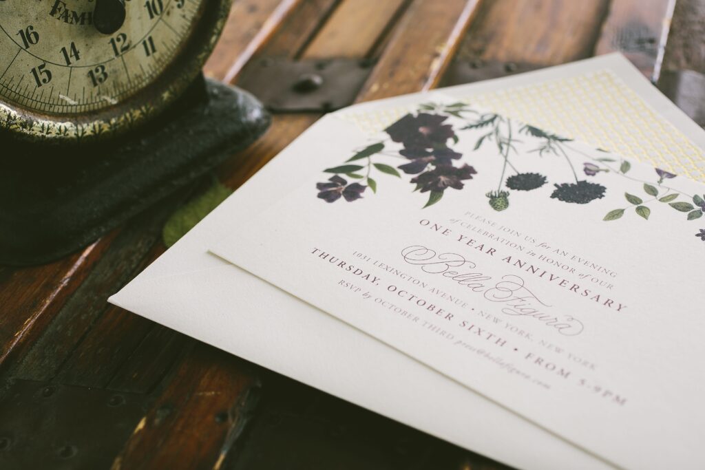
The Bella Figura flagship store in New York City is celebrating its 1-year anniversary in October, and we’d like to invite you to celebrate! Join us on Thursday, October 6 from 5-9pm for an evening of celebration and be among the first to preview our 2017 collection. You can also enter to win our in-store raffle for a chance to win over $7,000 in prizes! If you can’t make it to the party, don’t worry – we’re running the in-store raffle all month long, and in November we’ll select 1 lucky winner to receive an amazing range of prizes (see below for details!). We’ll also be offering a trunk show special from October 6-20 – buy 75 invitation sets or more, get 25 sets free. Our flagship store is located in the Upper East Side of Manhattan at 1031 Lexington Avenue (at 74th Street) – book an appointment at the store today!

The Bella Figura 1-year Anniversary Grand Prize will contain the following:
Many thanks to our friends at Twirl New York for partnering with us on this event!
No purchase necessary to enter. Must enter in-person at the Bella Figura flagship store, located at 1031 Lexington Avenue (at 74th Street) in New York City. Enter by November 1, 2016 to be included in the drawing. (1) grand prize winner will be selected at random and notified by email by November 18, 2016. Grand prize is non-transferable.
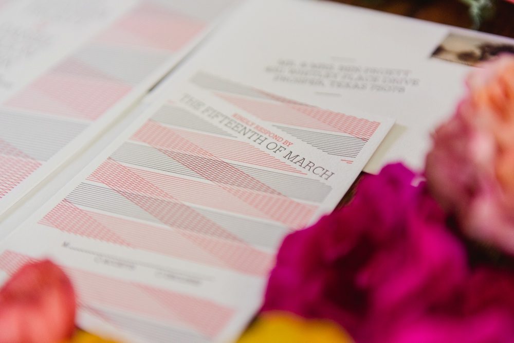
We printed these black and gold wedding invitations for Kimberly and Daniel’s Miami Beach wedding. Our friends at Papery and Cakery helped them customize our Joie de Vivre design with hand calligraphy, a contemporary layout and custom fuchsia envelopes that perfectly matched the painted edges of their cards. A chevron envelope liner printed in gold shine foil and cute bow ties on their menu provided touches of festive fun.


letterpress ink: black | foil stamping: gold shine | font: streamline | hand calligraphy style: victoria | paper: bella smooth cotton white 2-ply | edge painting: fuchsia | envelopes: supplied | foil stamped liner: classic chevron pattern in gold shine | Papery and Cakery | customization #31767
Save
Save
We worked with our friends at Ipanema Press on the design and printing of these Damask wedding invitations for a winter wedding at Oheka Castle. Brittany and Nicholas chose a crisp palette of black letterpress and gold matte foil and used blind deboss to highlight the damask pattern. Ipanema Press supplied the monogram and silhouette of Oheka Castle that we incorporated into the suite as well as the gold shimmer paper for the envelope liners. The romantic script font was carried throughout the suite, including their digitally addressed envelopes.
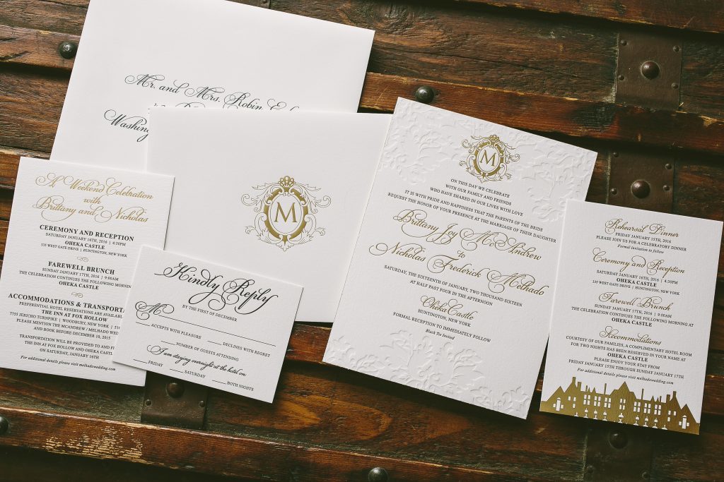
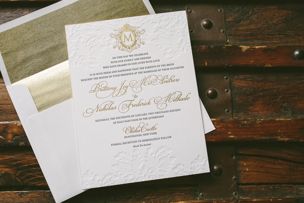

letterpress inks: black + blind deboss | foil stamping: gold matte | fonts: parisian + times new roman | paper: bella cotton white 1-ply + 2-ply | foil edging: gold matte | envelope: bella cotton white | liner: supplied | Ipanema Press | customization #30022
Bailey and Drew fell for our Nightingale design while looking for vineyard inspired wedding invitations at our flagship store in New York City. To give their suite a more elegant, less rustic feel they kept the artwork and typography simple and added Debi Zeinert’s hand calligraphy to highlight their names on the invitation. Digital guest addressing in matching charcoal ink made sure even their envelopes coordinated with the rest of their suite.


letterpress ink: charcoal | foil stamping: gold matte | paper: bella cotton white 1-ply + 2-ply | foil edging: gold matte | digital addressing ink: charcoal | Bella Figura NYC | customization #31782
Save
We loved spotting our Anais letterpress wedding invitations in the latest issue of Martha Stewart Weddings (see the feature here), so today we’re sharing close-ups of the entire invitation suite that we created for Tara and Dan. We collaborated with Jennifer at Invited to create the set, which included letterpress save the dates, invitations, and reply cards in watermelon and taupe inks on our white cotton paper. Coordinating envelopes were printed for each piece, including inner and outer envelopes for the invitations (which also featured taupe envelope liners and hand calligraphy by Butler’s Pantry). To carry their stationery style through to the wedding day, Tara and Dan created an amazing string art escort card display that mimicked both the invitation design and color palette! Visit Martha Stewart Weddings to see more of their modern wedding day details!


Photographs by Shaun Menary Photography courtesy of Invited.
Today we’re sharing a romantic real wedding that took place earlier this month at the beautiful Inn at Barley Sheaf Farm! Jaclyn and Camilo worked with the team at our flagship store to create their calligraphy wedding invitations, which featured our Gournay design by Kelle McCarter customized with hand calligraphy accents by Debi Zeinert. Debi also hand calligraphed their invitation envelopes to match! Pink details (including the rose gold foil highlights on their invitations) were used throughout the entire wedding, from the pale pink bridesmaid dresses and flower bouquets to their elaborate floral cake and centerpieces! Here are a few of our favorites from this real wedding, but check out Love & Light for the full feature!


Photographer: Love & Light Photographers | Venue: The Inn at Barley Sheaf Farm | Floral Design: Flowers By David | Invitations: Bella Figura | Hair: Mia Moore | Makeup: Kathy Genchi | DJ : NY Edge | Cinematography: Hart to Heart Media | Cake: My Daughter’s Cakes
We worked with Nate and his family on these typography Bar Mitzvah invitations based on our Irving design. They chose a rectangular shape and a bold palette of prussian blue and clover along with our vintage stripes pattern liner in the invitation and thank you envelopes.


letterpress inks: prussian blue + clover | font: didot | paper: bella cotton white 2-ply + 1-ply | edge painting: prussian blue | envelope: bella cotton white | liner: vintage stripes pattern in prussian blue | customization #28366
Save
Earlier this spring we teamed up with Olli Studios on an incredible pastel inspiration shoot, which was featured recently on both Style Me Pretty and ModWedding! Inspired by the two Pantone colors of the year, Rose Quartz and Serenity, the shoot showcased a spectrum of design elements in varying shades of pastel blue and pink — including a stunning blue wedding gown! We also couldn’t get enough of the florals intertwined throughout the spread of desserts on the sweets table. To help set the tone for the shoot, we created additional pieces from our Vincent suite, including a custom envelope liner, menus, and place cards printed with a pale wash of digitally printed persimmon ink. Kelle McCarter hand calligraphed place cards and envelopes to match, adding the perfect finishing touch to the set. Take a look at some of our favorite shots (including several in front of the iconic New York Public Library!), but be sure to head over to Style Me Pretty to see more photos from the shoot!


Photography: OLLI STUDIO | Dress: Carol Hannah | Cake: Cake Alchemy | Stationery: Bella Figura | Engagement Ring: Cosh NYC | Hair & Makeup: Beautini | Transportation : FilmCars | Wedding Venue: Punto Space | Bouquet: Julia Testa | Bridal Accessories:Untamed | Bridesmaid Dresses: Two Birds Bridesmaids | Donuts: Keyhole Donuts | Floral Design & Bouquet: Design By Ahn | Hair Pieces: Carol Hannah | Menswear: Indochino | Women’s Footwear: Alterre
Katelyn and Kevin chose our Duncan design as inspiration for their post-wedding letterpress personal stationery. We created a joint card using their last name as well as personalized cards for individual correspondence. Pointed flap envelopes lined in classic black were a simple and sophisticated addition.


letterpress ink: black | font: brandon | paper: bella cotton white 2-ply | edge painting: black | envelope: bella cotton white pointed flap | envelope liner: classic color pattern in black | customization #30941
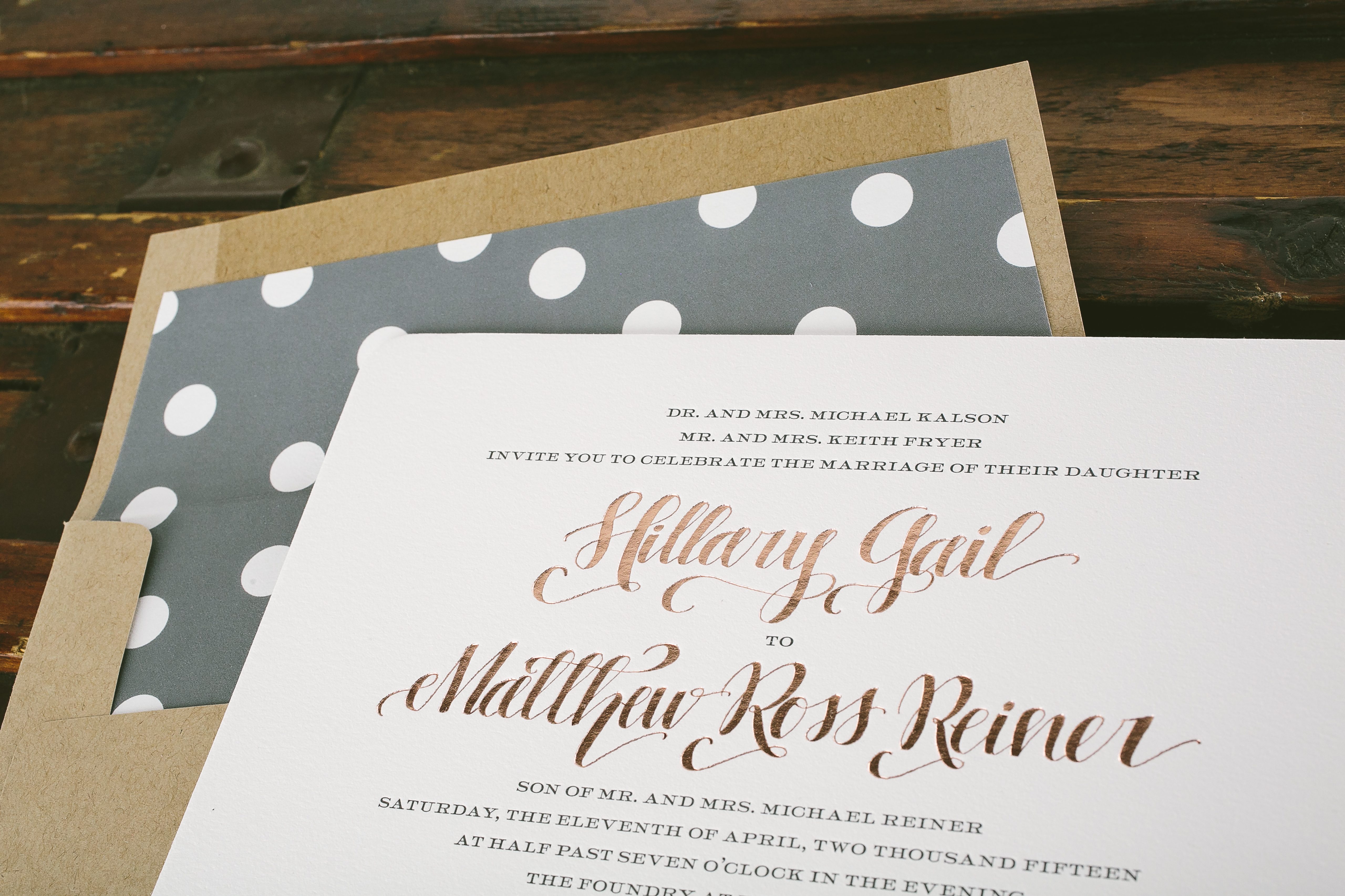
Hillary and Matthew chose rose gold and gray wedding invitations for their Atlanta wedding last spring, using our Eleanor design as inspiration. They let Elizabeth Hardin‘s hand calligraphy take center stage, complimenting with a simple font, jute envelopes and a sweet, oversized polka dot liner. Mad lib language on their reply cards was a fun, unexpected personalization.


letterpress ink: charcoal | foil stamping: rose gold shine | font: impression | hand calligraphy: carlisle style | paper: bella cotton white 2-ply + 1-ply | rounded corners | envelope: jute | envelope liner: custom pattern in charcoal | Jenny’s Paper, Ink | customization #25693
Madeline and Edwin came to us for bilingual wedding invitations for their Mexico destination wedding. The playful and carefree vibe of our Surfside design complimented their seaside venue The Fairmont Mayakoba (known as the Venice of the Caribbean!). They printed two sets of their invitations – one in English and one in Spanish – and included reply sets and accommodations cards with both.


letterpress inks: coral + pewter | paper: bella cotton white 1-ply | fonts: surfside + bergamot | envelopes: bella cotton white | customization #27358
Galen and Matthew customized our Astoria design for their Maine wedding, opting for a less formal color palette and more whimsical type treatment. These watercolor wedding invitations were digitally printed in spring green ink with navy letterpress on our Bella Smooth Cotton paper. A coordinating navy envelope liner tied the whole set together.


letterpress ink: navy | digital inks: spring green + navy | fonts: moderno + herald + nib | paper: bella smooth cotton white 1-ply | envelope: bella cotton white | envelope liner: classic color in navy | Gus & Ruby Letterpress | customization #27198