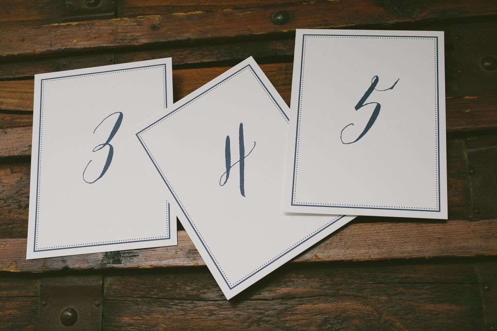
Personalized place cards, escort cards and table numbers are yet another way to use your stationery to express your wedding style. Let us digitally print your guests’ names, table numbers or both on your reception pieces to showcase your stationery design, colors and fonts throughout your event.
We printed these flat escort cards and table numbers in navy digital ink, using our Gus design as inspiration.


Since digital printing allows you to print in multiple colors it is a great way to designate meal choices in a subtle way – as seen here on these folded place cards inspired by our Briolette design.

Along with all of our 325+ designs, Jorie can be customized to create floral wedding invitations for any style event. Here are a few ways our couples have made this design their own:
Diana and Simon chose our ivory cotton paper to soften their palette of rose gold foil and taupe. Sarah Hanna’s hand calligraphy added an elegant formality to important text on the invitation and additional suite pieces.

Lauren and Daniel opted for a more modern presentation by using the floral artwork as a border printed in pale gray. Copper shine foil and Debi Zeinert’s hand calligraphy gave the design a contemporary yet still classic feel.

Meaghan and Peter chose a modern layout with the floral artwork printed in inkless blind deboss and the text in rose gold foil. Vine ink was used on the accessory pieces and tied in the custom envelope liner that incorporated more of the Jorie florals.

Tiffany and Andrew also printed the floral artwork in inkless blind deboss but used it to frame their text that was printed in gold matte. They used one of our vintage print floral liners to add romance and color to the otherwise neutral invitation.

Anna and Jason kept the layout the same but chose a palette of pewter and dusty pink that complemented the simple hand drawn look of the floral artwork. They carried their palette throughout the suite that included an accommodations card, thank you cards and menu.

Thanks to our friends at RSVP Today, Paper Place, Pulp and Ink, Village Invites and Invitations & Company for helping these couples customize our Jorie design for their weddings!
Save
Using a palette of gold matte foil, desert letterpress ink and a custom pink watercolor, Lauren and Jeffrey transformed our Wreath Crest design for their Boca Raton wedding. Gold foil was incorporated into the hand drawn crest and highlighted their names and custom monogram from Nicole Black. The custom pink watercolor accented their save the date and was used again on the reply card and envelope liner to tie the whole suite together. Many thanks to our friends at Windmill Paper Boutique for helping us create these pink and gold wedding invitations!


letterpress ink: desert | foil stamping: gold matte | digital ink: cmyk | fonts: aster + gill | hand calligraphy monogram: custom style by Nicole Black | paper: bella smooth cotton white 1-ply + 2-ply | edge painting: british rose | envelope: bella cotton white | liner: custom watercolor in cmyk | Windmill Paper Boutique | customization #30507
Emily and Peter chose gold matte foil for their text and a pale purple watercolor as the background of their invitation but made their accessory pieces pop with the artwork from our Blossom design in custom shades of purple, blue and green. Many thanks to our friends at Magnificent Milestones for these lovely pastel floral wedding invitations!


foil stamping: gold matte | digital inks: amethyst + cmyk | fonts: keeva + pike | paper: bella smooth cotton white 1-ply | Magnificent Milestones | customization #33579
Save
To celebrate Arkansas Bride’s 25 year anniversary, our friends at The Social Type helped customize our Modern Lumen design to create these starry night invitations in black and silver foil. Debi Zeinert’s hand calligraphy highlighted the details and added elegance to the ultra modern design.


foil stamping: silver matte | digital ink: black | hand calligraphy: paisley style | paper: bella smooth cotton white 1-ply | envelope: bella cotton white pointed flap | liner: modern lumen design in black | The Social Type | customization #34229
We’re looking for a passionate individual that shares our enthusiasm for paper, printing, and the creation of beautiful things. Be a part of the exceptional team devoted to clients in our flagship store in New York City.
In addition to providing a personal shopping experience for our clients, the ideal candidate will be a detail-oriented brand ambassador, preferably with stationery or design background and will help the store maintain a polished appearance. Other responsibilities include assistance with visual displays, inventory management and replenishment, and after sales service. Check out all the details and apply today!

We have our friends at Menage Fine Stationery & Gifts to thank for these gold foil bohemian wedding invitations that we printed for Kelle and Joshua’s Memphis wedding. The artwork and typesetting was supplied to us; we added our charleston diecut shape and our petite dot envelope liner for just a hint of playful pattern.


foil stamping: gold matte | digital inks: cmyk | fonts: rivia upright + avenir | paper: bella smooth cotton 1-ply + duplexed 2-ply ivory | diecut shape: charleston | envelope: bella cotton ivory | liner: petite dot pattern in vine | Menage Fine Stationery & Gifts | customization #34304
Along with our friends at Note Bene, we helped Alexa and Joseph turn our Meryl design into rustic gold foil wedding invitations for their autumn wedding. They kept the overall look simple by printing only in gold matte foil with the exception of their website card that was printed in charcoal letterpress. All of their pieces were edge painted in charcoal while Elizabeth Hardin’s hand calligraphy highlighted their names and other standout text.


letterpress ink: charcoal | foil stamping: gold matte | font: holden | hand calligraphy: carlisle style | paper: bella cotton white 2-ply | edge painting: charcoal | envelope: bella cotton white | foil stamped liner: petite dot pattern in gold matte | Note Bene | customization #33935
When your photographic envelope liner showcases an impressive view of the Appalachian Mountains you can keep the rest of your suite pretty minimal and still have an impressive presentation. That’s just what Mackenzie and Patrick did with their hand calligraphy wedding invitations, using Nicole Black’s whimsical lettering and a sweet pine sprig motif printed in a palette that tied back to their stunning liner. Many thanks to our friends at The Write Touch!


letterpress inks: pewter + chartreuse | hand calligraphy: hayden style | paper: bella cotton white 1-ply + 2-ply | envelope: bella white | liner: custom | The Write Touch | customization #31539
One of the biggest trends of 2016 is perfectly illustrated in this custom design we created for Margaret and Brett – classically elegant invitations with fun/bright/colorful envelope liners and accessory pieces. These palm-inspired wedding invitations from our friends at Magnificent Milestones were formal and polished in gold matte foil while the reception card featured the custom palm pattern from the envelope liner. This suite happens to showcase another top trend – location/event specific icons on events cards. How fun are the mini golf clubs and tennis racket?


letterpress ink: vine | foil stamping: gold matte | digital inks: spring green + sea-side + jade + whisper | fonts: moravia + parisian | paper: bella cotton white 2-ply + bella smooth cotton white 1-ply | edge painting: vine | envelope: bella cotton white | liner: custom palm pattern | Magnificent Milestones | customization #32008
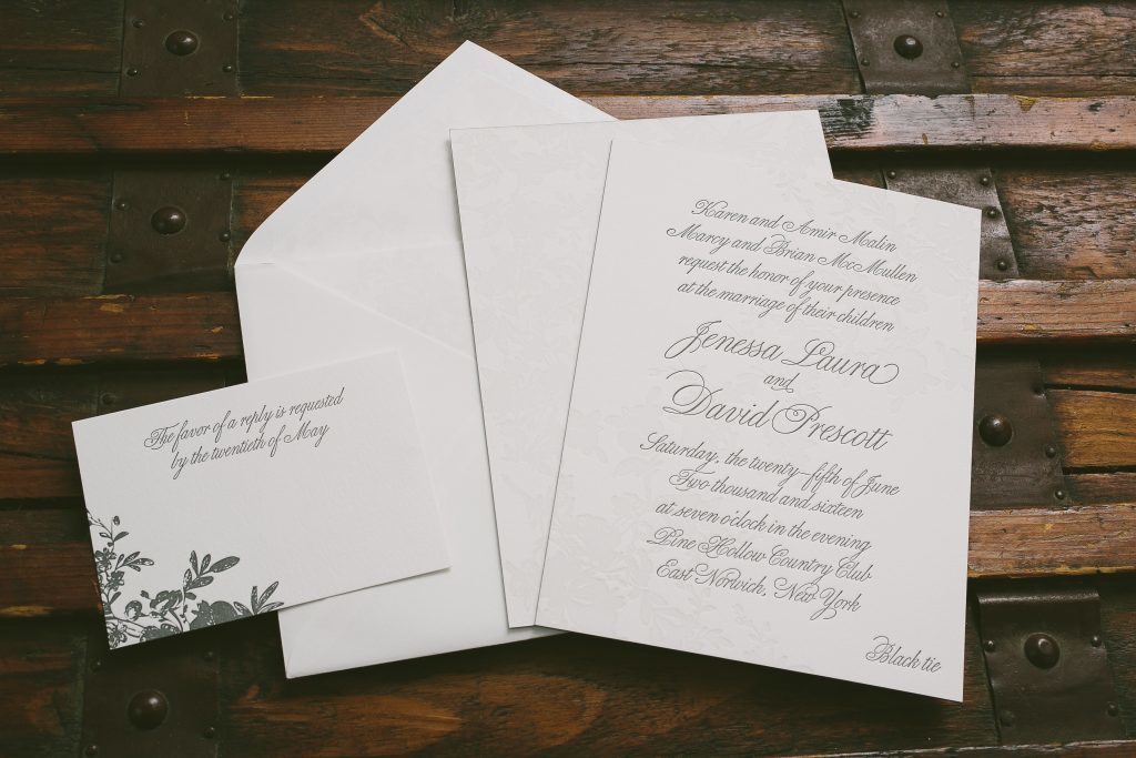
Jenessa and David worked with our friends at Phantastic Papers to transform our Vendage design into vintage botanical wedding invitations for their summer celebration. We used a custom pale gray ink to letterpress print the barely-there floral pattern on the front and the back of the invitation and charcoal ink for the romantic script font used throughout the suite.


letterpress inks: custom pale gray + charcoal | font: portofino | paper: bella cotton white 1-ply + 2-ply | envelope: bella cotton white pointed flap | liner: elegant garden pattern in custom pale gray | Phantastic Papers | customization #30377
Even with our extensive motif library, some couples find inspiration in our patterns and ask us to incorporate elements from them into their stationery. For Elizabeth and Scott’s wedding invitations, we created a frame for their initials from our chic combs pattern and printed in a color palette of copper foil and pool and raspberry letterpress inks. Many thanks to our friends at Seaside Papery for helping us create these chic, contemporary wedding invitations!


letterpress inks: pool + raspberry | foil stamping: copper shine | fonts: aster + serlio | paper: bella cotton 1-ply + 2-ply | foil edging: copper shine | envelope: bella cotton white | liner: chic combs pattern in pool + raspberry | Seaside Papery | customization #34302


