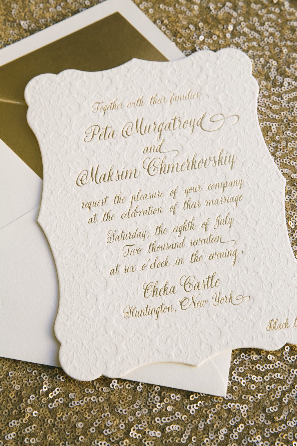
We were honored to work with Peta Murgatroyd and Maksim Chmerkovskiy to create these luxe custom wedding invitations for their July celebration at Oheka Castle. The Dancing with the Stars duo let their elegant venue inspire their invitations, which featured our Charleston die-cut shape and blind debossed damask patterning. Peta and Maks chose a romantic script font for their text, which we printed in gold matte foil on our ultra thick 2-ply ivory cotton paper. We printed reply cards, Shabbat Dinner cards, and a farewell pool party invitation on our 1-ply ivory cotton paper to round out the suite. Many thanks to Maks and Peta for choosing us to help set the tone for their beautiful big day – it was an honor to be a part of this star-studded wedding!


We worked with Lauren at The Write Image to create a custom take on our Natura suite for a feature in the Summer / Fall 2017 issue of Salt Lake / Park City Bride and Groom Magazine. We digitally printed the suite (which included invitations, reply cards, and menus) in our umber ink on our ivory smooth cotton paper and paired the invitations with a Dutch painting inspired vintage print patterned envelope liner to fit with the overall vision for the shoot, which turned out beautifully! From the paper goods to the flowers, venue, and even the cake, the entire shoot was carefully crafted and every detail blended together seamlessly. Many thanks to The Write Image for partnering with us for the paper goods on this beautiful photoshoot!


To celebrate their joint birthdays in style, Robin and Brian hosted a weekend long celebration in Cabo San Lucas. Our friends at Union Street Papery helped them create these tropical birthday invitations using our Olvera design as inspiration. They incorporated island-inspired motifs like palm leaves, anchors, pineapples, and sunglasses, and used our handpainted watercolor pattern to carry the beachy theme throughout the suite.


letterpress ink: black | digital inks: yolk + papaya + aquamarine + garden + black | fonts: champagne & limousines + anna clara | paper: bella smooth cotton white 1-ply | pocketfold [interior]: garden | [exterior]: cmyk | envelope: bella cotton white | digital liner: cortes pattern in yolk + papaya | Union Street Papery | customization #38777
Our wedding invitation designs can be customized to suit any event, including corporate gatherings. Our friends at Events helped create these corporate anniversary invitations based on our Townsend design using colors that coordinated with the company’s branding. The simple, formal feel of the design was complemented by modern touches like geometric envelope liners printed in the same pattern but different print methods.


letterpress inks: navy + fog | foil stamping: silver shine | fonts: fresco + holden | paper: bella cotton white 1-ply + 2-ply | envelope: bella cotton white | digital liner [save the date]: hector pattern in navy | foil stamped liner [invitation]: hector pattern in silver shine | Events | customization #37530 + #37946
Save
Using a dark and moody color palette and the night sky as inspiration, we transformed our Sloan design into planetarium inspired wedding invitations fit for a minimalist glam celebration.

foil stamping: silver matte | digital ink: CMYK | fonts: beloved script + brown | paper: bella smooth cotton white | invite size: SQ-7 | digital liner: marble 5 pattern in blackberry | original design by Brenda Fox | customization by in-house designer Andrea Streeter
photos
Anne and Christopher worked with our flagship store in Manhattan on the design of their gold monogram wedding invitations based on our Ophelia design. Navy letterpress ink and gold matte foil were paired with casual typography and a solid gold envelope for a chic yet relaxed look.


letterpress ink: navy | foil stamping: gold matte | font: caleigh | paper: bella cotton white 1-ply + 2-ply | foil edging: gold matte | envelope: bella cotton white pointed flap | foil stamped liner: classic color pattern in gold matte | Bella Figura NYC | customization #37372
Our friends at The Papery of Philadelphia helped Lauren and Kenneth create their vintage typography wedding invitations based on our Abigail design. A palette of espresso and bronze foil, maritime motifs, and a cheeky quote from Captain Jack Sparrow set the tone for their unique reception on The Moshulu, a square-rigged sailing ship docked in Philadelphia.


letterpress ink: espresso | foil stamping: bronze shine | fonts: era + impression | paper: bella cotton ivory 1-ply | diecut: lincoln style | envelope: bella cotton ivory | liner: philadelphia map pattern in taupe + custom background | The Papery of Philadelphia | customization #37839
Katie and Jayson worked with our friends at Shindig Paperie to create these foil stamped watercolor wedding invitations for their Florida wedding. Our Glamorous Swash design in a soft palette of sea mist and rose gold foil was used throughout their stationery suite, from their invitations and reply cards to their rehearsal dinner invites and ceremony programs. They chose our Bradley design for their ‘happily ever after celebration” in Arkansas the following month, using the same palette and hand calligraphy seen throughout both suites.


foil stamping: rose gold shine | digital ink: sea mist | font: linotype dicot | hand calligraphy: spencerian style | paper: bella smooth cotton white 1-ply | envelope: bella cotton white | foil stamped liner: classic color pattern in rose gold |
Alana and Jake chose our Sierra design for their recent New England wedding. A warm palette of hunter and copper foil and an elegant floral envelope liner paid homage to the stunning backdrop of the Berkshires. Many thanks to our friends at Samantha Scott Events!


letterpress ink: hunter | foil stamping: copper matte | fonts: nave + natura | paper: bella cotton ivory 1-ply | envelope: bella cotton ivory pointed flap | liner: tristan pattern in hunter | Samantha Scott Events | customization #36883
The latest issue of Weddings in Houston magazine features a variety of popular wedding trends for 2017, and we were thrilled to spot our Katerina wedding invitations by Leslie Johnston in their “Finer Details: Invitations & Favors” section! Katerina is a sophisticated floral design filled with lush greenery and white florals accented by tawny matte foil. Many thanks to Weddings in Houston for the feature!


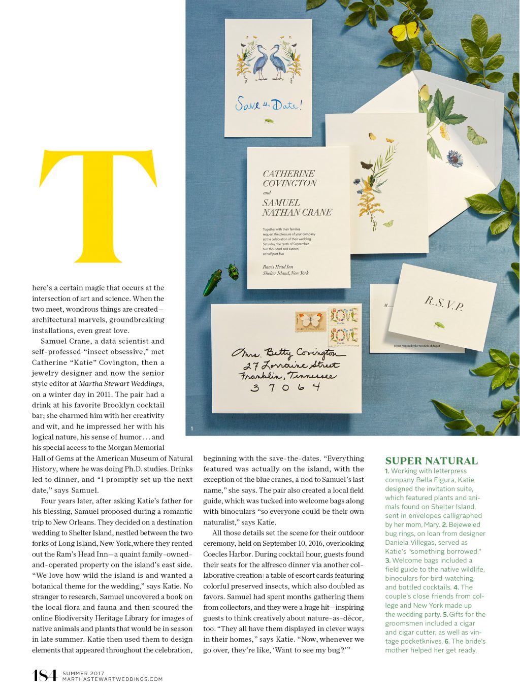
It’s always special to be featured in an issue of Martha Stewart Weddings magazine, but when the real wedding feature happens to be for an editor of the magazine? Well, that’s just the icing on the cake. We were thrilled to work with Katie on the invitations for her Shelter Island wedding last September. Katie and her husband Samuel chose a botanical theme for their wedding to reflect the wild nature of the island, and included a variety of flora and fauna motifs featuring native animals and plants that would be in season in late summer. Katie shared that “everything featured was actually on the island, with the exception of the blue cranes, a nod to Samuel’s last name.” For the invitation suite, we letterpress printed the invitations and reply cards, and digitally printed the back of each card to include vintage artwork featuring insects and leafy botanicals. Katie’s mother calligraphed the invitation envelopes, which featured a vintage floral print envelope liner and vintage postage stamps. To read more about Katie and Samuel’s Shelter Island wedding, be sure to head over to Martha Stewart Weddings, or pick up the summer 2017 issue!


