To celebrate Anthi and her new baby, friends mailed these woodland baby shower invitations based on our Sherwood design. A neutral palette of hunter and fawn letterpress inks highlighted the sweet illustrations while a woodgrain envelope liner carried through the forest inspiration.
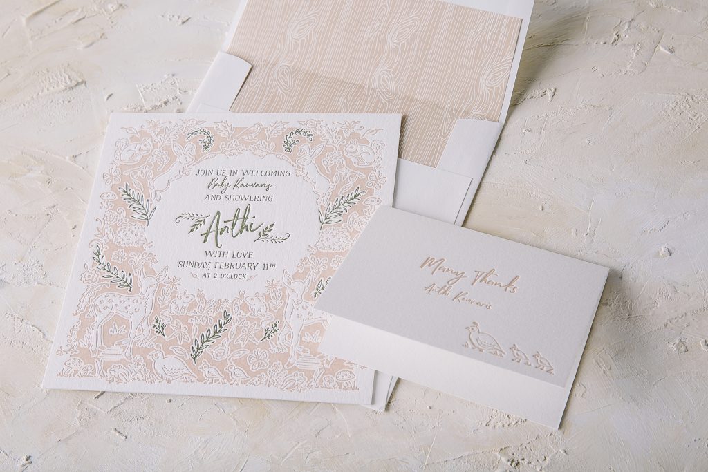


letterpress inks: hunter + fawn | paper: bella cotton white 1-ply + 2-ply | envelope: bella cotton white | liner: natural woodgrain pattern in fawn | customization #41856

Designer Lindsy Talarico draws inspiration from unexpected places, and her vision for Pomona is no exception. “As a fan of all things Harry Potter, I was inspired by Pomona Sprout, the Herbology professor at Hogwarts. I love her mystical, earthy nature and the overall look of the Harry Potter film sets. Beyond the whimsy and magic, there is something quite sophisticated about it all. I think the greenery and whimsical calligraphy style on this invitation represent a bit of that.”

boutonniere | bouquet | alter | rings | cake | maids | table | favors | herbs
Rebecca and Mario customized our Nightfall design for their recent Palm Beach wedding. Our friends at Sweet Paper helped them personalize their suite with our Bella Blue paper and our palm motif used sparingly throughout the suite.


foil stamping: gold matte | letterpress ink: prussian blue | paper: bella blue 1-ply + bella smooth cotton ivory 1-ply | envelope: bella blue | foil stamped line: traditional palm pattern in gold matte | customization #41455
When asked to contribute to a feature for Money magazine about the cost of Prince Harry and Meghan Markle’s wedding invitations, we were more than happy to chime in! 600 guests were lucky enough to receive an invitation to the royal wedding. For those who received one of these beauties in the mail, they opened their envelopes to find a die-stamped invitation burnished in gold with black text, containing beveled and gilded edges. Space was left purposefully for their calligrapher to handwrite guest names once printed. These invitations are the definition of elegance and no expense was spared to achieve that look.
If you are looking to recreate a royal replica, that’s certainly something we can do with our engraving printing process. Whenever someone thinks of engraving, they think of tradition and refined luxury. These type of invitations are typically typographically based with ornate script adorning the card – similar to the look of Prince Harry and Meghan’s wedding invitation!
If you are loving the vibe of their invitation, but are not so keen on the cost, there are always other options available to you. We can achieve the same kind of look through letterpress and foil stamping as an alternative to engraving. It’s easy enough to keep the elegant integrity of Harry and Meghan’s design, but instead of raised ink, the ink would be pressed into the beautiful paper. This kind of printing is equally as lovely, but allows for even more design experimentation should you want to add any whimsy to a more formal set that engraving might not allow for.
Below you will find some designs that ring true to the feel of the royal couple’s wedding invitation, while we’ve also included designs that add a more modern twist to a more formal layout. We hope this sparks some ideas for those who are inspired by the royal wedding to come this May!
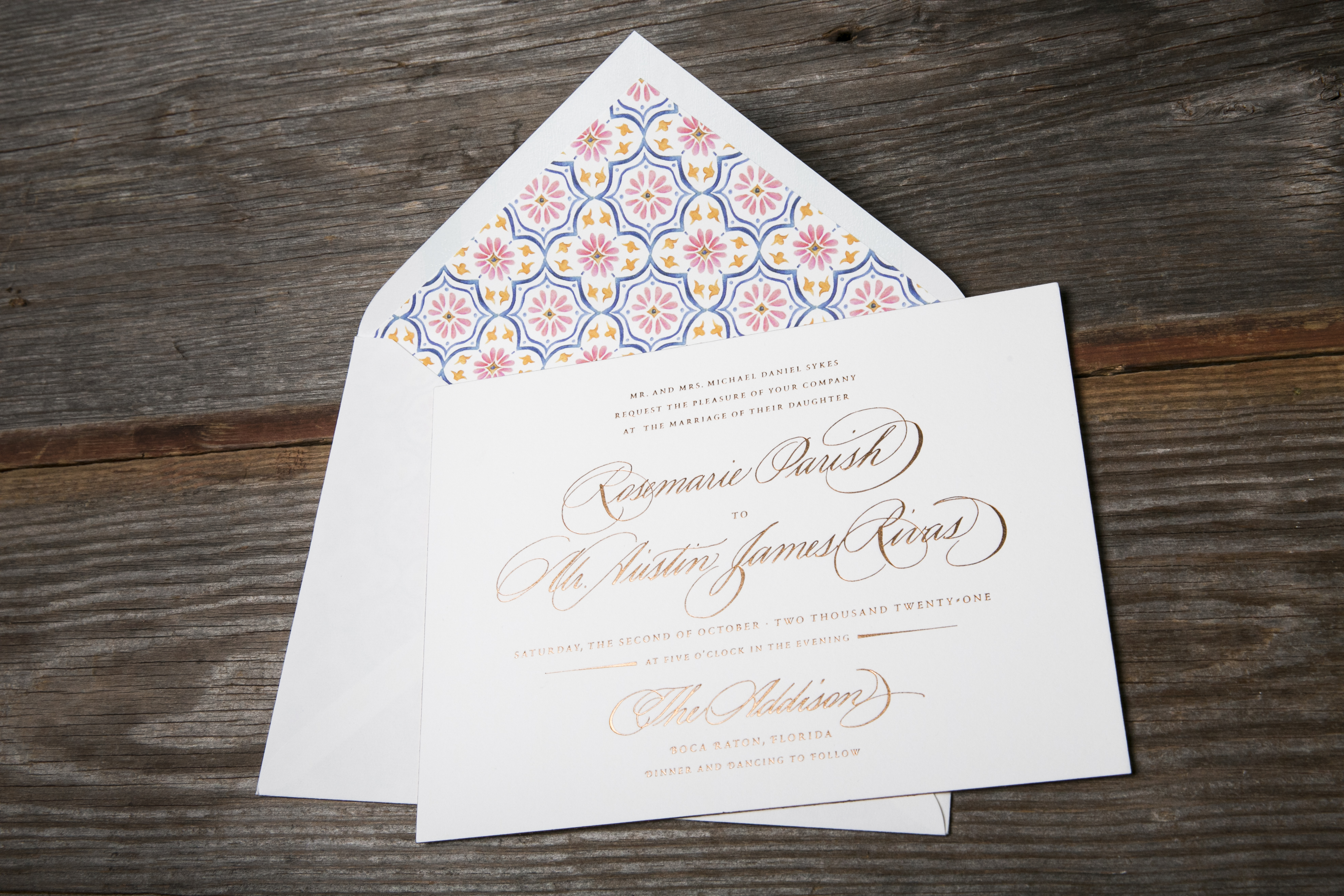 Our Morocco design is carried horizontally like Harry and Meghan’s, featuring Partial Flourish hand calligraphy accents by Ted Clausen for an extra touch of luxury.
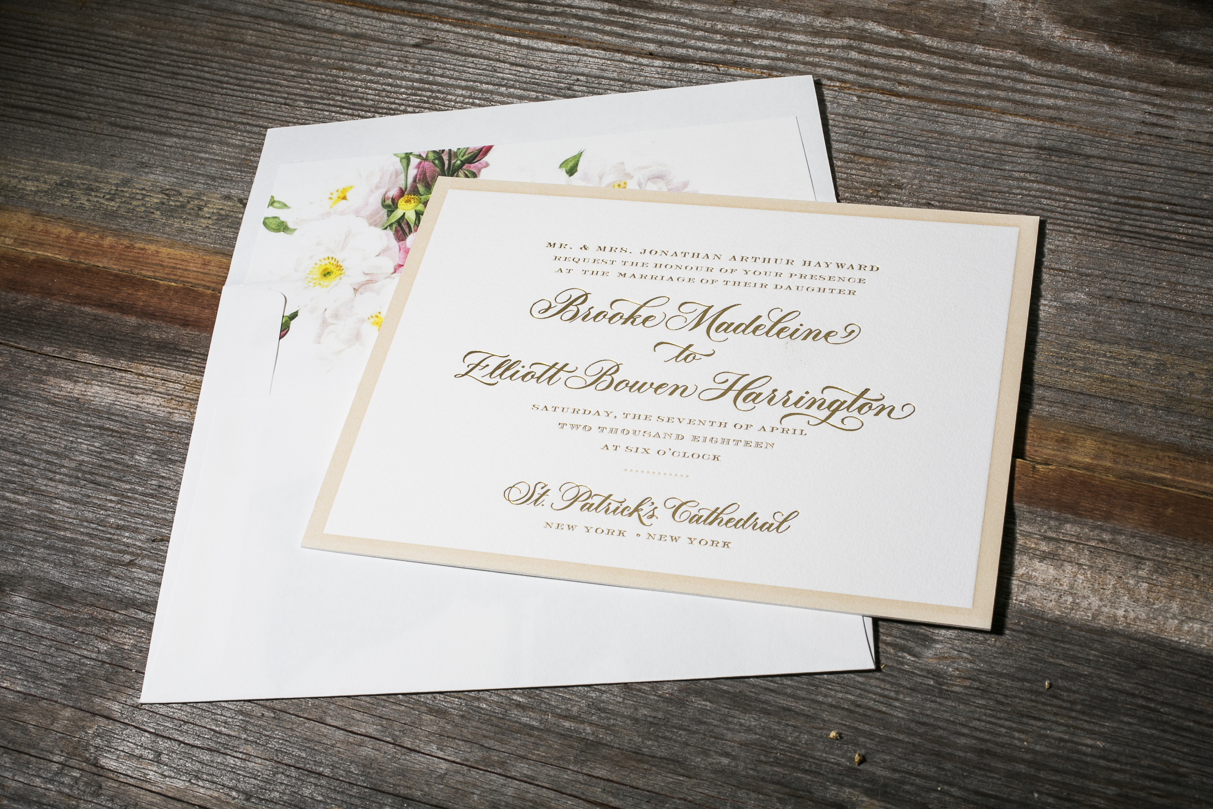 The royal couple’s wedding invitation features beveling (a sloping edge) and while this isn’t something we offer currently, we are able to add foil edging or edge painting to the sides of the invitation itself. We can also mimic the royal invitation in a reimagined way by using a Gold Matte border or a letterpress ink color instead, like what’s shown on our Chatsworth design in French Vanilla.
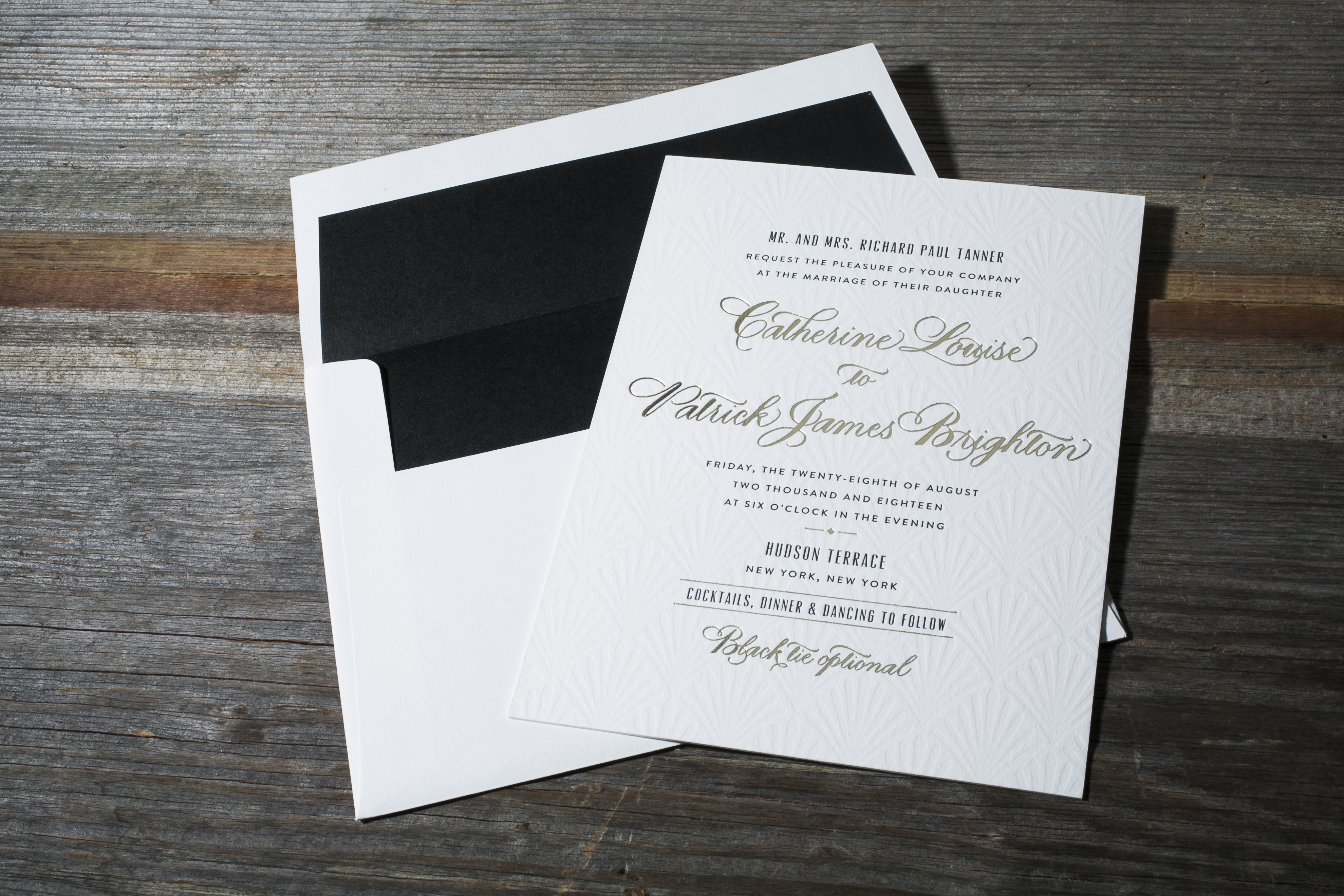 The blind-debossed pattern in the background of our Oberon design adds a level of sophisticated intrigue to a more traditional layout.
 Faunus V.2. shows off what you can do with foil stamping that might not be necessarily achievable through engraving with intricate florals in each corner. The Marsala letterpress ink compliments the Tawny Matte foil providing a royal and elegant overall look.
“My main source of inspiration for this Kalino customization was the Parker Palm Springs,” says designer Racheal Bumbolo. “From iconic to classic to cool vibes – this venue has all the feels! You can have a fun playful event, something exotic or even a classic black tie affair – the Parker Palm Springs offers something for every event style.”

photos
letterpress ink: cherry blossom | foil stamping: gold shine | fonts: manhattan + sweet sans + wild moon | paper: white | invite size: F-8 | foil stamped + digital liner: hector pattern in gold shine + classic color pattern in navy | original design + customization by Racheal Bumbolo
We were thrilled to spot Charlotte and Henry’s romantic August wedding on Style Me Pretty today. They worked with the team at our flagship store in New York City to make their wedding stationery vision come to life. The delicate watercolor crest created by Gina Langford was originally used on the save the date and was carried onto the invitations for a cohesive overall feel to the stationery. You will also find touches of Gina’s watercolor work on the details card and envelope liner as well as the menus used at the reception. Charlotte wanted her wedding day to reflect the beauty and innocence of their youth, and it’s safe to say their wedding stationery certainly reflected that sweet sentiment too. Style Me Pretty has even more photos from their big day, but here are a few of our favorites below!


Photography: Kelly Kollar Photography | Videography: S. Lewis & Son | Florals: Felicity Bontecou | Wedding Dress: Monique Lhuillier | Venue: Lion Rock Farm | Catering: Hathaway Young
Kathleen and Francis customized our Theon design with a shamrock motif and appropriate palette for their Saint Patrick’s Day wedding. Our friends at Mi-Te Print helped them select a script font that softened the look but maintained the modern typography that complemented their unique venue.


letterpress ink: vine | foil stamping: copper shine | paper: bella cotton white 1-ply + 2-ply | foil edging: copper shine | customization #41707
This romantic retake of our modern Corinne design is a softer and more feminine version that is perfect for a traditional garden wedding ripe with lush floral centerpieces, glowing taper candles and inspiring decor in soft shades of neutrals and blues.

photos
letterpress ink: prussian blue | digital ink: deep blue | fonts: adora bouton + garamond | paper: white | invite size: F-8 | liner: petite pearse pattern in powder blue | original design + customization by Jessica Downs
Our elegant Corinne design stands out with hand-painted florals and simple yet modern copper typography. We envision it for an intimate wedding filled with foraged arrangements made of deep hued flowers and autumnal leaves with soft shades of white, cream and metallic copper highlights.

photos
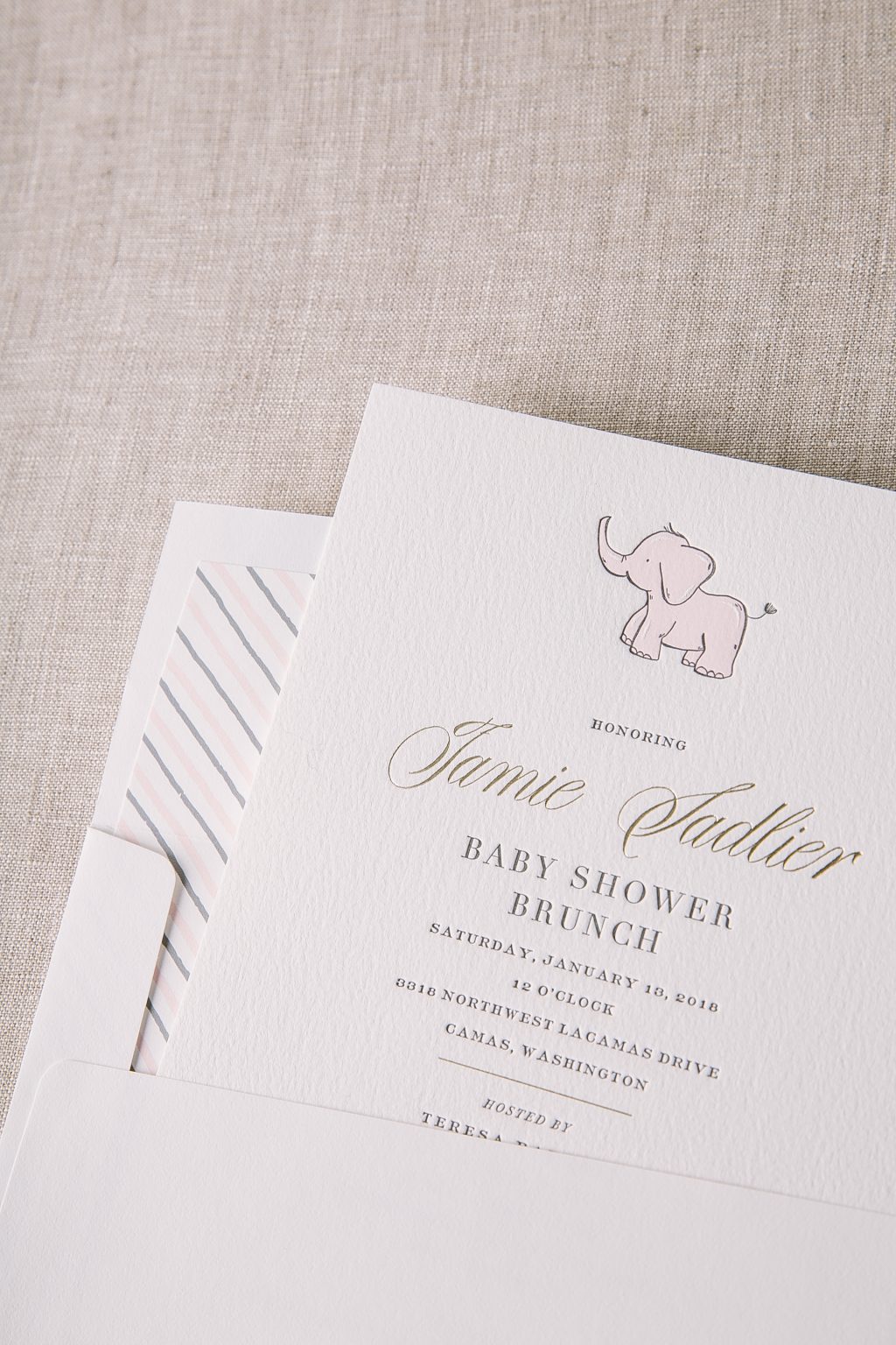
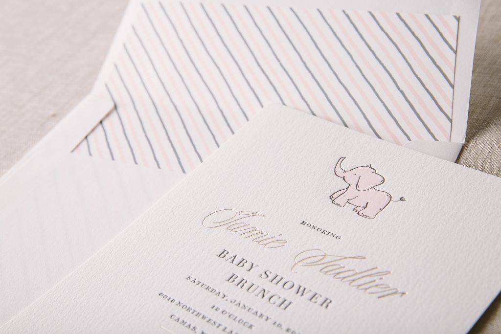
Jamie’s friends worked with Uptowne Papers to customize these letterpress and foil baby shower invitations using our hand illustrated elephant motif and a palette of pink, gray and tawny foil. A striped liner was a playful addition that added another layer of sweetness.


letterpress inks: pewter + whisper | foil stamping: tawny matte | paper: bella white cotton 1-ply | envelope: bella cotton white | liner: splash pattern in pewter + whisper | customization #41476
Our friends at LS Amster Company helped Emily and Jonathan customize our Deveril design to create these gray and white foil stamped wedding menus for their winter wedding. The elegant pairing of our Bella Gray paper and the crisp white foil was a modern choice that paired perfectly with the otherwise traditional typography and layout.


foil stamping: white matte | fonts: danube + impression | paper: bella gray 1-ply | customization #41896


 Our
Our  The royal couple’s wedding invitation features beveling (a sloping edge) and while this isn’t something we offer currently, we are able to add
  The blind-debossed pattern in the background of our


