Thanks to the help of Dorothy Goldsmith Printing & Party Service, we created the Brooklyn inspired letterpress wedding invitations of Marisa and Kevin’s dreams. Inspired by our Deveril design, the majority of the invitation was printed in Black ink while their names were calligraphed beautifully and printed in Rose Gold Shine foil. The suite included a coordinating reply card, rehearsal dinner invitation as well as a website card all printed in clean and classic Black ink. It was only fitting that their envelope liner depicted a graphic, bold image of the Brooklyn Bridge as the couple was married at the 1 Hotel Brooklyn Bridge which opens right into the Brooklyn Bridge Park.


Foil color: Rose Gold Shine | Letterpress color: Black | Fonts: Impression + Natalia Calligraphy | Design: Deveril | Paper: 2 ply Cotton White | Size: F8 | Customization: 43583 | Dorothy Goldsmith Printing & Party Service
Designer Sierra Detrick created our playful foil stamped wedding invitation Koi that added a bit of color and fun to our line-up! Here’s a little bit about the makings of this vibrant design from the designer herself: “I began looking at all different types of Koi ponds and studying the colors and textures specifically in the aquatic plants, fish, stones and water. I picked out a palette that felt was representative of everything I had seen. I then settled on light and airy brush strokes as the style for the background to give it a more natural feel. With such a fun and whimsical piece of art, I knew the typography had to be a bit more structured, but I didn’t want it to feel stiff or too contained. From there, I broke up the lines on the outer boundary of some of the pieces to keep the suite feeling structured yet somewhat free.” Detrick also had a strong Asian influence in her life as she was growing up saying, “I had a pen pal from Japan and we began writing in 7th grade and still write to each other today. In her letters, she always sends me postcards with the most beautiful scenery filled with vibrant colors and textures. The idea of the koi pond stemmed from some of these inspiring authentic images.”


Rings + Couple + Escort-cards + Venue | Table Setting | Koi Pond | Bridesmaids |
We were thrilled to have had the opportunity to create Michelle and Neema’s maple foil invitations thanks to the help of our friends at the Dandelion Patch. We were even more excited to see their wedding come to life through the eyes of their photographer Katie Stoops. The couple was married at Union Market’s Dock 5 which they transformed into a space filled with gorgeous greenery, Persian rugs, and all their loved ones surrounding them. Michelle and Neema wanted their special day to be reminiscent of a dinner party on a much grander scale so they created a warm, intimate overall environment for their guests to experience. Their invitations reflected the color palette of their day with burgundies and blushes represented in the florals on the envelope liner and invitation backer. After attending 21 weddings with Neema by her side, we’ll let Michelle share more about the most special wedding of them all, her own:

What was the inspiration for the wedding?
We host dinner parties for friends at our home in DC all the time, and our goal was to create an (obviously much more elaborate) version of that. We wanted it to feel warm and personal, centered around delicious food paired with good wine and conversation. For example, we picked menu items that we like to cook at home (crab and avocado salad; duck breast with port wine sauce; vegetable wellington); we created versions of the dishes at home and tasted various wines alongside them to choose pairings for dinner; and we used our guests’ nicknames on the menus to serve as place cards. Hosting the wedding at Union Market, DC’s favorite food market was the perfect anchor for it all.

What surprised you the most and what was your favorite moment?
My answer to these two questions is the same – the ceremony! I was mostly looking forward to the dinner and dancing part of the evening and didn’t really expect how meaningful the ceremony would feel. Our officiant (a good friend) wrote a beautiful tribute to our relationship filled with insights from our family and friends; our mothers and my sister participated in a traditional Persian sugar ceremony (happily married female relatives grind sugar cubes over the couple to ‘sweeten’ the marriage) to honor Neema’s heritage; and instead of feeling self-conscious and overwhelmed as I expected, I felt so in tune and in love with Neema as we said our vows. The dinner and dancing parts of the evening were obviously amazing too, but I have to say the ceremony was my favorite part!


Advice to future couple’s planning their own wedding?
It’s easy to say “try to relax and have fun with it!” but the reality is, there will always be moments of stress, conflict, and indecision. Our best concrete advice is to sit down at the very beginning with your partner and make a list of which wedding elements are most important to each of you, and which elements you care less about. That way, down the road when it’s time to make decisions, compromise will be easier because you’ll have established priorities from the start. For example, I wanted a band but Neema felt very strongly from the beginning about having a DJ, so I compromised on that; I felt strongly about having a small bridal party (only our siblings) so Neema gave his group of five best friends the role of ushers.

How did you choose your invitation design and ink colors?
I was initially hesitant about sending paper invitations for environmental reasons, but after some urging from my more traditional mother, I did some research on printing options and learned about Bella Figura’s green printing commitments, which made me feel much better about the whole process. We visited The Dandelion Patch in Virginia who helped us create a gorgeous fall floral suite, again finding a compromise – I adore big splashy florals, but Neema preferred something more streamlined, so we designed a simple maple shine foil invitation card with Bella Figura’s amazing floral print on the back and on the envelope liner. The beautiful purples, burgundies, and blushes of this print matched perfectly with our décor colors. The wording on the invitation was very important to me as well – we avoided the standard language and crafted a message carefully to reflect the kind of evening we were planning and how much we appreciate our guests.

What’s next for the happy couple?
After our wedding, we took a couple months to enjoy some downtime before traveling to Sri Lanka and the Maldives for our honeymoon over the holidays. We can’t recommend this break between wedding and honeymoon enough – the comedown after a wedding is very real, and the delayed honeymoon gave us something additional to look forward to while allowing us to rest and recuperate in between.

Photographer: Katie Stoops | Venue: Dock 5 at Union Market | Event Planning & Design: Christie Yerks from Grit & Grace | Catering: Design Cuisine | Floral & Décor: Amaryllis | Marquee Dance Sign: Brightly Ever After | Lighting: John Farr Lighting | Hair and Make-up: Claudine Fay |
Designer Leslie Johnston created Nostalgique, our retro inspired letterpress wedding invitation printed in Cobblestone ink that established a subtle grayscale aesthetic. This design was created with a pair of old souls in mind who envisioned a wedding full of old-fashioned accents like records used as favors, typewriter cuff links, and old-school cameras surrounding the venue. The envelope liner featured sweetly illustrated motifs printed in Desert ink with a Cobblestone backdrop to keep a tone on tone look. The design was imagined on a smaller scale for an extra touch of vintage charm.


Favors | Bicycle | Cameras | Venue | Couple | Typewriter | Cuff Links
Imagine walking into a wedding ceremony with a 100-year-old Oak tree before you covered in sparkling lights, greenery and beautiful florals cascading down the side as if it everything been there all along, just waiting for a couple to marry beneath it. We were over the moon to spot Rachel and Max’s dreamy wedding and equally as dreamy letterpress wedding invitations featured on Style Me Pretty. They were married at the Historic Aldie Mansion which created the perfect setting for their butterfly garden affair where guests were surrounded by various botanicals within every detail from the seating chart to the wedding cake. This was also carried over to their Everly inspired invitations that feature a watercolor cartouche made up of greenery that was paired with an envelope liner repeating this same botanical pattern to tie everything together. From meeting on the soccer field to beginning their next chapter with their dog Murph by their side, we have no doubt that Rachel and Max will have attain all their dreams together. Here are some of our favorites from their day, but be sure to check out the rest over at Style Me Pretty!


Photographer: Rachel Pearlman | |Venue: Historic Aldie Mansion | Video: Tweed Weddings | Floral: A Garden Party | Gown: Liz Martinez | Music: Best Train Productions
Christina and Pierrick worked with Maddie Merriweather, Inc. to create these sweet foil save the dates for their June wedding. This save the date printed on our Bella Light Gray paper was the perfect glimpse into the couple’s elegant day to come at the Roaring Gap Club in North Carolina. Hand calligraphy elements with a hand-drawn cartouche enclosing the bride and groom to be’s names added personal touches to this save the date.


Foil color: White Matte | Fonts: Caslon, Submitted Calligraphy by Sarah Hanna | Design: Custom Customer Supplied | Paper: 2 ply Light Gray | Size: A6 | Customization: 42111 | Maddie Merriweather, Inc.
This modern rehearsal dinner invitation customization was inspired by our contemporary Newbury design. The Bella Gray paper from the original design was substituted with our Ivory paper to give the invitation more of a vintage vibe. The design itself was inspired by dark jewel tones represented in the Maple Shine foil and Prussian Blue letterpress accents. We imagined pairing this invitation with our elegant garden pattern also printed in the same color palette, all perfect for a moody candlelit affair.

Foil stamping: Maple Shine | Letterpress ink: Prussian blue | Blind Embossing | Fonts: Marguerite + Times | Paper: Ivory | Invite size: F-8 | Foil stamped liner: Elegant Garden in Maple shine + Prussian Blue | Original design by Kyle Laatsch | customization by Andrea Streeter | Photos: Ruffled Blog
Thanks to the help of our friends at Magnificent Milestones, Sarah and Stephen’s vision for timeless foil stamped wedding invitations came to life beautifully. The wedding was held at the University Club of Chicago, a classic venue which called for an equally classic invitation such as this reflecting an elegant affair to come. The couple chose a design reminiscent of Maeve and it was printed in Gold Matte foil with Bella Blue paper used as the backdrop. Their reply card was kept on the simpler side and printed in Navy letterpress to coordinate with the invitation. Guests will be pleasantly surprised to find the initials of the bride and groom intertwined as they open their envelope to reveal a gold leaf metallic envelope liner.


Foil: Gold Matte | Letterpress: Navy | Fonts: Imprint MT Shadow + AT Sackers Gothic | Design: Custom Created Design | Paper: 1 ply Bella Blue, 1 ply Bella Smooth White | Size: F8 | Customization: 39618 | Magnificent Milestones
From weddings to mitzvahs, we always love seeing different kinds of invitations made for a variety of special occasions come through our shop and bridal showers are no exception to that! The host of this particular day, Joan Bergen, worked with Fete Collection to create these romantic letterpress bridal shower invitations for the bride to be. They chose a color palette of Prussian Blue letterpress and Carolina letterpress with our Bella Blue envelopes to match creating an overall sense of monochromatic harmony. Our popular Sophia script font made sure the bride to be’s name stood out from everything else while hydrangeas printed in Carolina gave this sweet invitation an added touch of romance.


Letterpress ink colors: Carolina + Prussian Blue | Fonts: Sophia + Moravia | Design: Custom Library | Paper: 2 ply Bella Smooth White | Size: A6 | Customization: 42239 | Fete Collection

After a 29-year engagement filled with all the twists and turns life has to offer, Claudia and Daniel were finally married on the twenty-sixth of August surrounded by all of their loved ones. In 2012, Claudia was diagnosed with stage three cancer and from there endured a treatment plan that included chemotherapy, radiation, a double mastectomy and a full hysterectomy. In 2016, Claudia’s cancer metastasized to her bones which led to a partial hip replacement and she is currently on oral chemotherapy. Though Claudia and Daniel have experienced many ups and downs, the love that they share for each other has remained constant. We were lucky enough to play a small part in this couple’s incredibly moving story as we worked with Brilliant Event Planning and Wish Upon a Wedding to create their dream invitations and day of pieces.

Using our Everly design as inspiration, Claudia and Daniel picked a warm color palette of Cobblestone letterpress ink and paired it with Gold Matte foil. Botanical watercolor accents were added throughout each piece including the envelope liner to give everything a softer overall aesthetic. We’re excited to share a glimpse into the making of this couple’s invitations and day of pieces below. It takes a love like Claudia and Daniel’s to remind us of all the good in the world and to embrace it every single day.


Wish Granters: Wish Upon a Wedding | Wedding Photography: Sasithon Photography | Planning: Brilliant Event Planning | Venue/Catering: Mountain View Manor | Video: Pioneer Media | Floral: Winston Flowers | Baker: Elliegant Cakes | Gown: Amsale Aberra | Music: On the Move Events | Officiant: Tri-State Weddings
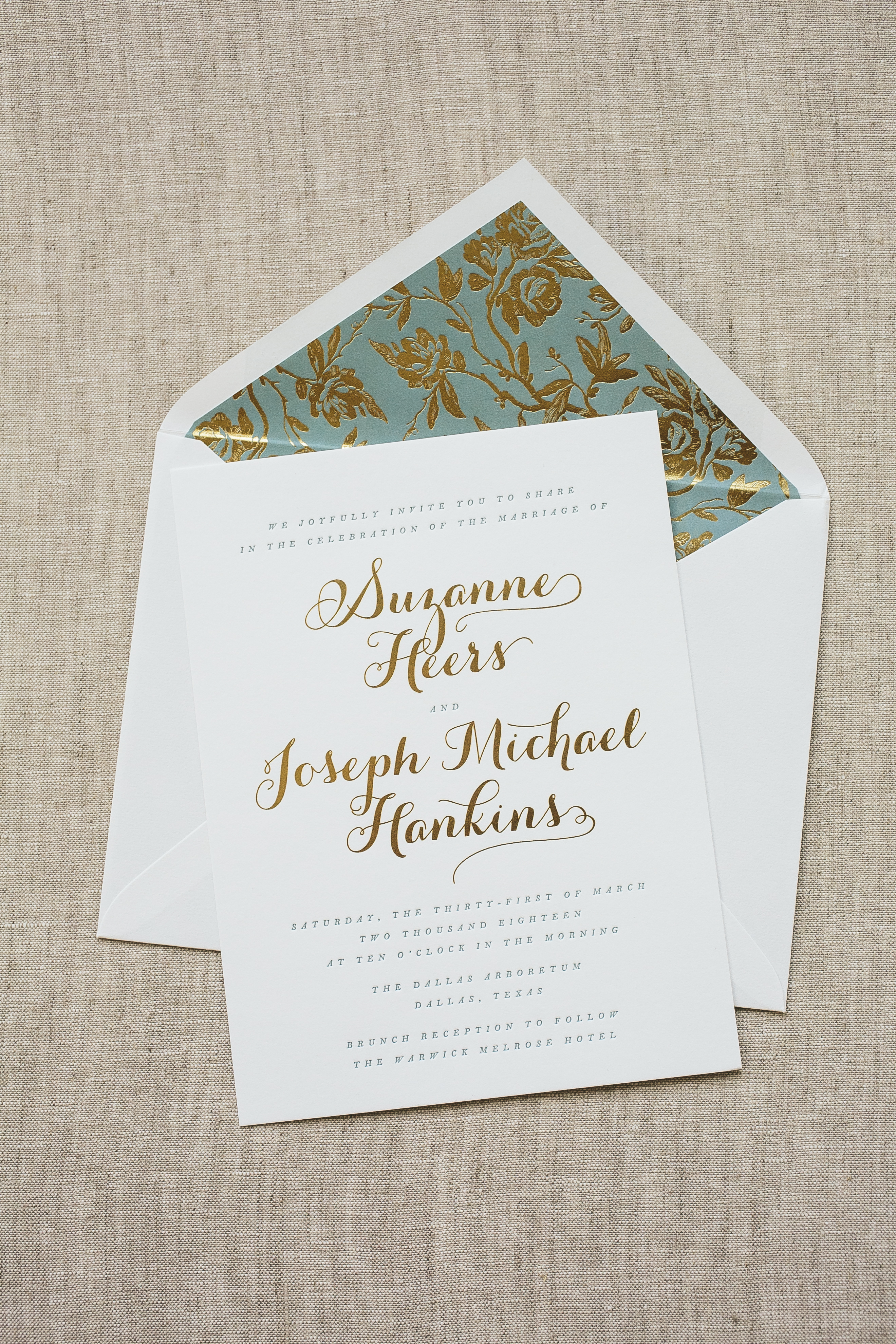
We worked with Invited to create these gold foil wedding invitations for Suzanne and Joseph’s botanical Dallas affair this past March. The wedding was held at the Dallas Arboretum which their chosen envelope liner mimicked beautifully. They chose to go with our Tristan pattern in Gold Matte foil with a digitally printed background in Pool behind it giving this suite a little extra punch of color. The invitation was inspired by our Whisper design but customized to fit the couple with a more modern script font decorated in gold foil surrounded by the rest of the wording in subtle Pool letterpress ink. It’s easy to see that everything tied together within this suite and we have no doubt Suzanne and Joseph’s special day came together just as elegantly too.


Foil color: Gold Matte | Letterpress ink color: Pool | Fonts: Keeva + Botony | Design: Whisper | Paper: 1 ply Bella Smooth White | Size: F8 | Customization: 42418 | Invited
Alexander and his family worked with our friends at Papery of Philadelphia to create these silver foil stamped Bar Mitzvah invitations. They customized our Irving design by using our rich Bella Gray paper and dressed it up with silver foil typography. This same palette was carried onto the party card while the reply card was kept clean with white paper and Charcoal letterpress ink. Our geometric Chic Combs pattern added an extra splash of fun to the suite but still tied everything together effortlessly.


Foil color: Silver Matte | Letterpress ink color: Charcoal | Fonts: Didot | Design: Irving | Paper: 2 ply Bella Gray, 1 ply Bella White | Size: SQ-7 | Customization: 40272 | Papery of Philadelphia


