Amara and Michael worked with Mariana at our NYC studio to create their stunning invitation suite for their wedding in Montana last summer. We’ll let Amara take it from here to share more about their wedding details!
CAN YOU SHARE WITH US A BIT ABOUT YOUR WEDDING AND YOUR INSPIRATION FOR THE EVENT?
I had never been a “wedding-kinda-girl.” I was eager to elope, but my fiancé, Michael (now husband) wanted a wedding. I really had no clue or vision of what I wanted except for three things, I didn’t want “conventional”, I wanted it in Montana (where my family is from) and I wanted it to be more about Michael and I getting married than the wedding. Besides that, I really was clueless! Thankfully, I have the most amazing mother. All while growing up, my mom always set a beautiful table-scape for dinner. I knew that I wanted our wedding to feel and look like those special memories of being a family at our dinner table. Honestly, it was really my mom who stepped up to the plate and created exactly what I wanted in a wedding. In the end, I can’t even imagine wanting to elope. I loved our wedding!
WHAT ADVICE DO YOU HAVE FOR COUPLES CURRENTLY PLANNING A WEDDING?
Wedding planning was VERY stressful for me, even with my mom’s generous help! It felt like I was non-stop having to answer a million questions from a million different people all while never really knowing how to answer them!! Do your best to give yourself a pat on the back and acknowledge that it is freaking hard and always ask for help when you need it! Outside of that, don’t compare your wedding planning to anyone else’s. It’s different for everyone! Plus, it does all work out in the end and the quirks of the day make it unique to you! (We forgot our marriage license!) Also, don’t be afraid to get married on a day that isn’t Saturday. We got married on a Sunday and it allowed us to book the vendors we wanted since they weren’t booked. Plus, some venues give discounts if you do a “non-Saturday” wedding.
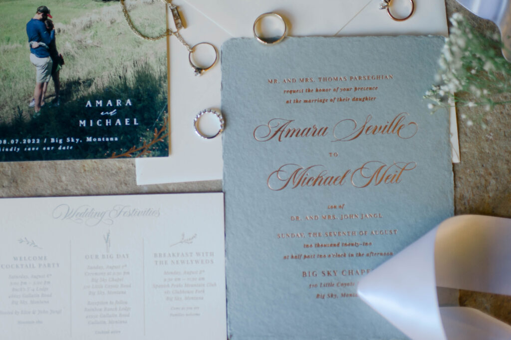
HOW DID YOU CHOOSE YOUR INVITATION DESIGN & INK COLORS?
Coming up with our invites was a group effort. I worked with Mariana at Bella Figura and she was a dream! I was so scatterbrained and there were so many options, I really needed help! I knew I wanted our invites to reflect our rustic wedding in the mountains. We used sample invites and combined elements I liked to create gorgeous invitations. The invited were on the most beautiful gray/green, hand torn homemade paper. The copper text with just a hint of shimmer was perfect for a western wedding. My favorite part was the lining of the envelope, which was a spattering of three simple line drawings of flowers. Before stuffing them into the envelope, we tied the info card and the invite with a rusty pink chiffon ribbon. We carried a lot of the same elements into our menus and place cards. The whole design felt like it matched the natural beauty of Montana perfectly.
WHAT SURPRISED YOU MOST ABOUT YOUR WEDDING?
I was very surprised by how much my dad got into the planning! I flew out to Montana a couple weeks before the wedding and when I arrived at my parents house, the front porch was covered in huge planters with beautiful flowers. My dad had been growing and tending to them since the spring (our wedding was in August) to use at our reception! I also was surprised at how ready I was to get married. The day off, I was surprisingly calm. I just felt eager to marry Michael and start our life together!
WHAT WAS YOUR FAVORITE MOMENT?
There were so many favorite moments! Two that really stick out are walking down the aisle just after we were announced as husband and wife. It was surreal that the first moments of our new lives together were walking that aisle surrounded by family and friends showering us with applause and love! The second moment was when we had gone to the fire station to take photos (Michael is a firefighter, so we wanted some pictures with the fire truck!). Two kids had set up a lemonade stand across from the station and brought us free lemonade in paper cups. The kids were so sweet and that lemonade was our first toast together as husband and wife.
FAVORITE DESIGN ELEMENT OF YOUR BIG DAY?
I adored our invites. They were stunningly beautiful and served as the foundation for the look and feel of our wedding. I feel like the invites nailed the vibe of capturing the beauty of Montana. I wanted to embrace the natural landscape of work with it, not completely against the design of our wedding.Another element that was very important to Michael and I was our seating chart. Instead of a standard seating chart, we handwrote a letter to each one of our guests. Writing these letters allowed us to personally acknowledge each guest, thank them for coming and share how much they mean to us (along with let them know what table they are sitting at!). We stuffed the letter in envelopes that a family friend hand calligraphed our guests names on and we tacked them on a large white stand adored with green leaves. Writing the notes took forever, but was something Michael and I did together before the wedding. It gave us a chance to relish in memories of the people who love us and truly realize how grateful we are for all those in our lives.Oh! And I cannot forget our cocktail napkins! With us living in NYC and our wedding in Montana, it meant that our beloved cat, Bosco, and dog, Jax, were not able to join. It was vital that we incorporated them into our wedding, so we put their pictures on our cocktail napkins. They were a hit and big conversation starters, which really made us feel like, even though our pets were not physically there, they were a part of our day!
WHAT’S NEXT FOR THE NEWLYWEDS?
Anything and everything! We keep saying how excited we are to experience life together. First up, our first actual trip together to celebrate our honeymoon in Greece and Italy!
Lucy’s Bat Mitzvah celebration started with these bold, rainbow foil invitations designed with the help of our friends at First Impression in Leawood, Kansas. She chose a combination of our Caribbean, Bright Pink and Black papers and printed in Gold Shine and Rainbow Shine foil for an unforgettable invitation suite.
Our friends at Ink Papery in Fair Haven, New Jersey helped Talia and Warren create wedding invitations using our orchid 2 motif as inspiration. The motif was printed in Gold Shine foil, as was our wave-like Parrish pattern used to line their envelopes. They paired the foil with Deep Blue letterpress ink throughout.
letterpress ink: deep blue | foil stamping: gold shine | paper: bella smooth cotton white 1-ply + 2ply | fonts: wild moon + avant-garde | envelope liner: classic color pattern in deep blue + parrish pattern in gold shine | envelope: bella cotton white pointed flap | customization #60753
Our friends at Union Street Papery in San Francisco, California transformed our Mitra design into a contemporary invitation for an evening dinner. The Mitra liner pattern was used as a border in Meadow Shine foil to compliment the formal text in Vine letterpress. Our Franklin die cut shape was used on the reply card as well as the outline on the invitation. Holly envelopes and a solid Clover-colored envelope liner carried on the green palette.
Thanks to the help of Penny Post, we were able to create these Dark Gray and Deep Blue letterpress wedding invitations inspired by our Mila design. They chose a cool color palette with Dark Gray letterpress ink for the typography and Light Gray envelopes to pair alongside it. To add a hint of color to their set, they incorporated a Pastel Blue reply envelope and a Deep Blue digitally printed envelope liner in our Minett pattern. To finish their invitation off, they added a bevel painted in Cinder.
Letterpress colors: Dark Gray + Deep Blue | Fonts: Melvin and Emily + Sweet Sans | Design: Mila | Paper: 2 ply Smooth White | Size: F8 | Customization: 56008 | Penny Post
We had the pleasure of creating six exclusive suites with our friend Heidi Daniels of Parchment Fine Papers in Nantucket and The Customs House in Wellfleet, Massachusetts – and now we can share them with you!
Chadwickwas imagined for a classic black tie wedding at The Wauwinet, a luxury hotel nestled on the shores of Nantucket Island. A timeless palette of black letterpress and gold foil is complemented by a custom, hand-drawn duogram and elegant vintage Nantucket artwork featuring ships and maps to honor the island’s history. Beveled, gold foil edging and a vellum wrap adorn the save the date to set the tone for an elegant celebration.
The Chadwick suite, featuring a vellum wrap, gold foil bevel, and custom duogram.
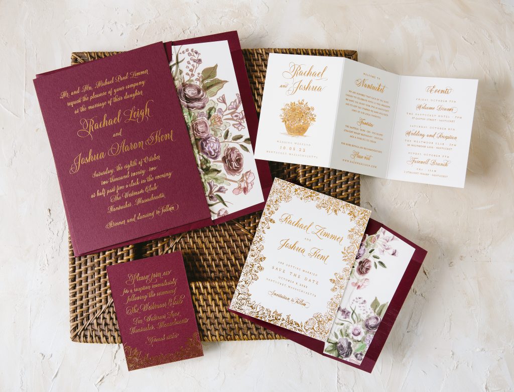
A bohemian, autumn beach wedding was the inspiration for the Westmoor suite. Floral illustrations of bold bouquets filled with succulents, hellebores, garden roses, anemones, and ranunculus show off a deep jewel toned palette in shades of of plum, cranberry, sage, and copper. An illustration of an iconic Nantucket Lightship basket filled with flowers on the events card is a special nod to Nantucket.
The Westmoor suite, featuring Currant paper and gorgeous watercolor and illustrated florals.
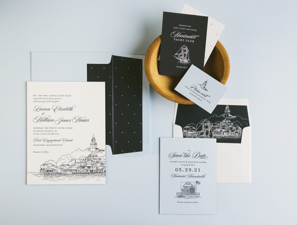
Nantucket Harbor was the main inspiration for the Dockside suite. As you sail into the harbor, you are greeted with a skyline of church steeples and historic sea captain’s homes. A hand-illustrated rendering of the harbor takes center stage on the main invitation while crisp blues and traditional fonts give give this suite a classic, tailored look.
The Dockside suite, featuring Blue and Pastel Blue papers and an illustration of Nantucket Harbor.
The maritime-themed Compass suite was inspired by vintage maps and Nantucket’s famous Gardiner’s Corner mural. In fact, the mural is featured on the envelope liner and the duogram on the invitation and save the date was created from its historic compass motif. The Nantucket Whaling Museum, where we imaged this couple having their reception, inspired the petite whale motif used throughout the suite. Moody blues, representative of the sea, and tawny foil, mimicking the light of the North Star, pair perfectly in this seafarer’s dream suite.
The Compass suite, featuring Blue paper and envelopes, a custom illustrated cartouche and the iconic Gardiner’s Corner sign.
The closing days of summer in Nantucket were the inspiration behind the Lighthouse suite. The colors are a bit cooler and slightly muted making this entire set feel soft and sweet. A hand-painted watercolor map, highlighting iconic landmarks of Nantucket, sets the perfect mood for a local couple’s big day!
The Lighthouse suite, featuring Light Gray envelopes and a variety of watercolor artwork (don’t you love the whale?!)
The Sailor suite was envisioned for a wedding set back on the mainland where sailing is still the heart and soul of the people. Nautical illustrations of sailboats, buoys, lobsters and anchors are playfully used throughout the set. With carolina blue and navy letterpress, along with a fresh modern layout, you can almost feel the wind in your hair.
The Sailor suite, featuring a vellum belly band, more illustrations, and an adorable thank you card (aw, shucks!).
We worked with Smitten Boutique to create these gold monogrammed wedding invitations for Nicole and Aaron. They opted for an ornate, flourished script font that pairs with the equally ornate monogram. They added a splash of color with our Prussian Blue letterpress ink on the reply card that coordinates with the envelopes as well. Our Old Rose paper also makes an appearance in this suite printed in Gold Matte foil to keep everything cohesive. Both the envelope liner and belly-band appear in our Gold Leaf metallic stock as the finishing touch to the set.
We helped Big City Bride create these Olive letterpress wedding invitations for Emily and Robert. They used our Terrace design as a jumping-off point for their personal set. Instead of using foil, they opted for Olive letterpress ink for the majority of the suite. This gave the set an overall earthy aesthetic. It includes a matching reply card, accommodation card as well as a welcome reception card. To keep with the more rustic feel, they used Jute envelopes to compliment the rest of the suite. The envelopes lined with a vintage print of Chicago added a final touch of personalization printed in Olive to match.
Ethan Niles helped us bring these white matte foil bar mitzvah invitations together in honor of Jared’s big day. The design used a heavily based typography layout in the ITC Avant Garde Gothic font. The insert cards used the same fonts in Charcoal letterpress to coordinate with the supplied gray invitation paper. The envelopes tied everything together also in a similar gray tone. Finally, the custom envelope liner used Jared’s initials to create an overall pattern.
Letterpress: Charcoal | Foil color: White Matte | Fonts: ITC Avant Garde Gothic | Design: Custom Created | Paper: Supplied 2 ply – Basis Gray + Smooth White | Size: F8 | Customization: 50618 | Ethan Niles
We can’t imagine a better fit for a Montana affair than these Espresso and Vine letterpress wedding invitations. They opted for a sprawling script for the bride and groom’s names in Vine. The mountainscape beneath added a hand-drawn aesthetic to this set. Coordinating insert cards featured elements of this drawing to tie everything together. Each piece used Espresso and Vine as well to keep consistent with the invitation. To keep everything in one place, they opted for a Jute pocket fold with Jute reply envelopes adding to the earthy tone of this suite. Thanks Weddings by Nancy for sending this rustic set our way!
Letterpress: Espresso and Vine | Design: Customer Supplied | Paper: 1 ply Bella Cotton White | Size: A7 | Customization: 48907 | Weddings by Nancy
Ordering extra cards and envelopes is easy, and we’re always happy to accommodate this back to press request. We know changes happen all the time! However, think about how much you might save in the long run just by ordering 10 more “just in case” suites at the time of the initial order. The less stress, the better – especially when it comes to all things wedding related!
Something to keep in mind:
Here at Bella Figura, there are an assortment of different hands on a job at any given time. We put our heart and soul into these heirlooms. From graphic design to prepress, from prepress to precut, from precut to press, and so on. The production chain is there to make your vision come to life and this happens whether it’s the first order or a reorder. The same amount of care, materials, and dedication of time is put into each order.
We love what we do, but below you’ll find a graphic that outlines the savings between ordering 110 at the time of the initial order versus ordering 10 more later on after the first order is completed:
We’re here to make your wedding load that much lighter. It is always better to order more than not enough when it comes to invitations. Whether it be a change in address or a new addition to the guest list, you’ll want to have an extra pile of back-up invitations ready to go at your disposal. We’re here to do whatever we can to make that happen in the easiest way possible!
The proper postage is essential for a perfect send-off once you are ready to sign, seal, and deliver! Should you choose our F-8 size (6.25 x 8.3125), there are a few things to keep in mind:
This means they should never fall into the “letter” category. We have observed some post offices mistakenly use First Class Mail Letter rate instead of the First Class Mail Flat rate. Regardless of envelope size, mailing as “flats” should ensure that the post office will handle a thick envelope more delicately—reducing the risk of damage.
Bear in mind that different post offices may give inconsistent guidance on how to handle thick envelopes. As a result, we recommend you stress the importance of these above-mentioned guidelines.