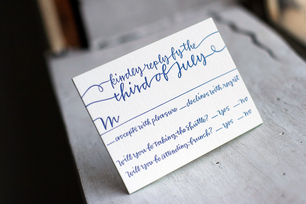
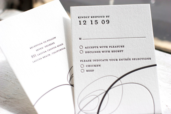
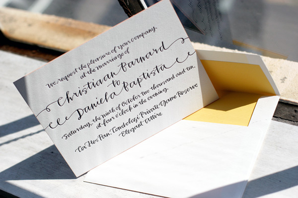
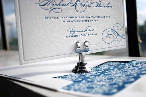
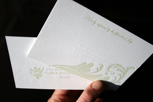
In recent months we’ve been fielding a lot of questions about cool reply card ideas and wording options, so we thought it’d be fun to round up some of our recent favorites to share with you. From traditional reply cards with envelopes to cool reply postcards to petite-sized reply cards requesting a response via email or a website, the options are limitless. Go modern or traditional, but don’t be afraid to make your reply card your own!

[Surya letterpress reply card.]

[Letterpress reply card with edge painting in String Calligraphy.]

[Destination wedding reply card in Plume.]

[Birch letterpress reply card.]
(more…)
This fabulous customization of our Moderno 2 letterpress wedding invitation design was printed for an upcoming autumn wedding right here in Upstate New York in nearby Pittsford. The letterpress invitations, reply cards, and events cards all feature pumpkin and aubergine inks on our white cotton paper with shimmery metallic bronze envelope liners, a perfect pairing of color and design for a fall celebration.


These letterpress wedding invitations are our Surya design by Tara Hogan, printed last year for a winter wedding. They were printed in pewter and black inks on our white paper and feature a pewter envelope liner.


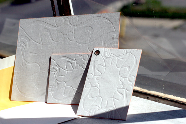
We simply adore this customization of our String Calligraphy letterpress wedding invitation design, which features the hand calligraphy of Bella Figura calligrapher Patricia Mumau of Primele Studio. It was letterpress printed in black ink on our 2-ply cotton paper and features papaya edge painting. The backside of the invitations as well as the escort cards and favor cards all showcase our Emile design in blind deboss, while the letterpress thank you cards and envelopes all feature a custom designed, blind deboss tree motif, perfect for this South African safari wedding. To complete this beautiful custom design, the envelopes are lined in champagne and the favor cards were hole drilled and grommeted.


Our Vendage letterpress wedding invitation design has become one of 2010’s greatest hits. This customization is printed in pool and umber inks and features a horizontal orientation instead of the square featured in the original design. The envelopes are lined in pool to match the pool edge painting and the set is printed on our luxury 2-ply paper. Classic black ink for the envelope printing makes this set sophisticated, a bit whimsical and cool blend of modern and traditional design.


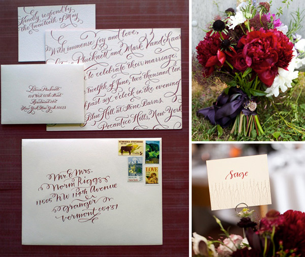
We loved seeing these gorgeous photos by Jonathan Young from Leticia and Mark’s recent wedding sent over by one of our amazing Bella Figura calligraphers, Patricia Mumau of Primele. Leticia and Mark were married in June at the picturesque Blue Hill at Stone Barns just outside of New York City and chose our New Calligraphy letterpress invitations by another of our long time favorite calligraphers, Debi Zeinert of The Blooming Quill. The invitations were printed in cardinal ink and the couple then worked with Patricia for the calligraphy addressing and gorgeous escort cards featuring crisp white ink on red envelopes. We love the rich, vibrant jewel tones Mark and Leticia chose for their celebration and the fun pairing of Debi and Patricia’s calligraphy. Thank you for sharing, Patricia, and congratulations, Leticia and Mark!


{Photos by Jonathan Young.}
Today we’re exited to introduce you to July’s Design of the Month – Hendrix by Jessica Hische. It’s pretty, playful and a touch whimsical, and one of our favorites from our 2010 collection. We think it’s perfect for a garden party wedding or an outdoor celebration under the stars. As our Design of the Month, all orders of our Hendrix design over $1000 placed between now and August 15 will receive free letterpress thank you notes – don’t miss out! (Flat thank you notes, letterpress printed to match your invitations with unprinted envelopes.)

Meet the Designer – Jessica Hische
In honor of our Design of the Month, we thought a little Q & A session with the talent behind the design was in order. Brooklyn-based Jessica Hische is an incredibly inspiring designer, typographer and illustrator. In addition to her amazing art prints and Buttermilk, her first typeface of which we just can’t get enough, we are obsessed with her blog and her Daily Drop Cap project. Without further ado, meet Jessica Hische.

What was the inspiration behind Hendrix?
My friend, illustrator John Hendrix, had a baby girl and commissioned me to design his baby announcement, which I letterpressed for he and his wife in exchange for one of his original drawings. The Hendrix wedding invitation design takes elements from the original announcement and tweaks it and expands it to a full wedding suite. Everyone loved the original design so much I was so happy to be able to share it with others!
When did you know you wanted to be a designer? How did you get your start?
I actually didn’t know what graphic design was until I was in college. I always knew I wanted to do something art related, I just didn’t really know exactly what that was until I took my first design class in my sophomore year at Tyler School of Art. I loved that design isn’t really self-expressionistic — it is about solving problems and doing what is appropriate for a client / project.

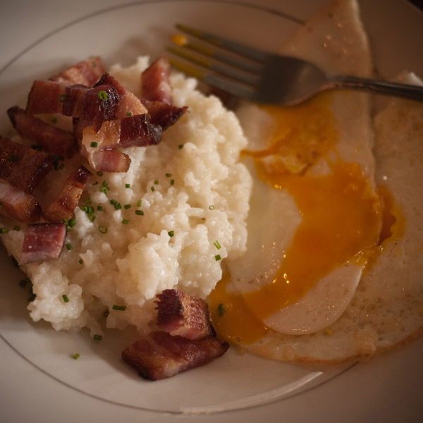
{Jessica notes, “I love breakfast.”}
If you were an ice cream flavor, what would you be?
This is a tough one! I think the closest one might be Ginger, but if “Almond Croissant” was an ice cream flavor I’d be that.
What’s your favorite PMS shade?
PMS Warm Red U or something a bit more orangey.
What’s the most memorable vacation you’ve ever taken?
I was invited to speak at the Semi-Permanent Conference in Sydney this year and went a week prior to vacation with my boyfriend. It was the most fun vacation I’ve ever been on. All we did was eat amazing food, drink amazing coffee and get our pictures taken with koalas.

(more…)
Our Cartoccio letterpress wedding invitation design has become a fast favorite and it’s easy for us to see why – it is so incredibly chic! This customization is one of our favorites that we’ve recently printed, because it’s so lovely and so luxurious. Printed on our 2-ply ivory paper in 2-color letterpress, this invitation set is an absolute showstopper. Featuring garden and antique gold inks, it’s a look that is modern, but with the all of the subtle formality of a more traditional letterpress invitation design. Paired with fabulous letterpress printed envelopes with beautiful metallic gold liners, this invitation is rich in detail and personality. Even the reply cards are printed on our luxurious 2-ply paper for a finished look that is completely polished. We can’t get enough!


When you’re surrounded by incredible letterpress creations every day, choosing your own letterpress wedding invitations becomes difficult. Really really difficult. There were moments during that time when I joked about wanting to send each of our guests a different invitation, just so I could see all of my different ideas in print. After much debate, with the help of our amazing client coordinator, Tiffany, and our equally amazing graphic designer, Beth Ann, I was was able to settle on our Keswick design in mediterranean and pale gray inks. The entire process was incredibly exciting, but nothing topped the day I finally got to hold them in my hands. They’re absolutely stunning and you can bet we’ll have a set framed to hang in our house after the wedding.


Because we’re having an unusual two-day wedding with a private ceremony on Friday and a larger reception on Saturday, our main invitation was printed for Saturday’s reception. To let Friday guests know they were invited to the ceremony, we included a small ceremony card insert with the details as to the ceremony time and location. Reply cards sent to those guests provided space to reply for both the Friday and Saturday events. All of the pieces were printed in 2-color letterpress, with the exception of the ceremony card, which was a 1-color letterpress card.


Of course, no invitation is complete without beautiful hand calligraphy. Our envelopes were addressed by our amazing calligrapher, Debi Zeinert of The Blooming Quill. She even hand-mixed the ink to perfectly match the mediterranean blue of our invitations and printed envelopes. Not only was I stunned at how amazing the envelopes looked, but our guests are still raving about how exciting it was to get them in the mail. Now that right there, that’s a good way to kick off a wedding celebration if you ask me!
With that said, I’m off to get married – I can’t wait to share photos and more details when I’m back!
Julie and Noam’s letterpress wedding invitations are a custom creation we were thrilled to letterpress, designed by the couple in collaboration with their good friend Katerina Barry of Your Day Designs. The invitation design is based on a postcard Noam sent Julie a few years ago when he was living in Berlin and she in New York and the complete set is incredibly thoughtful and personalized with details that are reflective of Julie and Noam’s history as a couple. The set includes several pieces including the gorgeous main invitation, a custom map depicting locations special to Julie and Noam, invitation cards to other weekend events, a wonderfully fun mad lib reply card that was a nod to Julie’s love for word games and a custom blind debossed envelope that we hand crafted to meet Noam’s vision. All of the pieces are printed in 1-color in deep blue ink and together are an absolute showstopper, featuring a range of finely printed details and large solids that together achieve a really unique and beautiful letterpress look.


Bride to-be Julie was wonderful and happily shared thoughts on their inspiration with us…
The inspirational postcard, which still hangs on our fridge, features the silhouettes (in black) of a bunch of Berlin monuments that were then reflected so that the row of monuments looked kind of like a sound wave. When we started talking about invitation design, we knew we wanted to do something that was striking and that was both really different and really beautiful. We went to Katerina with the idea of a reflected composite skyline made up of some of the most recognizable buildings from cities around the world that we had spent time in together: New York, Berlin, Paris, Moscow, Istanbul. Our friend Katerina took it from there — she created the skyline image, hunted for the perfect font, and brought it all together. She created the individual events cards using enlarged versions of the New York buildings in the skyline, in recognition of the fact that our wedding will take place in the city.

The hand-drawn map was created by calligrapher Nancy Howell. It features some of Julie and Noam’s favorite East Village and Lower East Side spots, including the place where they first met, Tompkins Square Park, the theater that hosted their first real date, Millennium Film Workshop, and the site of New York’s best smoked salmon, Russ & Daughters. The Angel Orensanz Foundation, where they will be married next month, is also included on the map.


Julie and Noam’s design was especially unique because it continued onto their inner envelopes, a design element that evolved from an idea Noam dreamed up and was ultimately engineered by Bella Figura co-founder, Harold. The invitation design was blind debossed on large sheets of paper and then die cut, with each envelope being carefully hand-assembled. Naturally, we had to ask Julie to share the inspiration behind their beautiful envelope design…
One thing Noam got really excited about was the idea of making the letterpress technology a part of the design itself. He really wanted to have not only a mirroring of the skyline image, but also a reproduction of the letterpress plate, so that there would be one part of the invitation that mimicked the plate used to print the skyline and invitation text. Katerina played around with doing all of that on the invitation itself, but it always seemed to be visually confusing or, if printed blind, to leave too much white space. So we took it off of the invitation card and moved it to the inner envelope, where the entire invitation is blind debossed in an exact mirror of the invitation itself both in left-right orientation and in terms of what is pressed down and what is raised…but printed without ink. It’s as if the press came through the card and pressed into the envelope. You all at Bella Figura ingeniously figured out a way to execute Noam’s vision of the inner envelopes, and they turned out better than we had even imagined.
Having had the opportunity to work with Julie and Noam on this brilliant invitation suite, we had to know a bit more about their upcoming wedding and the things they are most looking forward to…
We chose Bella Figura because of the company’s commitment to social justice and the environment, values we hope will permeate every aspect of our wedding, from the local and sustainable food to the egalitarian ceremony. And we are also looking forward to a really crazy hora.
Now that’s our kind of wedding! Julie and Noam, thank you both for letting us share your incredible invitations. Congratulations and best wishes from all of us at Bella Figura!
We’ve noticed a lot more clients choosing letterpress reply postcards over the traditional reply card + envelope for their wedding invitations. We’re all for this trend – it’s more eco (less paper!), and also helps keeps budgets down and keeps letterpress more affordable. Reply postcards cost less to letterpress, and you also save a little bit on the postage. We’ve also seen a huge movement to do 2 color letterpress designs as 1 color (see below for some examples) – a great way to keep your costs down as well while keeping letterpress in your budget. While reply postcards are slightly less formal than reply cards + envelopes, it’s still totally appropriate for even high black tie events. Remember, we’re talking about letterpress postcards on a luxurious cotton paper — they’re still really, really lovely, and we know all of your guests will have trouble parting with them!
Here are a few of our favorites, starting with the Boutique letterpress postcard.

The Champagne letterpress reply postcard — this is usually a two color design, but turning it into a 1 color piece helps keep costs down too.

The Vintage letterpress postcard.

The Deveril letterpress reply postcard.

The Somersby letterpress postcard – another 2 color design that looks lovely in one color.

Lastly, the Nonpareil! This is usually a two color design also.

Concluding our letterpress calligraphy love fest (for now!) — here are some really sweet escort cards that feature letterpress printed calligraphy. What a great keepsake this would make for your guests…these escort cards are from our Classic Calligraphy letterpress design. In addition to offering letterpress printed calligraphy, we do offer calligraphy services (for envelopes, place cards, etc.) through our favorite calligrapher ever Debi Zeinert.


