Marissa and Franklin worked with our Bella Figura Brooklyn store to create their blind debossed wedding invitations. Inspired by Link, large symbols added an overall texture without any ink to the design. They chose Brandon as a complementary font to keep the type modern and clean. The reply card coordinates with the invitation also using black and blind deboss elements. The Currant outer envelope adds a pop of color to this otherwise neutral color palette. A copper metallic envelope liner added a touch of shimmer to complete the suite.
We worked with PS Paper to create these blind debossed gray Bat Mitzvah invitations for Davis. Inspired by Sweet Christine, they customized the design by using our Light Gray paper. They opted for a clean sans serif font for the entirety of the design rather than including any script accents. Bronze Shine foil shined brightly on the Light Gray paper throughout each piece in the set. The suite included a corresponding reply card and party card. These particular pieces did not include the debossed pattern but used the honeycomb pattern in a different way with foil. Finally, the envelope liner in our Pearse pattern brought in another geometric element to the suite.
Union Street Papery helped us bring these silver shine foil invitations with blind deboss accents to life. The typography in silver shine foil framed the blind debossed quarter. Bembo kept everything legible while a script font added a softer touch to this otherwise clean design. The Bella Black paper allowed the foil to pop and shine brightly. Whereas the Blind Deboss captured the intricacies within the quarter design. The envelope liner used a supplied pattern to add some color to these silver shine foil invitations. Finally, a vellum gatefold also uses the pattern from the envelope liner to tie the set together.
Becky and Raymond worked with Disenos Personalizados to create the botanical blind deboss wedding invitations. They paired the botanical motif with typography that is justified to the bottom left corner. This allowing space for the textured motif to spread across the invitation. The name of the bride and groom printed in Platinum Shine created a metallic pop while surrounded by Desert letterpress. Finally, the set contains a metallic sand envelope liner to keep the overall color palette consistent in its neutrality.
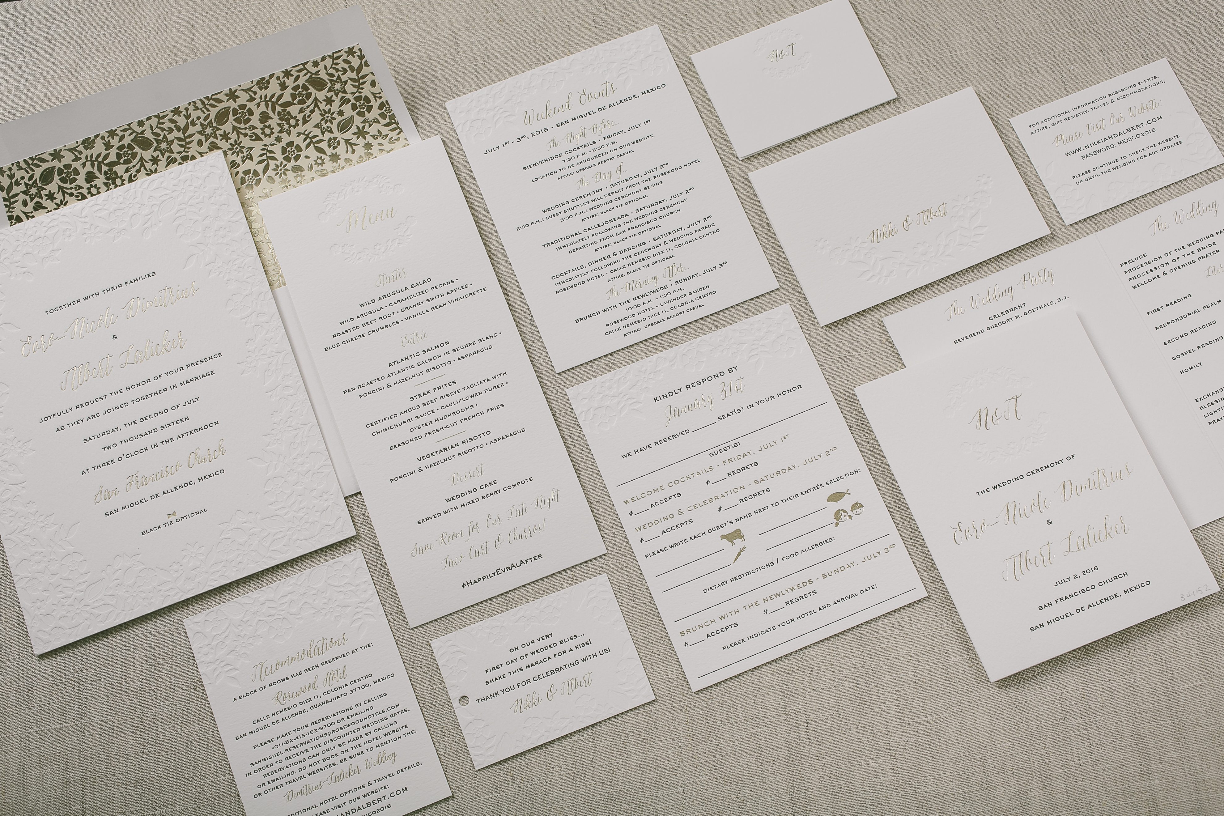
We printed these three color floral wedding invitations for the Mexico wedding of Nikki and Albert. Our Penelope design served as inspiration and the modern palette of black and tawny foil was highlighted by the blind debossed floral pattern that accented each piece. The same floral motif was used as a custom foil pattern printed over a flood of french vanilla ink. We printed their reception pieces, too – from the ceremony programs to the menus, place cards and favor tags.
letterpress inks: black + blind deboss (no ink) | foil stamping: tawny matte | fonts: aster + sans capitals | paper: bella cotton white 1-ply + 2-ply | envelope: bella cotton white | digital + foil stamped liner: classic color pattern in french vanilla + custom penelope pattern in tawny matte | customization #31118
Our Irving wedding invitation is the quintessential modern design – bold type and lots of white space make it perfect for any contemporary event. Kelly and Zachary embellished their Irving customization with an all over blind deboss pattern, foil stamping to highlight their names and edge painting for a pop of festive color.
Blind deboss back patterning on this customization of the Ellipse design adds subtle texture, perfect for an elegant African safari themed wedding. The hand drawn design elements bring in a soft bohemian look that are kept from feeling too wild when paired with Maybelle Imasa-Stukuls‘ unique hand calligraphy.
ellipse customization = letterpress ink: espresso + blind deboss | font: sans capitals | paper: white | invite size: f-8 | liner: diego pattern in desert + olive | hand calligraphy accents: belle style | original design by Courtney Jentzen| customized by in-house designer Jessica Tierney
Ravishing as always, Beth Barr‘s Damask design is shown here sporting a classic combo of charcoal ink and inkless blind deboss. Papery and Cakery of Boca Raton gets the kudos for this lovely set – thanks guys!
inks: charcoal + blind deboss | font: impression | calligraphy: victoria hand calligraphy by Sarah Hanna | paper: 2-ply white | invite size: f8 | edge paint: metallic silver | liner: classic color pattern in charcoal | customization #: 14495
We printed this letterpress wedding invitation set for a very sweet Brazilian client of ours and – what’s the Portuguese word for gorgeous? Well, these are it! Letterpressed in a sophisticated paring of Pewter and ink-less Blind Deboss, this Amici (by designer Ian Koenig) set speaks softly and with an impeccably romantic tone. Lavender edge painting and lavender envelope liners printed with our reverse vintage river pattern add a subtle whisper of color to the set.
inks: pewter + blind deboss | fonts: coronation + utrecht | paper: 1-ply white | invitation size: f8 | liner: the reverse vintage river in lavender | client coordinator: chris gannon | in-house designer: racheal decker
This Sonoma Calligraphy (by Maybelle Imasa-Stukuls) letterpress wedding invitation set is without a doubt absolutely gorgeous! The invitation is printed in Black and Colorless Blind Deboss inks on our 1-ply white paper. Both the invitations and flat place cards are edge painted in our striking metallic gold ink. Using Light Peach ink as an accent on their flat place cards, and envelope liner really adds character to this unique set! We see this invitation being used for a very intimate and elegant wedding.
ink: black + light peach + blind deboss | fonts: streamline | calligraphy style: belle by maybelle | paper: 1-ply white | invite size: f-8 | liner: the classic color pattern in light peach ink | edge painting: metallic gold | client coordinator: jessica hanaman | in-house designer: lindsy aragona
We worked with our friends at By Invitation Only in Little Rock, Arkansas to create this gorgeous suite. The invitation was entirely embossed on our plush 3-ply cotton stock, and finished with a winston shaped bevel and painted edge. The welcome dinner card features blind debossing, and marsala letterpress. Our roses pattern envelope liner in CMYK with a rosebud background complements the cards.
We had the pleasure of working with Daniela and Chris to create their wedding invitations. Inspiration came from our Underwood v.2 suite. We kept the luscious debossed botanicals, and spruce and ivory color palette. The fonts were updated to a more modern mix of serifs.